Showing posts with label graphic design. Show all posts

Friday, July 5, 2013

How Do You Measure A Year

"What makes the difference between wishing and realizing our wishes? Lots of things, and it may take months or years for wish to come true, but it's far more likely to happen when you care so much about a wish that you'll do all you can to make it happen." - Fred Rogers
For those who wonder why my posts have been so sparse in recent months, let this be the answer. Every day for the last 365 days I have shared a snapshot of creativity with the world. I've researched, sketched, and written a years worth of mini history lessons and posted them on my Facebook page, never missing a day. I amassed over 60 Photoshop files alone with this project, filled with drawings and factoids. Over these past twelve months, there have been times when I wanted to stop. I would have two or three other projects in the works, my day job stressing me out, but I kept going. As I look back on what some may not see as much of an accomplishment, I see just how far I've come. If there's one thing a year-long project will do, it's show you just what the word 'commitment' means in your life.

A Year of Art & Design History
Digital sketches © Rachael Sinclair
Researching these people, objects, structures, and creations has taught me much about where we've been as inspired creatures and where we may go in the future. There has been beauty pulled from darkness and depression, invention pulled from necessity, and awe-struck breath pulled from the lungs of the world over the centuries. Art, music, literature, architecture, craft: these things give us the basic energy we need to soldier on. Without the creativity the arts bring us, we would not know the forms that lie waiting in a slab of marble, the colors hiding in an unpainted canvas, or the way a certain chord or line of prose can bring tears to our eyes.

The milestones as they appeared on my Facebook page.
It's been an amazing journey into history and into my own determination. I've tried new styles and picked up a few bits of trivia. Pearl Buck said, "If you want to understand today, you have to search yesterday." I encourage you to delve into the history of what inspires you. Learn the ins and outs, ups and downs. Strike up a kinship with the past and you will never spend another tomorrow alone.

Wednesday, February 13, 2013

Happy Valentine's Day

I've never loved Valentine's Day, but I can't say I completely detest it. Who can resist chocolate, right?


Thursday, December 6, 2012

Details Matter: Know Your Subject

'It has long been an axiom of mine that the little things are infinitely the most important.' -Sherlock Holmes, A Case of Identity

Design is an art, true, but design and art are not the same. In art, liberties can be taken, but in design, attention to detail is a must. And it could be said that too much research may never be enough. No matter the size of the client or job, a bit of sleuthing can make the difference between success and failure.

In the late 90's, an ad campaign was launched by Quilted Northern tissue featuring cartoon women quilting. Though the intention was fine, the ladies were 'quilting' using knitting needles. This was a costly mistake, teasing the sensibilities of a large demographic: homemakers and housewives. The campaign was eventually revamped to show quilting instead of knitting, but the lesson wasn't a nice one to learn. This is where research could have saved them a lot of time and embarrassment. Knitting and quilting may both use needles, but that in no way means the two are interchangeable.

Agencies and designers work with a lot of different clients. Though it may be familiar for you to work for a coffee shop if you love coffee and know a lot about it, it may not be a simple when the client deals in something outside your realm of expertise. Don't be afraid to take to the books, so to speak, and learn some things. Start by listening to your client, ask lots of questions. Dig deep and pay attention to the smallest of facts. This will not only make your design better, but can really help establish a trusting relationship.

Next, research every angle. If your client has something to do with music and you aren't a musician, give yourself a lesson in musical theory. Don't go by what you think may be okay, start out with a strong foundation and build your house there. You can have a design that's technically good, but if the base concept isn't sound, that design may end up on the scrap heap. And pay special attention to symbols and what they mean. A symbol or term may have a completely different meaning to one group than it does another.

Designers can be crunched for time more than we'd like, but our clients aren't always of a 'get it to me when you can' mentality themselves. If you've listened to your client, gotten to know them and their business, and done your research, what you deliver will be the cream of the crop. "Measure twice, cut once" as they say also applies to design. When you bring your client something that's thoroughly researched, it's easier to move forward without time-wasting error correction.

Jacks of All Trades, designers are detectives with sketchbooks. Knowing a little something about a lot of subjects isn't only beneficial for a trivia buff or Jeopardy contestant. These days, when information is so readily available, there's no excuse for errors of continuity. Be respectful of your client and good things will happen. And remember, you can't quilt with knitting needles.

Wednesday, October 31, 2012

Pop Inspiration: White Zombie

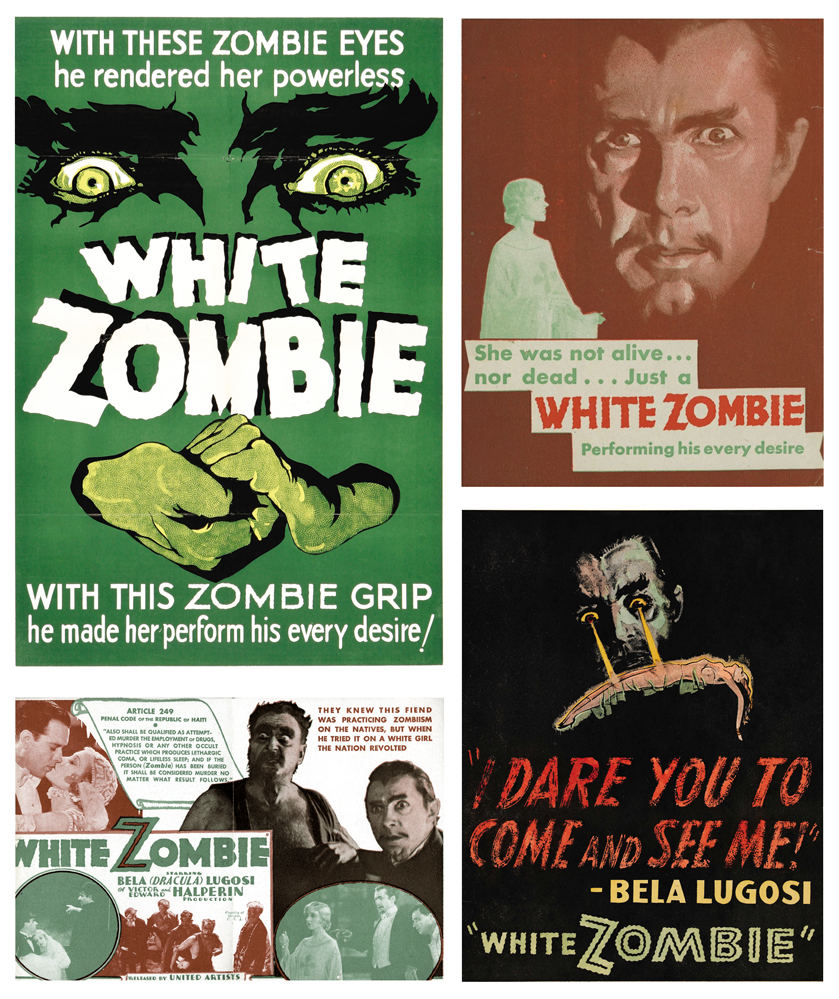
With these zombie eyes, he rendered her powerless. With this zombie grip, he made her perform his every desire!

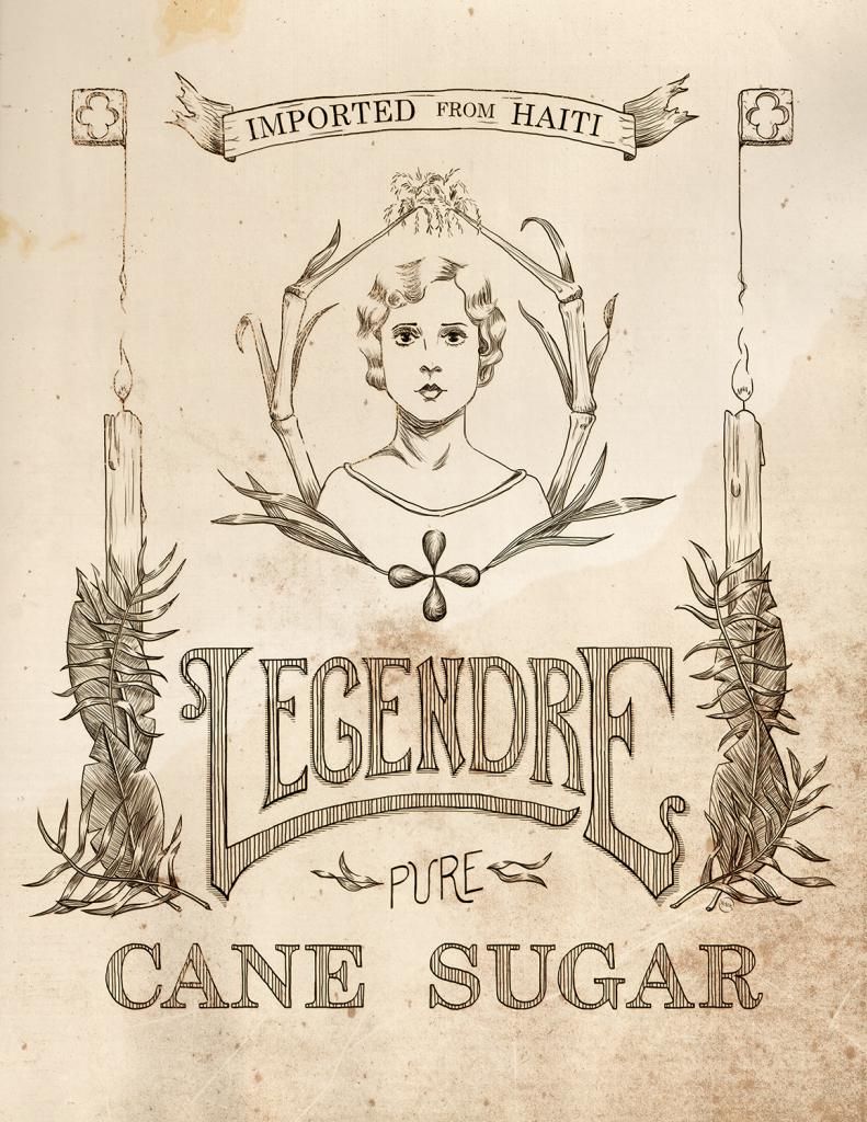
Released in 1932, the film White Zombie is considered the first feature-length zombie film. It starred Bela Lugosi, fresh off his unforgettable role in Dracula. He played a sinister witch doctor, 'Murder' Legendre, the vile owner of a zombie-staffed sugar mill in Haiti. Though it doesn't command the adoration of Dracula or Frankenstein, there's something enchanting (pun perhaps intended) about this film.


The posters and promotional items for the film give us a wealth of fun design. Take the colors for instance. In the pieces featured here, we see a period-perfect palm green, fading to a jade. On the opposite of the spectrum, we have a rusted red, a rich earthy tone. Perhaps subconsciously, these colors can transport us to the film's setting in the tropical world of Haiti in the 1930's.

Typefaces are predominately san serif, chunky and 'modern' in most cases. The titles are in a similar design, but tremulously edged, to give the words more intrigue and almost tribal mystery. The imagery shifts from graphically altered monotone photographs to posterized features and faces, sure to unsettle the nerves. These posters hearken to a time of minimal color usage and bold graphics.


White Zombie is a wealth of nostalgia, a transportation to the world of roaring Hollywood studios and 'monsters' more famous than the actors who played them. The story, the setting, the crackling audio, it's quite fantastic. With a short running time, it's great for wiling away a little over an hour. Have a Happy Halloween and watch out for zombies!


Legendre Sugar
Original lineart label
© Rachael Sinclair

Friday, September 28, 2012

Cleland's Harsh Words

Today, I wish a happy birthday to someone who passed before my time but has had a great impact on me. I covered him in a Cultivators of Inspiration post a while ago, so this should come as no surprise. On this day in 1880, Thomas Maitland Cleland was born. He went on to be one of the foremost designers and illustrators of the early 20th century. I have a large collection of his work, including his writing. In celebration of his 132 birthday, I share with you the final bits of an address he gave to the American Institute of Graphic Arts in New York on February 5th, 1940, bound and published as Harsh Words by T.M. Cleland. The world is always changing, but some things hold true from generation to generation. Hard work and effort will always be an integral part of success.

Wednesday, August 29, 2012

The Science of Good Design


Science! Art and science may seem like strage bedfellows, but the pairing flourished in the middle of the 20th century. Engineering and science, chemistry and space travel, these things helped make the 50's and 60's a roaring 'technological' age. Advertisers and designers were used to spread the good word of science and gone were the days of art used only for anatomy illustrations and concept work.

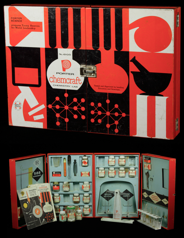
Photo from The Chemical Heritage Foundation
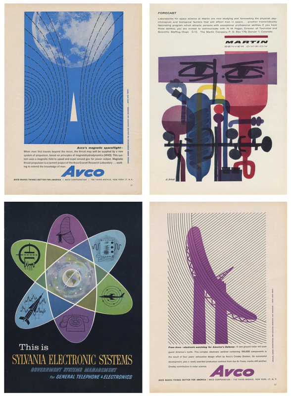
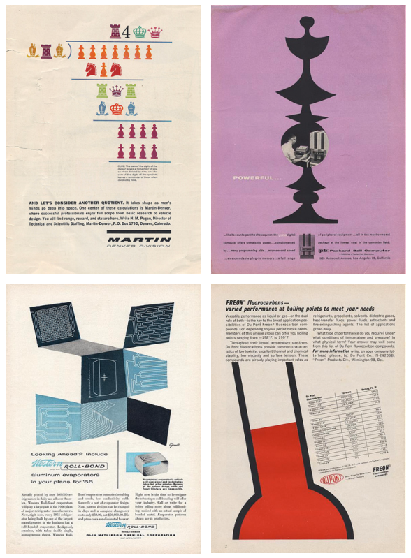
Following in the footsteps of design contemporaries, the people who worked on advertising and product design and promotion for Martin, Packard-Bell, Dupont, and Avco (to name a few) knew the sciences were tailor-made for the modernistic style of the day. In spite of the rigid nature of science and engineering, the designers felt freedom to be a bit more abstract. This helped, to a point, to demystify the sciences.

Let's take a look at this Porter Chemcraft chemistry set from 1958. This set is most indicative of the graphic style of mid-century modern. We see the use of black and white with the addition of bright, unadulterated red. The images are crisp and simplistic. On the inside, close attention is paid to continuity, with each item carefully designed to fit within the overall look. This set wasn't intimidating, it was friendly. A child could be at once in awe of science and eager to learn. How fantastic are these colors!

If we look at the eight samples of advertising below, we see the same use of bright color, oftentimes just one color with black and white much like the Chemcraft set. The illustrations are almost abstract in their simplicity and placement. The ads (all found here on the photostream of bustbright) are attention-grabbing, the text clean and 'futuristic'.


I adore the design of this era and when you add science, well, I love it even more. It's no surprise designers remain inspired by the work of those who, at the time, were on the cutting edge of what was to come. The next time you need some a little boost in the creative engine, try seeing things scientifically. Inspiration is everywhere, much like that thing we call oxygen. Breathe deep!

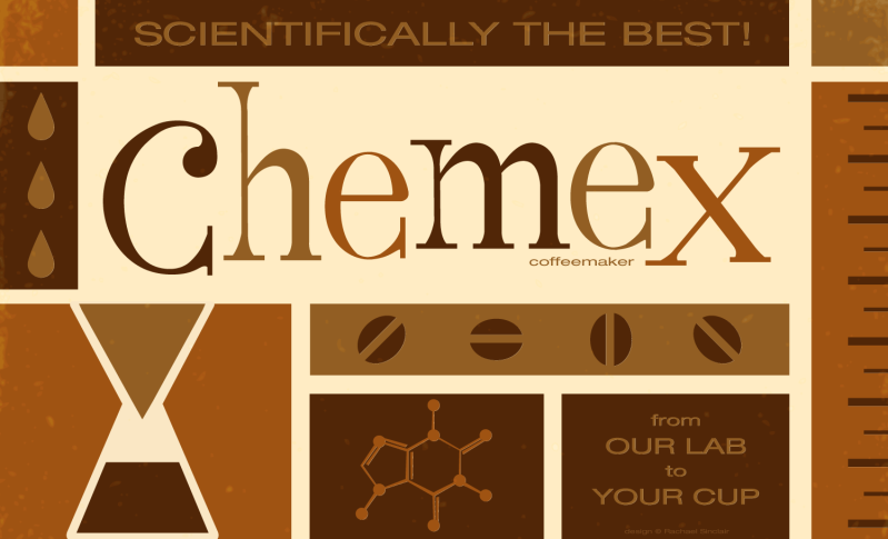
I took this opportunity to marry design, science, and one of my favorite things on earth, coffee. Invented in 1941 by a scientist, Dr. Peter Schlumbohm PhD, the Chemex coffeemaker uses the proven methods of chemistry to brew a simple, but absolutely perfect cup of coffee.  This poster features the squat copy text that's prevalent on pieces from the mid-century. The word 'Chemex' was hand done in a playful style, something also common to 50's and 60's design.

Scientifically the Best!
Original vector art
Rachael Sinclair

Wednesday, June 6, 2012

Idea Seeds: the Olympics

They are a symbol of peace, civilization, and excellence. The Olympics are the pinnacle of society; athletes from all over the globe participating in friendly competition, living together in a 'village'. This show of goodwill and skill is also an inspiration to artists and why the Olympic Games star in this Idea Seeds post.

Athletics is akin to art in sculpting and grace. From the balance of a gymnast to the lines of a diver; the chiseled beauty of an eventing warm blood to the blurring colors of racing oval, the games are stuffed with creative energy.

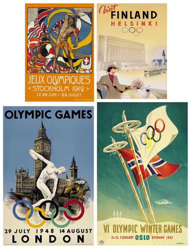
The Olympic games boast a number of year-specific creative items. The medals themselves are sculpted especially for each Olympiad. The opening and closing ceremonies are a spectacle of dance, music, and color. Posters have long been a way for artists and designers to show their tribute and skill. You see in this collection a sampling of some of the best Olympic and Olympic-related from the first half of the 20th century.

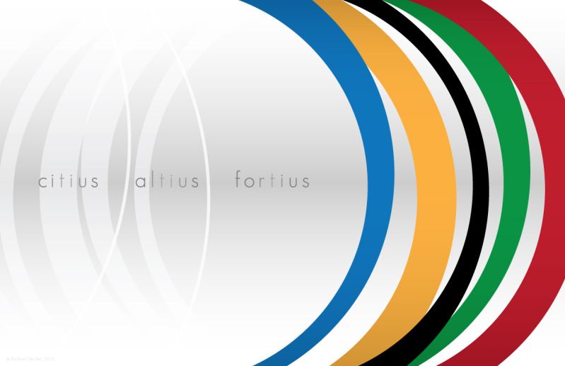
The games of the XXX Olympiad will take place in London this year. There's no better time to enjoy the events how you may and be spurred to create. I created this piece to reflect the depth and movement of the games. The stylized rings are like sails moving us forward while echoing back to remind us of how far we've come. The motto is Citius, Altius, Fortius (Faster, Higher, Stronger) and it gives us the fire to keep going, to keep achieving things we didn't think possible. How can you be better today?

Faster, Higher, Stronger
Original vector art
© Rachael Sinclair, 2012


Tuesday, January 3, 2012

Coffee: An Infographic

"Actually, this seems to be the basic need of the human heart in nearly every great crisis - a good hot cup of coffee." -Alexander King

Anyone who knows me will attest to my love for coffee. I started drinking coffee in college. The coffee shop was a great a hangout and wonderful place to sketch. Since, I've developed a mature and discerning taste for the much-loved beverage. To me, coffee is an art, a science, a miracle. Coffee is my wine.

For such a small thing, the coffee bean has a huge impact on our lives and the global economy. Coffee is the #2 most traded commodity on earth behind oil. Why not, it keeps us going! This infographic has been in the works for some time. I wanted to show the coffee journey in graphics to fit a simple yet rich beverage. Enjoy, and remember, friends don't let friends drink bad coffee!

Earth to Cup
original vector art
© Rachael Sinclair, 2012

Wednesday, October 26, 2011

Apples: An Infographic

Infographics have been a hot trend for some time. There's something delightful about information put fourth with great, spot-on graphics. Featured often in magazines and through news outlets, infographics may look simple, but they are far from it. Creating a successful infographic (whether the one I've created is successful or not is not for me to say) is a consuming task. First, you must collect accurate and timely data. Then you must illustrate that data in an engaging and clear manner. If executed properly, an infographic can be an excellent learning tool and pleasing piece of art all at once.

In celebration of one of my favorite times of year as well as National Apple Month, I created this little ditty (click image to embiggen). I featured a wide swath of trivia. If you'd like to see more infographics, and let's face it, who wouldn't; you can visit Daily Infographic or Good: Infographics.

Friday, October 7, 2011

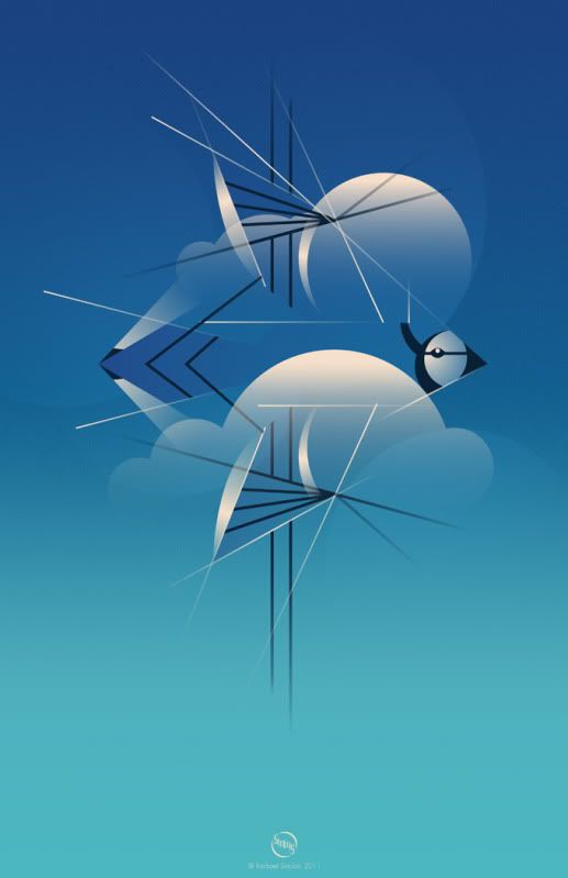
Happy Fall

"Those little nimble musicians of the air, that warble forth their curious ditties,
with which nature hath furnished them to the shame of art." -Izaak Walton

Tuesday, August 23, 2011

Iron Designer: MateVana

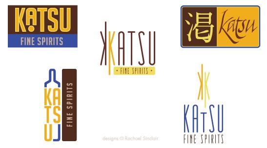
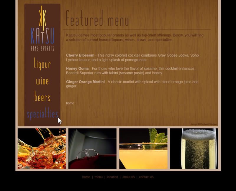
Imagine a client brings you a brand name, a niche market… and tea. The client wants branding, website design, and a few interior design ideas for an upscale, Japanese-themed cocktail bar named 'Katsu' (Japanese for 'thirst'). Your inspiration is a variety of loose-leaf tea sold by Teavana, the MatéVana®. Iron Designer, begin!

MatéVana® is a blend of mate and red rooibos teas with cocoa, almond, chocolate chips, and enhanced with hazelnut. It's mostly chocolate and nut browns, all with a woody but smooth texture. The tea is accented with a striking violet blue and a few shades of yellow ranging from citrus to sunflower. These portions of the tea are leaf-like and feminine. The client wants something that incorporates the clean, simple lifestyle of traditional Japan with a modern, rich atmosphere.


I pulled the palette above from the tea provided. We have a dark rich brown, a milky chocolate, two tones of gold, and a vibrant electric blue. Once we have those, we can apply them to our logo ideas. The client wants something sophisticated, but also evocotive of Japanese design and culture. On that vein, we have the logo ideas below.


I chose design at the bottom right to fashion a web site. I used the textures of tatami and wood grain. The photographs are simple and all match with black backgrounds. The site design is spartan and clean.


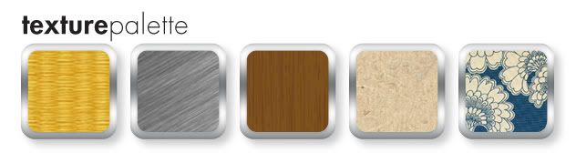
The bar itself should feature the textures of tatami, a touch of brushed metal, dark wood, rice paper, and a nice blue and neutral Japanese print fabric. The fabric brings in the feminine touch we found in the cornflower petals of the tea. Lighting should be intimate and utilize the golds in the palette.


Clients often find inspiration in things you may not expect. Sometimes it's good to practice by figuratively pulling an idea out of a hat. To be an Iron Designer, you have to be versatile and agile and ready to tackle any request. Explore the possibilities and take a second look at the world around you.

Teavana and MatéVana are registered trademarks. No copyright infringement intended.

Monday, August 15, 2011

Project Completion: Knowing When to Stop

"…letting well enough alone – which is the rule for grown artists only." -Winslow Homer

One of the most trying obstacles of art and design is knowing when to stop. Creative people, by nature, are often unimpressed by their own efforts. We can paint, sculpt, and tweak away until something is completely ruined. In order to grow as artists and designers, we must learn to step enough is enough.

When you're working on a personal project or make your money as a fine artist, it's oftentimes more difficult to put your signature on something and call it done. Doing something for yourself intimates a personal attachment and we all want personal things to be perfect. When you're collaborating, a project can be difficult to finish due to the principle of 'too many cooks in the kitchen'. When more than one decision-maker is involved, there are different ideas of 'complete'. How do we combat these roadblocks to success?

Where personal projects are concerned, the path to completion lies in understanding your expectations at the outset. What do you want your piece to accomplish? Do you have plans for the work when it's finished? What's your audience and what does this audience expect? It's also helpful to have a good set of sketches and references handy. As they say in carpentry: measure twice; cut once. This can be applied to art and design. Planning will save you time and help you create a more cohesive final product. When you know where you're going, you know when to stop.

Sometimes, all the planning in the world won't save you from feeling like something isn't quite right with your piece. If this occurs, step away. Speaking from experience, I attest to the difficulty of walking away, but it can really help you gain some perspective. Setting something aside for a while can allow you to revisit it later with fresh eyes.

If you're working collaboratively on a project—for an employer, freelance client, or volunteer project—planning, again, is a great way to avoid a lot of rough patches. Gather as much information as you can. Ask about audience again, be clear on expectations, and involve everyone in discussions about style, colors, and emotions. When everyone has input from the beginning, sticky confrontation down the road will be less prevalent. (I will add, confrontation is usually unavoidable, but the frequency can be lessened.)

Collaborative projects demand a high competency and confidence. Without being pushy or overbearing, speak your mind on technical matters. If someone suggests a typeface or color that just won't work, try to explain to them exactly why. Take your listener's experience into account. If they aren't creative, understand that some of your terms may not make sense. When all the cards are on the table, it will be easier to agree when a project reaches completion.

As with anything, it's possible to ruin a project by going only an inch too far. Planning for completion can really help you know when to step back, add your signature, and move on. Remember, even the masters had to put down their brushes and chisels at some point. Imagine if daVinci had put just one more swath of paint on the Mona Lisa. She may not be the enigmatic treasure she is today.