Showing posts with label color. Show all posts

Wednesday, October 31, 2012

Pop Inspiration: White Zombie

With these zombie eyes, he rendered her powerless. With this zombie grip, he made her perform his every desire!

Released in 1932, the film White Zombie is considered the first feature-length zombie film. It starred Bela Lugosi, fresh off his unforgettable role in Dracula. He played a sinister witch doctor, 'Murder' Legendre, the vile owner of a zombie-staffed sugar mill in Haiti. Though it doesn't command the adoration of Dracula or Frankenstein, there's something enchanting (pun perhaps intended) about this film.
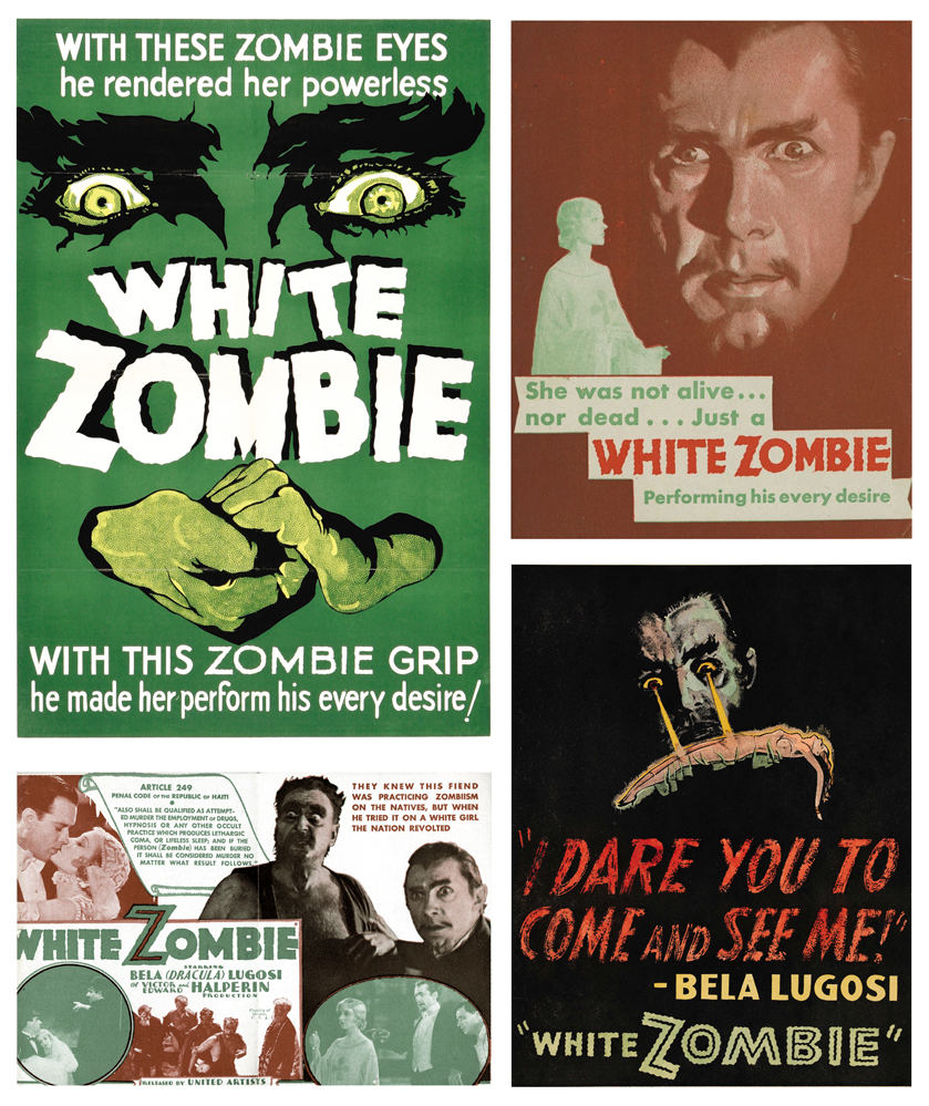

The posters and promotional items for the film give us a wealth of fun design. Take the colors for instance. In the pieces featured here, we see a period-perfect palm green, fading to a jade. On the opposite of the spectrum, we have a rusted red, a rich earthy tone. Perhaps subconsciously, these colors can transport us to the film's setting in the tropical world of Haiti in the 1930's.

Typefaces are predominately san serif, chunky and 'modern' in most cases. The titles are in a similar design, but tremulously edged, to give the words more intrigue and almost tribal mystery. The imagery shifts from graphically altered monotone photographs to posterized features and faces, sure to unsettle the nerves. These posters hearken to a time of minimal color usage and bold graphics.


White Zombie is a wealth of nostalgia, a transportation to the world of roaring Hollywood studios and 'monsters' more famous than the actors who played them. The story, the setting, the crackling audio, it's quite fantastic. With a short running time, it's great for wiling away a little over an hour. Have a Happy Halloween and watch out for zombies!
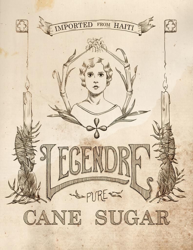

Legendre Sugar
Original lineart label
© Rachael Sinclair

Tuesday, October 2, 2012

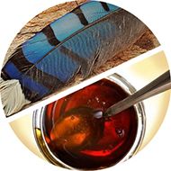
Color Flavor: Jay Feather and Sorghum

Autumn blows in on the backs of leaves to the calls of the garrulous blue jay. The electric blue feathers stand out against the contrasting golden leaves. Kitchens are thick with the smells of apple pies and pumpkin bread. On foggy mornings, warm biscuits aren't the same without a creamy spread of butter and sorghum. The rich, warm gold of this special syrup from the south paired with the near-holographic blue of a shed jay feather is the perfect combination to welcome the closeness of the season.


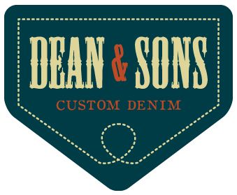
Sampling the darkest tones from the jay feather, we come up with a slightly greenish blue deepened with gray. This color is a little rustic and very natural. In design, the color is great for use on backgrounds (as it is fairly easy on the eyes) and in themes that call for a 'rugged' feel. See the theoretical logo for Dean & Sons Custom Denim. Here, the blue is married with a vellum neutral and the syrup umber. The tones separate well and accent each other perfectly.

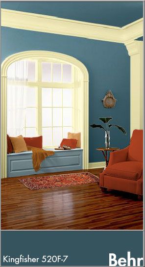
In the home, jay feather and sorghum are a recipe for cozy with a touch of class. The colors are rich and deep, but not shocking or heavy. Here, the walls and ceiling are painted in the jay feather color (Behr Kingfisher 520F-7). The window seat inset is in a slightly lighter hue (Shale Gray 540F-4) and the neutral is a cooler cream (Windsong 390C-3). To warm things up, the upholstery and accents come in unadulterated burnt umber and gold. Throw in a rich, warm oriental rug and you're set for a little reading in the afternoon sun.

Jay feather and sorghum are colors of nature in transition. Summer is giving way to autumn's bounty. The jay calls in the blazing trees and the cane is cooked down into semi-liquid gold. If you're in the market for 'country' with a touch of elegance, give these hues a try!


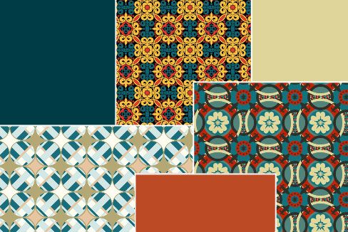
Patterns can be found here, here, and here.

Kentucky_Club
Color by COLOURlovers

P.S. If you'd like a good cookie recipe using sorghum, check out the chewy ginger cookies on my past post here. I mention molasses in the recipe, but I always use good Kentucky sorghum.

Wednesday, August 29, 2012

The Science of Good Design


Science! Art and science may seem like strage bedfellows, but the pairing flourished in the middle of the 20th century. Engineering and science, chemistry and space travel, these things helped make the 50's and 60's a roaring 'technological' age. Advertisers and designers were used to spread the good word of science and gone were the days of art used only for anatomy illustrations and concept work.

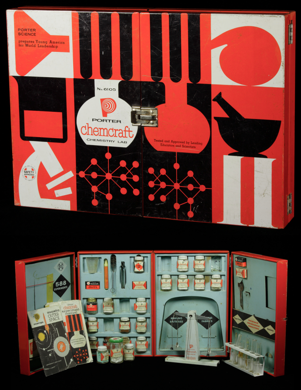
Photo from The Chemical Heritage Foundation
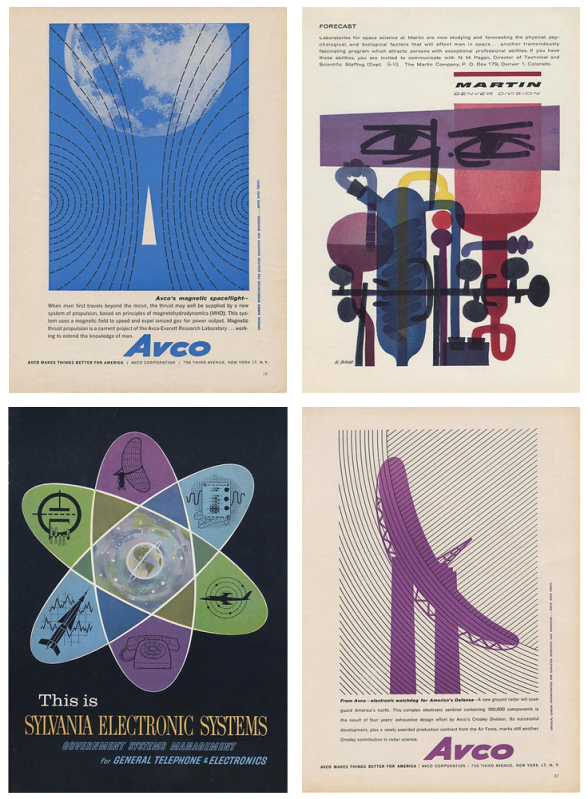
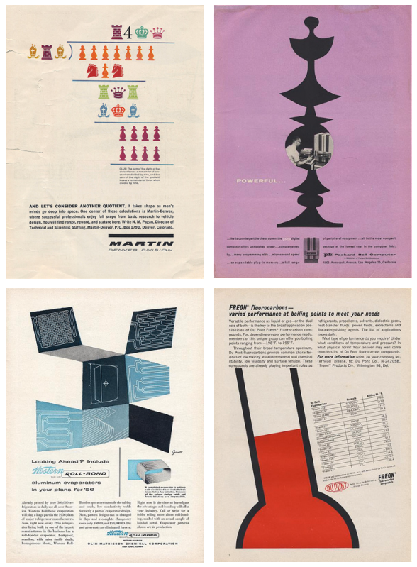
Following in the footsteps of design contemporaries, the people who worked on advertising and product design and promotion for Martin, Packard-Bell, Dupont, and Avco (to name a few) knew the sciences were tailor-made for the modernistic style of the day. In spite of the rigid nature of science and engineering, the designers felt freedom to be a bit more abstract. This helped, to a point, to demystify the sciences.

Let's take a look at this Porter Chemcraft chemistry set from 1958. This set is most indicative of the graphic style of mid-century modern. We see the use of black and white with the addition of bright, unadulterated red. The images are crisp and simplistic. On the inside, close attention is paid to continuity, with each item carefully designed to fit within the overall look. This set wasn't intimidating, it was friendly. A child could be at once in awe of science and eager to learn. How fantastic are these colors!

If we look at the eight samples of advertising below, we see the same use of bright color, oftentimes just one color with black and white much like the Chemcraft set. The illustrations are almost abstract in their simplicity and placement. The ads (all found here on the photostream of bustbright) are attention-grabbing, the text clean and 'futuristic'.


I adore the design of this era and when you add science, well, I love it even more. It's no surprise designers remain inspired by the work of those who, at the time, were on the cutting edge of what was to come. The next time you need some a little boost in the creative engine, try seeing things scientifically. Inspiration is everywhere, much like that thing we call oxygen. Breathe deep!

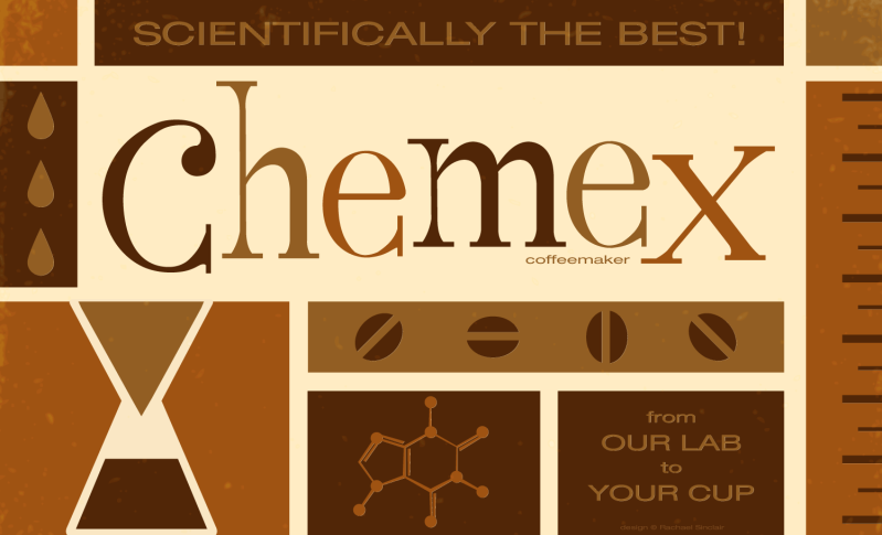
I took this opportunity to marry design, science, and one of my favorite things on earth, coffee. Invented in 1941 by a scientist, Dr. Peter Schlumbohm PhD, the Chemex coffeemaker uses the proven methods of chemistry to brew a simple, but absolutely perfect cup of coffee.  This poster features the squat copy text that's prevalent on pieces from the mid-century. The word 'Chemex' was hand done in a playful style, something also common to 50's and 60's design.

Scientifically the Best!
Original vector art
Rachael Sinclair

Wednesday, July 25, 2012

My Old Kentucky Home

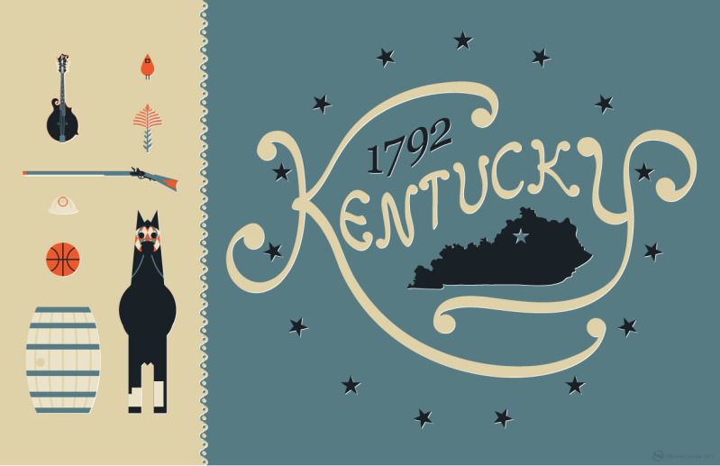
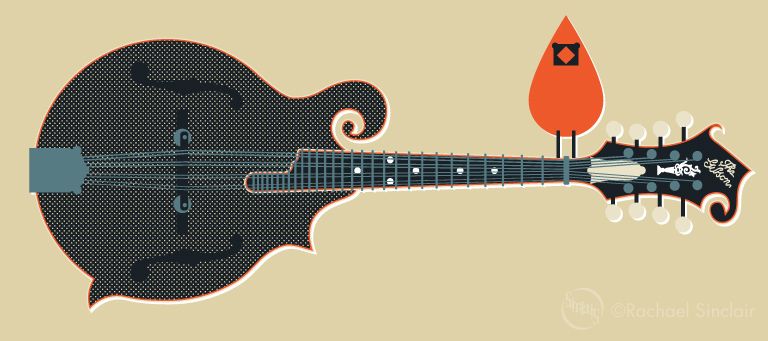
When I started this blog, one of my first posts was about collecting vintage tins. Among the tins I've accumulated is a weathered beauty for Kentucky Club pipe tobacco. I adore this tin. The imagery is wonderful, and the colors, wow. I've always wanted to do a homage to my state, incorporating the things that make Kentucky what it is. I did this poster using the tobacco tin colors, featuring a number of Kentucky icons. You'll find the state bird and flower, an alert thoroughbred in racing gear, a bourbon barrel, basketball, coal miner's helmet, a Kentucky long rifle, and lastly, a Gibson mandolin (the one used by the father of Bluegrass music, Bill Monroe). The word Kentucky was hand done for a more rustic feel and it's surrounded by 15 stars as Kentucky was the 15th state added to the union.

I love the Bluegrass. I love the people, the culture, the heritage, and the natural beauty. This poster is my love letter to my Old Kentucky Home and is likely not the last.

My Old Kentucky Home
original vector art
© Rachael Sinclair

element detail

Thursday, June 21, 2012

Color Flavor: Honeysuckle

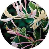
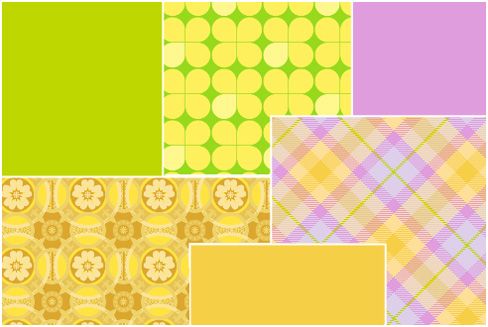
It's a popular fragrance for soaps and lotions and in the spring and summer, it sweetens the breeze and entices the bees. Honeysuckle comes in tame and wild varieties and doesn't just smell good, it's a great source for color inspiration. This vine can be considered a pest if not controlled, but if you've walked by a bank of it after a rain, you know the scent is like none other. If you stop to study further, you'll notice tones from smooth butter to lively magenta and all tones in between.

In design, these colors are a dream for something fresh or feminine. A bakery or candy shop would be a fitting use for the buttery yellow and zing of fuchsia and tart green. The brightness of these hues would also do well in the branding for a specialty children's store.


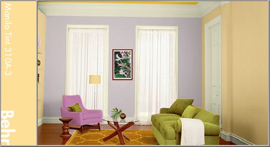
Home is for comfort and these warm tones do just that, comfort us in the arms of a summer day. Use a lighter honeysuckle yellow for the walls. Here, I've used Behr's Manila Tint (310A-3) with a more intense hue for accents (Flame Yellow: 360B-6). Splash around the greens and purple (Brook Trout: 110E-2) to bring attention to certain areas. Warm wood would further brighten the feeling where a contrasting use of cool metal would bring balance.

Honeysuckle yellow is a color that can almost instantly trigger a perfumed memory. The scent alone is a beautiful thing, but the kaleidoscope of colors in the bloom of a honeysuckle are just as amazing.

Patterns can be found here, here, and here.

Wednesday, June 6, 2012

Idea Seeds: the Olympics

They are a symbol of peace, civilization, and excellence. The Olympics are the pinnacle of society; athletes from all over the globe participating in friendly competition, living together in a 'village'. This show of goodwill and skill is also an inspiration to artists and why the Olympic Games star in this Idea Seeds post.

Athletics is akin to art in sculpting and grace. From the balance of a gymnast to the lines of a diver; the chiseled beauty of an eventing warm blood to the blurring colors of racing oval, the games are stuffed with creative energy.

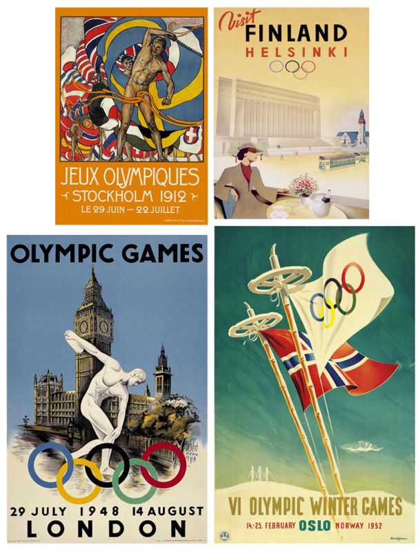
The Olympic games boast a number of year-specific creative items. The medals themselves are sculpted especially for each Olympiad. The opening and closing ceremonies are a spectacle of dance, music, and color. Posters have long been a way for artists and designers to show their tribute and skill. You see in this collection a sampling of some of the best Olympic and Olympic-related from the first half of the 20th century.

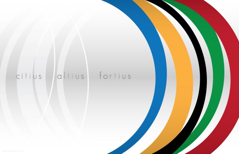
The games of the XXX Olympiad will take place in London this year. There's no better time to enjoy the events how you may and be spurred to create. I created this piece to reflect the depth and movement of the games. The stylized rings are like sails moving us forward while echoing back to remind us of how far we've come. The motto is Citius, Altius, Fortius (Faster, Higher, Stronger) and it gives us the fire to keep going, to keep achieving things we didn't think possible. How can you be better today?

Faster, Higher, Stronger
Original vector art
© Rachael Sinclair, 2012


Wednesday, April 25, 2012

Color Flavor: Porcelain Berry

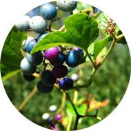
In my youthful explorations, I learned a lot about wildflowers, plants, and topography. I can instantly identify a number of native flora and fauna and know where you're likely to find them. A few years ago, I saw something I'd not seen before, a porcelain berry. A plant native to Asia, this climbing foliage is considered an invasive species in this country. It is quickly spreading across from the eastern states and must be controlled as it can choke out native vegetation.

The porcelain berry has grape-like leaves. It's a trailing bush, growing up to 15 feet tall, with drooping branches. Perhaps the most striking thing about this plant are the berries. The berries are small and opaque with tiny flecked spots. They range in color from magenta purple, cloudy sea blue, to pale earthy green, most of the time in the same fruit bunch.

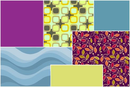
Dusty magenta isn't an easy color to incorporate into designs of any kind, at least not quietly. It is almost certainly going to be seen as feminine. Keep this in mind. This color would work well as an accent for a women's boutique or salon. It would also be appropriate for a bakery since it mimics closely the color of many berries used in baking.


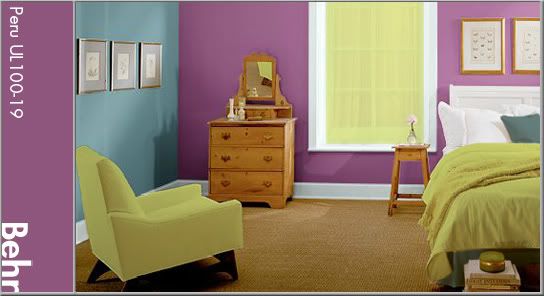
In interior design, these hues work well in rooms that tread the line between warm and cool. Bedrooms and bathrooms benefit from the relaxing blues and imaginative magenta. Add a spring-like yellow green for interest. Above, Behr's Peru (UL100-19) is the accent wall color paired with Bayside (510F-5) and Waterfall Mist (W-D-510).


 Patterns featured above can be found here, here, and here.

Friday, April 6, 2012

Idea Seeds: Dogwood

With spring comes a lot of inspiration. Everything's waking up after a winter's nap; there are colors and textures everywhere. One of my favorite things about spring is the dogwood tree. Dogwoods are pretty trees most of the year, but their blooms are something special. That's why I've chosen dogwood as this Idea Seed.

Viewed by some as a religious symbol and prized by landscapers for its foliage, the dogwood comes in both tree and shrub varieties. The blooms can range from a chartreuse shade of white to light and dark pink and have four petals with a distinct dark spot on the tip. These blooms are showy in spring and give way to simple leaves for summer. Eventually, they produce bright berries.

Sun Salutation
watercolor

©Rachael Sinclair

If you have a dogwood tree in your yard or know where you can inspect one, take a good look. Does the shape inspire you? How about the color? What textures do you see? Sit under a dogwood and let your mind drift. You never know what magic you'll find!

These PMS colors and CMYK breakdowns were sampled directly from the bloom of a dogwood tree


Wednesday, November 9, 2011

Pasta Fagioli

As winter approaches, we find ourselves seeking warmth. Soup is a great food for the cooler months both for its ability to warm us, but also keep us satisfied. One of my favorite soups is the Italian staple, pasta fagioli. With its bright, autumn-colored vegetables, it's not only filling, it's beautiful.

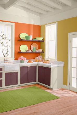
The soup has a base of tomatoes, a deep pinkish red. Add to that the translucent white of onions, the rich orange of carrots, and the wick green of celery. Great northern and dark red kidney beans round out the rustic rainbow with added spice of basil, thyme, and oregano. Use these colors in old fashioned design or anything dealing with cooking, food, or produce. In a room, the hues of pasta fagioli add lots of pop. They're bold and not for everyone, but can be a source of great interest in the right setting. The kitchen here features Behr French Pale Gold (350D-5), Startling Orange (S-G-230), Deep Garnet (110F-7), and Antique White interior flat enamel (1823).

The next time you need a hearty meal, I recommend pasta fagioli. It's fairly simple to make and can feed your creativity as well as your body. The recipe below is the one I use and was originally taken from Top Secret Recipes.

Pasta Fagioli

1 pound ground beef or turkey
1 small onion, diced (about 1 cup)
1 large carrot, julienned (about 1 cup)
3 stalks celery, chopped (about 1 cup)
2 cloves garlic, minced
2 14.5-ounce cans diced tomatoes
1 15-ounce can red kidney beans (with liquid)
1 15-ounce can great northern beans (with liquid)
1 15-ounce can tomato sauce
1 12-ounce can vegetable juice (such as V-8)
1 tablespoon white or balsamic vinegar
1 1/2 teaspoons salt
1 teaspoon oregano
1 teaspoon basil
1/2 teaspoon pepper
1/2 teaspoon thyme
8 ounces (around 1/2 package) ditali pasta

Brown meat in a large saucepan or pot over medium heat and drain. You can add the onion, carrot, celery and garlic with the meat, or transfer meat to a bowl so vegetables get more contact with the pan. Saute the vegetables for about 10 minutes or until they begin to caramelize. Optional: deglaze the pan with a little brewed coffee. Add the remaining ingredients (including the meat if you set it aside), except pasta, and simmer.

After soup has simmered for 45-50 minutes, cook pasta in separate saucepan until al dente. Drain the pasta. Add pasta to soup and cook for 5-10 more minutes. As an option, you can keep the soup and pasta separate as the pasta will continue to absorb liquid, making your soup thick. If you do this, add pasta to the bottom of the serving bowls, pouring the soup on top.

Serve with a sprinkling of Parmesan cheese and fresh-baked garlic or herb bread.


Friday, October 7, 2011

Happy Fall

"Those little nimble musicians of the air, that warble forth their curious ditties,
with which nature hath furnished them to the shame of art." -Izaak Walton

Tuesday, August 23, 2011

Iron Designer: MateVana

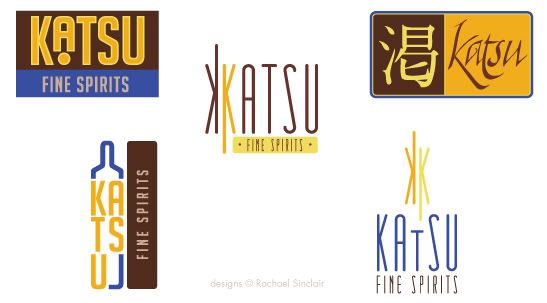
Imagine a client brings you a brand name, a niche market… and tea. The client wants branding, website design, and a few interior design ideas for an upscale, Japanese-themed cocktail bar named 'Katsu' (Japanese for 'thirst'). Your inspiration is a variety of loose-leaf tea sold by Teavana, the MatéVana®. Iron Designer, begin!
MatéVana® is a blend of mate and red rooibos teas with cocoa, almond, chocolate chips, and enhanced with hazelnut. It's mostly chocolate and nut browns, all with a woody but smooth texture. The tea is accented with a striking violet blue and a few shades of yellow ranging from citrus to sunflower. These portions of the tea are leaf-like and feminine. The client wants something that incorporates the clean, simple lifestyle of traditional Japan with a modern, rich atmosphere.


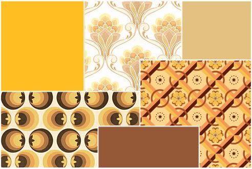
I pulled the palette above from the tea provided. We have a dark rich brown, a milky chocolate, two tones of gold, and a vibrant electric blue. Once we have those, we can apply them to our logo ideas. The client wants something sophisticated, but also evocotive of Japanese design and culture. On that vein, we have the logo ideas below.


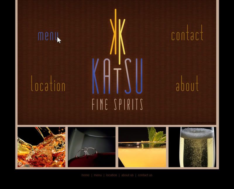
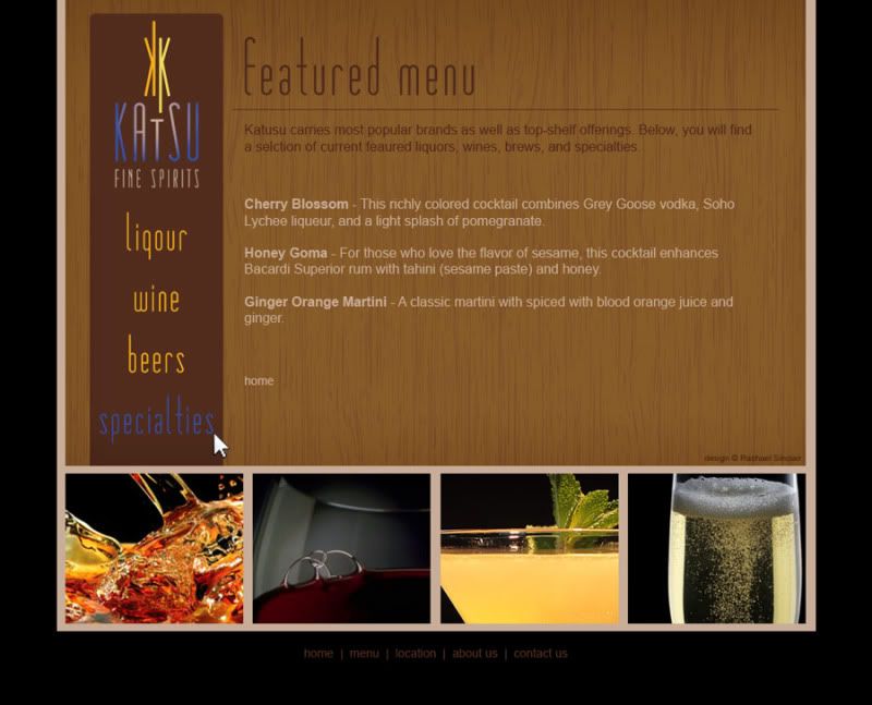
I chose design at the bottom right to fashion a web site. I used the textures of tatami and wood grain. The photographs are simple and all match with black backgrounds. The site design is spartan and clean.


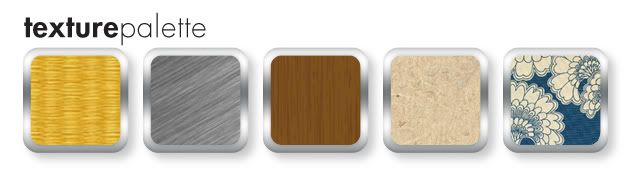
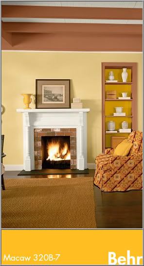
The bar itself should feature the textures of tatami, a touch of brushed metal, dark wood, rice paper, and a nice blue and neutral Japanese print fabric. The fabric brings in the feminine touch we found in the cornflower petals of the tea. Lighting should be intimate and utilize the golds in the palette.


Clients often find inspiration in things you may not expect. Sometimes it's good to practice by figuratively pulling an idea out of a hat. To be an Iron Designer, you have to be versatile and agile and ready to tackle any request. Explore the possibilities and take a second look at the world around you.

Teavana and MatéVana are registered trademarks. No copyright infringement intended.

Tuesday, July 26, 2011

Color Flavor: Mesquite

With summer comes the joy of grilling. If one is resourceful, an entire meal can be prepared out of doors. While some prefer gas and others charcoal, many add a touch of smoke to their meal by adding wood chips. The varied, tepid tones of mesquite chips can really spice up design as well.

Mesquite is a small tree, usually shrub size, that grows in the desert and range lands of the southwestern United States and as far south as parts of southern and western South America. It is a hardy plant that withstands droughts because of its long taproot. Used for many things, mesquite is perhaps most well-known as a smoke flavoring for southwestern foods. When the hardwood chips are soaked prior to use on the grill, the deep colors are amplified.

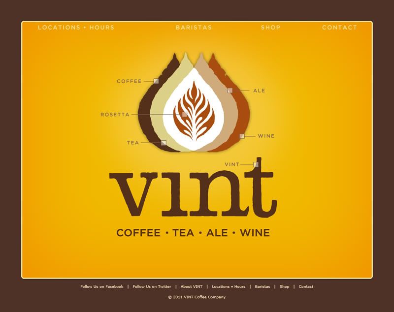
The colors of wood grain run the gamut from the usual umber and chocolate to a bright mustard gold. When combined with the browns, the tinted yellow adds a great deal of interest. In design, these colors are tailor-made for masculine or earthy brands and themes. Food branding is a given for this scheme that is warm, rich, and spicy. Take, for example, this branding for Vint Coffee. It uses all of the tones of mesquite, showcasing the striking gold. The branding brings to mind a classic, easy sense of comfort while maintaining a contemporary style.

This web page and all holdings are © Vint Coffee.

In interior design, the colors work best in rooms where you really want to add energy and warmth all at once. Kitchens, dining rooms, and living rooms benefit from the gold's soothing vigor and the tones naturally work well with wood floors and furnishings. These colors alone may seem bland to some, so feel free to spice up the mood with some graphic print on furniture, pillows, or art. Here, the yellow is used as an accent with Cinnamon Brandy (Behr 23OD-7), Honey Bear (Behr 34OD-4), and Oyster (Behr W-B-720).

Finding inspiration from nature is easy and to find it in food, simply follow your nose and taste buds. The most alluring foods can bring some amazing colors to your life.


Mesquite
Color by COLOURlovers


Tuesday, July 5, 2011

With Gratitude to the NASA STS

alternate version with Eliot quote

The first space shuttle, Columbia, was launched on April 12, 1981. I grew up to the countdowns and launches, the brilliant trail arches and spacewalks. I mourned for Challenger (posthumously, I was too young at the time) and Columbia. I watched as the shuttle made the International Space Station a reality. This was the ultimate in ingenuity, this was creativity, this was courage to tackle an open-ended dream with an ever-uncertain outcome.

It's a panorama I will remember forever; the bold white shuttle appointed in sun-lit black holds tight to a silo tank of rusted orange. Two missile-shaped boosters stand at the ready like military guards. The countdown begins and soon a flurry of sparks swirl under the engine bells. 4… 3… 2… 1… liftoff! Steam and smoke curl from below the massive machine like a rolling sea of whitecaps. The shuttle is airborne, stretching toward the heavens and chiseling history with each second.

From a design standpoint, the shuttle 'stack' (the external fuel tank, the two solid rocket boosters, and the orbiter itself) is iconic. It isn't terribly flashy in color, but the bleached ivory, charcoal black, metallic titanium, and umber paint a very familiar palette. Over the years the NASA badge has changed, but the font used on the shuttle has always been Helvetica. The U.S. flag flies proud on the side of the shuttle as well on the right wing. The shuttle is an example of how utilitarian design enters into our culture as a comfortable norm.


In season 4 of The X-Files, Fox Mulder gave his partner Dana Scully an Apollo 11 key chain for her birthday. In response, she said: "You never got to tell me why you gave it to me or what it means, but I think I know. I think that you appreciate that there are extraordinary men and women and extraordinary moments when history leaps forward on the backs of these individuals, that what can be imagined can be achieved, that you must dare to dream,  but that there's no substitute for perseverance and hard work and teamwork because no one gets there alone; and that, while we commemorate the… the greatness of these events and the individuals who achieve them, we cannot forget the sacrifice of those who make these achievements and leaps possible."

Great things have been achieved on the backs of these extraordinary individuals. From the ground crew to the commanders of the missions, these flights have been, each and every one, a testament to bravery and commitment. The people we lost along the way, the crews of Challenger and Columbia, will always be remembered for the courage to put themselves on the line for the advancement of man. The science and engineering are truly a nod to the greats before and will be an inspiration to the greats yet to come. Though the Space Transport System takes its final flight this year, the impact on all aspects of our lives will be eternal. I present this poster with gratitude to the NASA Space Transport System. Thank you for 30 breathtaking years; you will be missed. 


Dreams Aloft
original vector art, 11x17
© Rachael Sinclair, 2011