Showing posts with label typography. Show all posts

Wednesday, August 29, 2012

The Science of Good Design


Science! Art and science may seem like strage bedfellows, but the pairing flourished in the middle of the 20th century. Engineering and science, chemistry and space travel, these things helped make the 50's and 60's a roaring 'technological' age. Advertisers and designers were used to spread the good word of science and gone were the days of art used only for anatomy illustrations and concept work.

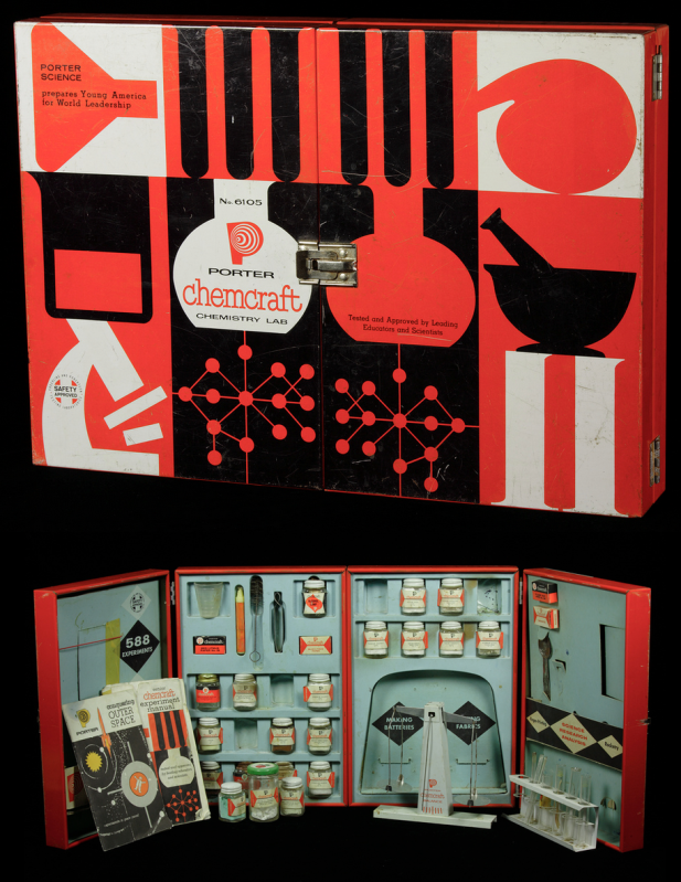
Photo from The Chemical Heritage Foundation
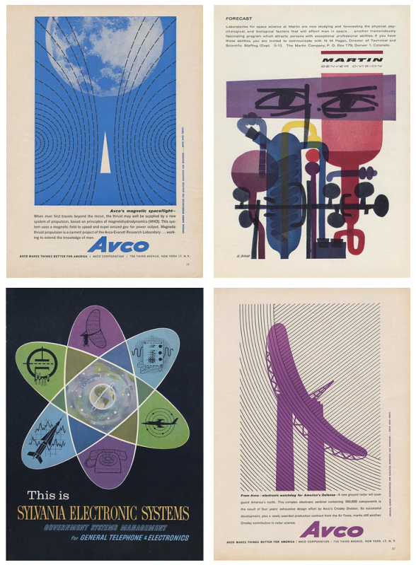
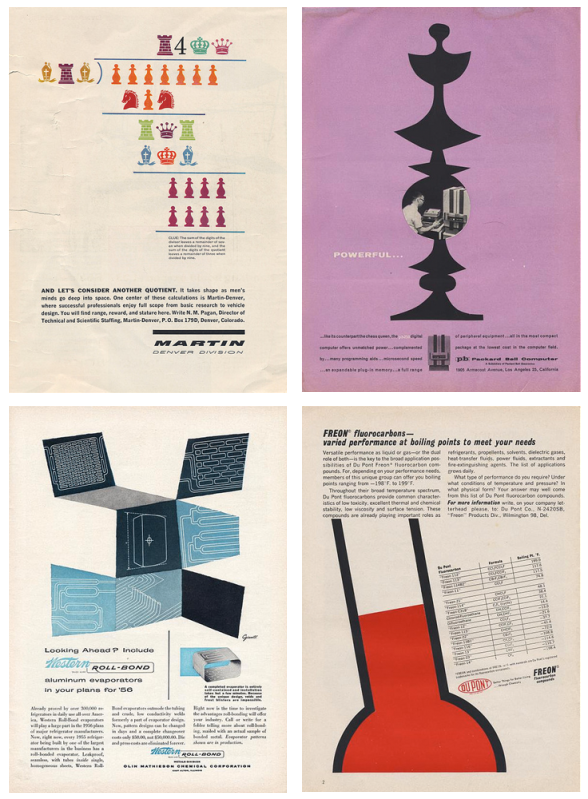
Following in the footsteps of design contemporaries, the people who worked on advertising and product design and promotion for Martin, Packard-Bell, Dupont, and Avco (to name a few) knew the sciences were tailor-made for the modernistic style of the day. In spite of the rigid nature of science and engineering, the designers felt freedom to be a bit more abstract. This helped, to a point, to demystify the sciences.

Let's take a look at this Porter Chemcraft chemistry set from 1958. This set is most indicative of the graphic style of mid-century modern. We see the use of black and white with the addition of bright, unadulterated red. The images are crisp and simplistic. On the inside, close attention is paid to continuity, with each item carefully designed to fit within the overall look. This set wasn't intimidating, it was friendly. A child could be at once in awe of science and eager to learn. How fantastic are these colors!

If we look at the eight samples of advertising below, we see the same use of bright color, oftentimes just one color with black and white much like the Chemcraft set. The illustrations are almost abstract in their simplicity and placement. The ads (all found here on the photostream of bustbright) are attention-grabbing, the text clean and 'futuristic'.


I adore the design of this era and when you add science, well, I love it even more. It's no surprise designers remain inspired by the work of those who, at the time, were on the cutting edge of what was to come. The next time you need some a little boost in the creative engine, try seeing things scientifically. Inspiration is everywhere, much like that thing we call oxygen. Breathe deep!

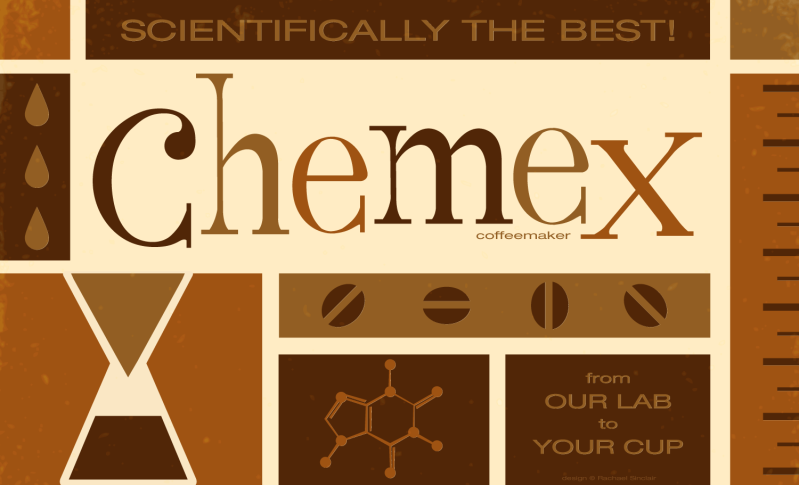
I took this opportunity to marry design, science, and one of my favorite things on earth, coffee. Invented in 1941 by a scientist, Dr. Peter Schlumbohm PhD, the Chemex coffeemaker uses the proven methods of chemistry to brew a simple, but absolutely perfect cup of coffee.  This poster features the squat copy text that's prevalent on pieces from the mid-century. The word 'Chemex' was hand done in a playful style, something also common to 50's and 60's design.

Scientifically the Best!
Original vector art
Rachael Sinclair

Tuesday, December 13, 2011

Merry Christmas 2011

Recently, I joined Pinterest. (You can follow the link in the sidebar to my boards.) I was skeptical at first; there are so many blogs and sharing sites. I found I love being able to 'bookmark' inspirational images and sites by using a visual. Over the past weeks, I've pinned a lot of interesting things, including some vintage typography. You can visit the BibliOdyssey blog post here to see some examples of the Sanborn Fire Insurance Maps that inspired my piece. I went for an old paper look and threw in some decorative elements. 'Merry Christmas' was hand drawn, scanned, and digitized. The moderate amount of work I did on this piece really made me appreciate the old techniques. Every designer needs to know what goes in to something as simple as a word.

Have a happy holiday everyone!

Merry Christmas
original digital art
© Rachael Sinclair, 2011

Monday, June 27, 2011

A Country Summer

It's in the way the late evening sun plays among the wildflowers. It's in the chill and refreshment of a juicy watermelon on a hot day. It's shooting stars over the clear wide open, whispering streams, screen doors, fireflies, and sun-bleached barns. Summer in the heartland is unlike anything else, full of charm and history, full of freedom. Capturing the authentic feel of this season in the sun may seem like a daunting task to someone who hasn't experienced a country summer first hand. And don't think a country theme always means hackneyed kitsch. Consider this blog post a cheat sheet to the perfect lived-in country style.

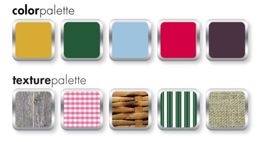
Colors are a good base for any design theme. The colors of a country summer are different than other summer themes. The bright citrus yellows and oranges and azure teals of the tropics are replaced with berry red, harvest wheat gold, and the wick, deep green of corn stalks. Blue is there too, but in more pure hues. The tonal family of aged denim is very fitting. Depending on the time of day, these colors may be stained with gold from the sun and resemble an old photograph faded with age.


Texture and pattern are just as important as color. A country summer highlights the age and wear of slow-paced rural living. Think of breathable fabrics like cotton and linen. Toss in a vintage basket, a faded quilt, and the rough but strong striations of weather-worn wood. If bare wood isn't your thing, consider a wash of white, cream, or one of the colors mentioned above in a creamy 40's pastel tint. The cool metals of the city can visit the country too by adding some chipping enamel and slight spots of rust.

Where patterns are concerned, one can never go wrong with gingham, checks, plaids, and simple polka-dots. A ticking stripe would work with this theme as well. Imagine a well appointed picnic with a red and white blanket, hand-me-down reed picnic basket, and food fresh from the garden.

In design, be mindful of line. Predominately straight, mechanical lines won't look at home here. Consider some rough brushstrokes or lines that appear hand-drawn. There are a lot of hand-drawn resources out there for icons and clip-art. You could also draw things yourself if you're comfortable. By the same token, don't go overboard with roughness and texture unless the design specifically calls for it. Everything in moderation and too much is just campy. Spacing is important as well. It's best to leave things light to aid in the semblance of air and openness.

Stay away from saturated darkness and lots of black. Even the summer night sky has a bit of blue to it. In web design especially, lots of white and light colors can be hard on the eyes. In this case, some darkness is appropriate. If dark colors for backgrounds are necessary, consider a light texture or perhaps a gradient to break up the block.


Fonts should be playful but don't have to be overly so. A thick san serif font may seem overbearing and too modern unless the usage is minimal. Don't be afraid of vintage-looking fonts or ones with a little charming distress. These work wonders for a country feel. If you find a font you like, you can always distress it yourself with some simple effects.

The breeze is magic as evening descends. Fireflies leap luminescent from blades of green grass. The crickets chirp to one another and the rhythmic squeaks and pops of an old porch swing are almost hypnotic. When morning comes, set out in bare feet to feel the dew on your toes, pick some ripe blackberries, and watch the way the sun paints the earth as each hour passes. Adding a little country to your summer design themes can give people a reason to slow down and smell the flowers.

Blackberry_Summer
Color by COLOURlovers

Tuesday, May 24, 2011

Thomas Maitland Cleland


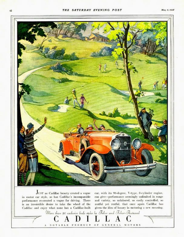
If someone mentions Bauhaus, Bass, Rockwell, Pollack, or Warhol, designers and artists will know the names instantly and probably intimately. But what about Thomas Cleland? Who exactly is this person? Does anyone recognize the artist and designer who went by T. M. Cleland? Years ago, I bought an advertisement for Cadillac taken out of a Saturday Evening Post from 1928. I was enamored with the design and the illustration; the happy 'flappers' and bright red car against the soft green of the golf course. I managed to make out the signature on the ad and have been researching and collecting Cleland ever since.

Thomas Maitland Cleland, the son of a Scottish doctor, was born on September 28th, 1880 in New York. When he was in his mid-teens, he convinced his parents to enrol him in the The Artist-Artisan Institute of New York. He saw this avenue as one that would bring easy success. After some time there, he had yet to find that particular thing to stoke his creative fire. One day, he observed a classmate designing a book ornament with pen and ink. He was in awe of the stark contrast and fine detail. This was the push he needed and soon his natural talent for detail and design blossomed. From here, he became a consummate and driven professional, running his own printing businesses at an early age. He took a break from his work (perhaps his only break from creative work) to serve in WWI.

His talents were almost savant-like. It is said that his knowledge of his field was encyclopaedic and intimidating. He was known to be taciturn at times, controlling, obsessed with perfection, and even 'quite a bit of a snob'. Cleland was proud of his self-taught profession, from print and typeface design (Della Robbia) to his complex and colorful illustrations and even set and costume design for plays.

He was married in 1905 to Elinor (formerly Nellie) Lane Woodruff. Elinor was 13 years his senior and preceded him in death by nearly 20 years; they had no children. He spent most of his later years in his home in rural Connecticut. Here, he continued his work designing and painting, building cabinetry and metalworking. He had an affection for dogs, debate and had quite an interesting circle of friends, one that included the more well-known artist, Rockwell Kent. Kent, who provided the frontispiece portrait of Cleland for the 1929 collection of his work had this to say of the artist, "... I may term myself his disciple. I proudly do. He was the most consummate craftsman of his time in every last least thing he did in all the many arts and crafts he ever undertook. His sensitive perception of beauty made him always keenly sensitive to ugliness..."


Though an innovator and master of his art, Cleland was extremely critical of 'modern' art and design. He felt the 'new' styles were lazy, distasteful, and lacked discipline. In an address to the Society of Typographic Arts on November 5th, 1948, he said, "Art was once the business of artists and not of writers and was taught to artists by other artists and not professors; and its rather wholesome definition seems to have been -- before anything was said about "art for art's sake" -- the doing of anything, from ploughing to painting especially well. Craftsmanship was not suspect or thought to be ruinous to individuality -- or perhaps individualities were not so feeble then that they could not survive the rigors imposed by craftsmanship. I do not know when the term "fine art" was invented and the breach between it and craftsmanship began to widen, but I have come to believe that it was a sorry day for both. For then, it seems to me, the spirit of art departed from its body and the body began to decay and the spirit to wander aimlessly in space."

In his career, he designed for Locomobile, Cadillac, the Red Cross, and served as the art director for 'Fortune' magazine. He's known today for his skill in art direction, but that seems to be the limit of his notoriety. He illustrated countless advertisements and books, many of the Heritage Press Limited Edition club stories of which he also designed the books themselves. His work was sold as prints and used to cap off magnificent wall calendars. Though his career was vast and his impact on those who knew him great, he remains an unknown. To this, I can only say, what a shame. There is much to be learned from a commitment and passion like Cleland's. No matter what style of art and design you choose, his work and words can be of great inspiration. Cleland died on November 9th, 1964, leaving behind a larger-than-life legacy and a collection of work to rival that of any master craftsman.


In his address to the American Institute of Graphic Arts on February 5th, 1940 entitled "Harsh Words", Cleland said, "And, remember, there is always progress to be made within yourselves, no matter if it is the same progress in the same direction that has been made by countless other souls. And there will, I hope, always be things new to you, as there are every day things new to me, even if the sun has seen them all before. I don’t want to live a day longer than I can learn."


Art from my collection: 
Cadillac advertisement from Saturday Evening Post, 1928.
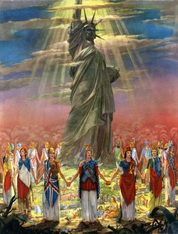
"God Bless America and Her Allies" print, 1943
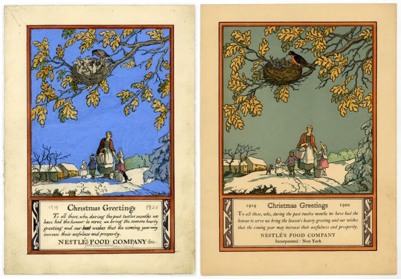
Rare hand-sketched rough and final Christmas greeting for Nestle's, 1919
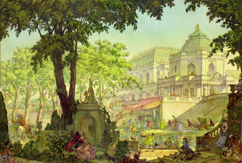
"Romance" print taken from a Harris-Seybold calendar, 1948
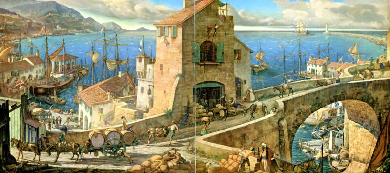
Front and back cover illustration "Commerce" for Westvaco's 'Inspiration for Printers' magazine #82, 1933

Thursday, March 10, 2011

Saul Bass

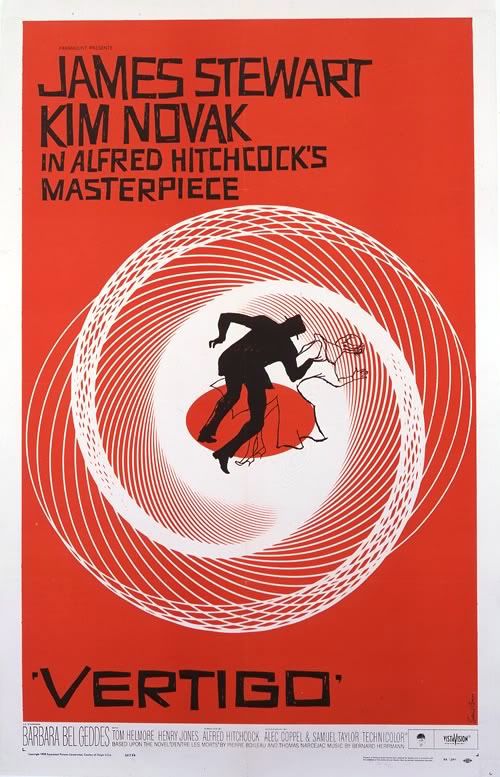
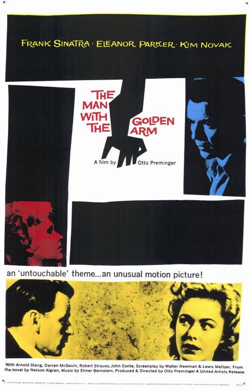
Though you may not have known at the time, you've likely seen the work of Saul Bass. Born in New York in 1920, Saul Bass was a key figure in graphic design. Some of his most notable work came in the form of poster and title design for films. Before Mr. Bass, most movie posters were paintings or head-shot photos of the film's famous stars. With his help, graphic design became an art form!

Perhaps one of his most famous works was the poster for 1955's The Man with the Golden Arm. The film's stars were still featured, but they were arranged in more dramatic fashion, eschewing the campy vignettes of years before. The lines were a bit off-level, a touch wavy; simple shapes had created tension where pearl-white smiles could not. When it came to animated title sequences, Bass was a master. I remember one in particular, the cheeky sequence for It's A Mad, Mad, Mad, Mad, World, one of my favorite movies. He worked with the greats like Alfred Hitchcock, Stanley Kubrick, and Martin Scorsese. He even designed the storyboards for the chilling 'shower scene' in Psycho.

Saul Bass went on to design posters and title sequences for 40 years, all the while, putting his mark on logo design. Ever hear of AT&T? The globe logo was designed by Bass. Like Girl Scout Cookies? That famous logo printed on the box, that's one of his. United Way, Quaker Oats, Kleenex, they're all Saul Bass.


Design started as a trade, but on the shoulders of Bass and visionaries like him, it grew into an art of its own. His work is still salient today, putting both the graphic and art in graphic arts.

Inspired by this amazing artist, I decided to throw a little Saul Bass style into a fun tribute to a favorite film of mine, Arsenic and Old Lace. It's not a straight copy of his style, but the influence shows through. I used haphazard lines and a bold, two-color presentation. The font is called 'Hitchcock' and can be downloaded here. Enjoy!


Arsenic and Old Lace
poster design © Rachael Sinclair 2011
film property of Warner Bros. Entertainment
no copyright infringement intended

Wednesday, November 24, 2010

Happy Thanksgiving

Thanksgiving has always been my favorite holiday. Even as a child, I looked forward to the Thursday in November almost more than I did the gift giving of Christmas. There's something pure about Thanksgiving, something selfless. On this holiday, let us celebrate the blessed things in our lives. Let us put away our worries and fears. As we join with our families and loved ones over a hearty meal, let us truly give thanks. Have a wonderful holiday everyone!


Give Thanks
Illustration and Typography
© Rachael Sinclair 2010

Friday, October 29, 2010

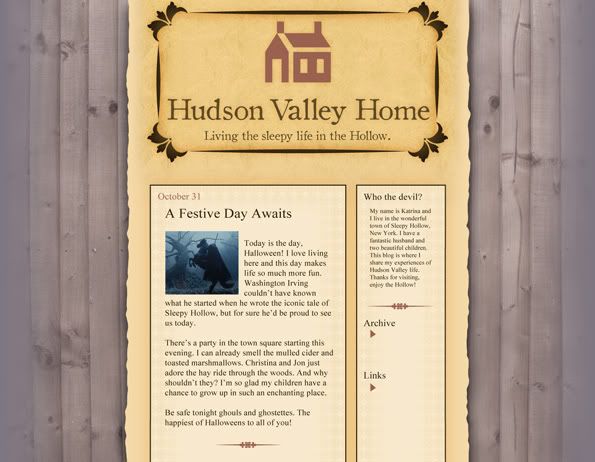
Design Dissection: Sleepy Hollow

“What was to be done? To turn and fly was now too late; and besides, what chance was there of escaping ghost or goblin, if such it was, which could ride upon the wings of the wind?” -Washington Irving, The Legend of Sleepy Hollow


There are few things as frightening as a ghost that can haunt and kill without necessity of a head. The original text of "The Legend of Sleepy Hollow" was included in The Sketch Book of Geoffrey Crayon, published in 1820. Set in the 1790's, Legend follows the story of Ichabod Crane, a nervous schoolmaster. Ichabod relocates to a glen of Tarry Town called Sleepy Hollow, where he encounters the horrific tale of the Headless Horseman. In 1999, Tim Burton released his own adaptation of the story starring Johnny Depp as Crane, a forensic investigator from New York. Burton's story, though it deviates from the original, was an amazing romp. The visuals and atmosphere were particularly notable. "The Legend of Sleepy Hollow" is one of my favorite scary stores of all time so I've chosen Burton's film for this installment of Design Dissection.

From the first, Sleepy Hollow swaths the viewer in a dusty, faded shroud of terror. We're party to the first killings of the horseman against a tumultuous evening sky. Gelatinous blood splatters on the foreboding face of a scarecrow and the stage is set. The promotional title is wrought in a jagged, heavy-inked script, a typeface that looks like the writing of calligrapher who is under great emotional distress. The tails on the font are drawn down like the slice of a blade, most apropos. The film titles are aged but elegant in serif small caps. Text appears against shots of the New England countryside and the hurried trek of a carriage. The letters react to their visual field, fading like fog, wavering like sun through the trees, and falling like autumn leaves.

Costuming is period appropriate. The men wear breeches, buckled shoes or riding boots, longcoats, cravats, and powdered wigs. The women are laced in corsets, their dresses flaring in large bells. To match the atmosphere, everyone seems washed out, something that gives the red of spilled blood even more impact. An interesting color note; most of the blacks in costuming and even the sets are a dusty tone, more like charcoal. True blacks are used sparingly. The overall feel of the film is reminiscent of an early 19th century portrait or perhaps a folk-art painting. The sets, even those 'out of doors' are intimate, like a stage production (as is natural considering nearly everything was filmed inside a studio building). The cinematography places actors and structures like elements of a folksy illustration. Symmetry is used as a character itself, creating stiffness and tension against the wispy mist and twisted trees.

The Headless Horseman merits mention all to himself. The costume designer, Colleen Atwood, did a magnificent job with the wardrobe. The 'Hessian' looks all the part of a long-dead phantom with a worm-eaten cape and body armor in a perpetual coating of Hudson Valley mud. Though otherworldly, the horseman is all too real, from his thorny spurs and snake-hilted sword to his frothing black charge. The hellfire is in the actions of this ghost, not spewing from the nostrils of his horse.

As I mentioned before, Burton's film is faded and weather-worn. Grays, browns, sun-bleached blues and yellows are abound. The reds are artificial, like the stain of old rouge on a powder-white cheek. The startlingly clean and soft hair treatments and luxurious wardrobe fabrics add a softer touch to the textures of the film. Without them, we would have only element-tortured wood and leaf-littered forest floor.

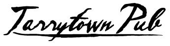
It's easy to get bogged down in the theme of a film like this and find it difficult to appreciate the elements and feel on their own. As usual, we will start with typefaces. Inked scripts like the one used for the promotional title can conjure a few things. Scripts in general are more organic, as one might expect from something patterned after handwriting. Calligraphic scripts are elegant; simple ones appearing masculine while those with long sweeping tails can seem more feminine. Meter of stroke is important as well. The typeface used for the promotional title is thick as if the stylus was held with the wide part of the nib perpendicular to the baseline. The ink flows freely and heavily. For this reason, the words aren't always easy to make out at a distance. Usage should be contained to one or two words. This breed of script would be good for masculine branding and perhaps a fine clothier or a pub-like eatery.

The film titles are done in a serif font that appears to have oxidized over time. The strokes waver, but remain strong. This type of lettering is useful for blocks of text as well as names and titles. As a basic serif, the uses are endless, but this one, with its added age character, is especially good for things relating to 'old world', antique, or well-worn and treasured items. This face would be appropriate on materials for a high-end furniture store, attractions relating to history, financial institutions, or blogs.


Atmosphere is key in designing with Sleepy Hollow elements. As stated above, the feel of the film is heavy, foreboding, and misty, yet artificial and nonthreatening; much like the Hammer films that lent Burton inspiration. Lighting remains soft and mostly even. This lighting can be used to decrease the dark sharpness of any design and is good for things that need to appear aged or vintage. Use colors, textures, and effects that play up and with diffused light. Use black perhaps only in logos, accent items, or text.

Speaking of colors, Sleepy Hollow presents a rather muted rainbow. Presumably set in late autumn/early winter, the colors are washed out and heavily tinted brown. Colors like these, again, are good for vintage schemes, but also for earthy palettes and seasonal items. Textures are those of era-appropriate fabrics and furnishings. Damask print, faint stripes, satin, lace, and rough wood can be used to infuse any design with a late 19th century Hudson Valley feel. Low contrast patterns are excellent as backgrounds for web sites or print media. Don't be afraid to use wood grains in these schemes as well.


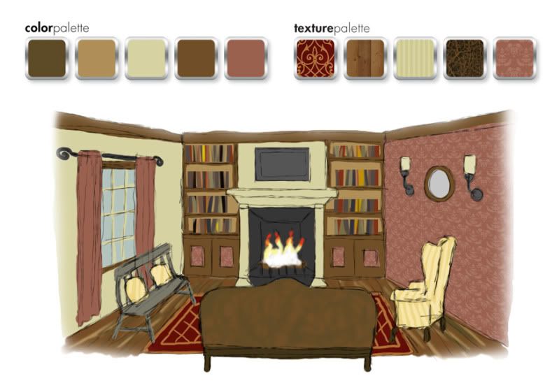
When decorating a space in Sleepy Hollow style, remember it only takes a few steps too far to lose your head. I suggest this look for a dining area, living room, or bedroom. For this example, I've chosen a living room with a fireplace. Start with neutral walls in your preferred film hue. Pale mustard, muted moss, or misty gray blue would be nice. Choose an accent wall and adorn with a damask print (or a black and white stripe, something featured quite a bit in Burton design) that coordinates with the other wall colors. For furniture, choose classic pieces but nothing overly ornate. Wood constructed lounge chairs work well, as do spindle-back chairs and benches. This time period was reserved in a lot of respects; the simplicity in furnishings due partially to availability of supplies and labor in the small farm towns.

For window treatments, I suggest plain drapes that extend to the floor in a coordinating color. Hang these from a wrought-iron-looking rod with swirled finials. (Tim Burton's style often includes swirls.) Rustic paneled shutters would work too. Wall adornments should be sparse. If you wish to hang art or mirrors, choose modest frames. Electric wall sconces or 'wireless' ones with large candles or oil lamps would be appropriate. Choose a sconce that is antique in design. Table and floor lamps would be nice, perhaps ones with a rustic iron finish. Built-in bookcases in stained wood are optimal, ones with decorative molding at the top and bottom. Hide the bottom shelves (if you have some) behind modest doors, perhaps inlaid with the damask pattern from the walls. This shelving should frame the fireplace, the mantel being understated but still maintain a presence

Texture is always important. As I've stated before, bare rustic wood is fitting. You can upholster modestly in stripes and less modestly in leather. Instead of heavy upholstery, consider cushions in muslin or pillows in quilt prints. Wood floors are best, but area rugs in understated 'oriental' patterns can add the right touch regardless of flooring.


A gore-filled film about decapitation is a treat on Halloween, but the design is just the trick for all kinds of looks. So when the air gusts cold and the Jack-o-lanterns burn, cast an eye to the western woods and capture some chilling design inspiration.

Thursday, September 9, 2010

Design Dissection: Kojak


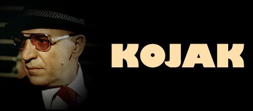
Who loves ya baby? Kojak loves ya. Telly Savalas turned a name into an icon in the 70's series Kojak. Theo Kojak was a tough New York detective with a soft spot for nearly lost causes, cigarillos, pretty ladies, and lollipops. In true 70's form, the series was full of smoky rooms, gritty streets, drab earthtones, and ugly cars. But there is something to learn from the look an attitude of a television series no matter when it was made or the era in which it was set.

A series about a police detective, especially one set in the rough city of New York needs a font that conveys authority. The Kojak title font (word in all caps) is something akin to Boris Black Bloxx or Musa. This is a san-serif with thick strokes and a more circular 'o'. It's got authority, but doesn't take itself too seriously as noted by the squat letters. Credit fonts were san-serif as well, keeping with the theme nicely.

The colors of Kojak were the quintessential colors of the 1970's. Browns, golds, and reds are abound. The scenes seemed to all be tinted slightly yellow. Though action took place outside of the squad room quite often, a look at the scenes within the precinct headquarters gives us a more Kojak-specific color and texture range. As one may have expected for the time and area, the Manhattan South squad room was housed in an old building. The furnishings were haphazard and everything was awash in a thin film of aged grime. The walls, painted various shades of institutional green, were peppered with posters and tattooed with cracks and stains. The equipment, phones, and dingy holding cell were all very rough. The only spot of freshness in the musty squad room was Savros' houseplant.

When it came to wardrobe, each character had a particular style. Kojak went for gray and pinstriped three-piece suits, long overcoats with popped collars, and black fedora hats. Bobby Crocker was a tweed and corduroy kind of guy, mostly in tones of khaki, camel, and brown. Captain McNeil was the grandfatherly type, wearing drab, loose-fitting suits and blazers. He seemed like he would be perfectly at home in an old cardigan. In black or brown pants, white shirt, and skinny tie, Saperstein was the classic overworked officer. Stavros was the token sloppy guy who always seemed to have his tie undone just a bit.

To dissect Kojak and reassemble the elements is easy baby! First, as in any dissection, one needs to think about the kind of feeling these things convey. For instance, san-serifs are usually considered a bit more laid-back than serif fonts, but they can also carry an air of stiffness. This font is blocky and thick, indicating strength with a little playfulness. Nothing says playful quite like a toy store. Lollipops Toys & Gifts is a great example.

A font with a squat stature allows for a circular 'o', something that adds even more 'common grit' as elongated letters often convey aristocracy and elegance. This font would work well as a title font for a novel or other entertainment endeavor in the gritty, witty mystery department. See example for 'Mojo'.

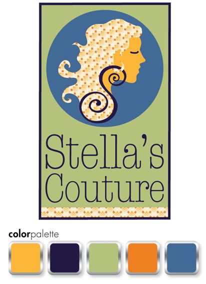
Another font choice with a Kojak feel would be a typewriter font. In this age before office computers and printers, typewriters were still prevalent. A handwritten script would also be acceptable considering the fact that messages would have been written and not emailed as we do today. The logo for Stella's Couture has a bit of both with a script 'S' and typewriter name. This logo also features a 70's inspired pattern. Bold, oftentimes monochromatic, patterns figured greatly into the fashion and décor of the 70's. This particular pattern would have been wallpaper in a victim's home or the print on a woman's dress. Kojak himself favored stripes and the occasional silk paisley.

Tiled patterns are great for web sites. Use monochromatic patterns with gradations or low contrast as backgrounds. Don't get too busy though as this may tire the viewer's eyes. Natural fabric textures, coffee ring-stained paper and clean or distressed metals are good for backgrounds too. These can play well as canvases for compartmentalized page elements. 70's colors are also good on the web, but beware of overly bright warm tones. Use these in accents only.

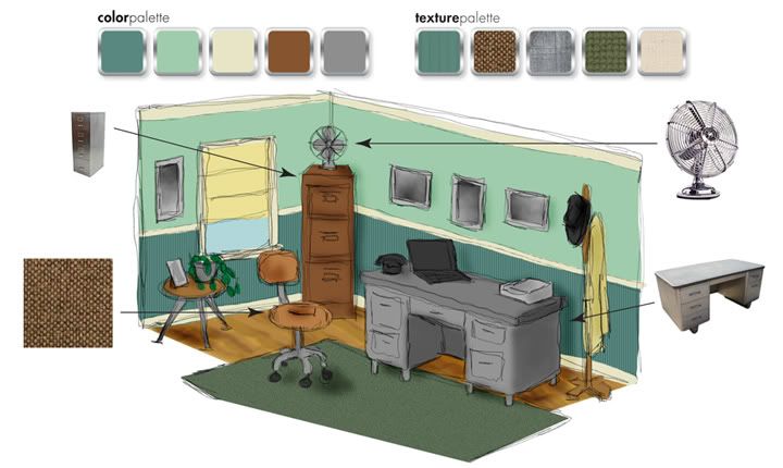
Using Kojak as an inspiration in décor can sound like a acid-trip disaster. A little bit of the 70's can go a long way and you certainly don't want to overdo it. Consider for an office an earthy moss green such as Aloe Essence (460D-4) on the upper wall and Billiard Room (480D-6) on the beadboard wainscoting with a trim color of Informal Ivory (330E-1), all from Behr. Build on that with a vintage metal desk and an understated office chair perhaps upholstered in tweed. Don't be shy of tall metal filing cabinets. In the right color, one of these in the corner can be a great place for storage of all kinds. Adorn windows with roman shades in natural muslin textures. A vintage-looking fan adds perfect punctuation, as does a few framed prints, perhaps black and white photos of Manhattan. Further accent with small potted plants on a low mod-styled table and a 60's or 70's-styled desk phone.


See, we've solved the mystery and like that. When you put aside the blatant time-period styles of something like an old TV show and focus on the pieces alone, you can create something new and fun. No matter what flavor Tootsie Pop you like, you're sure to find something useful in the life of Detective Theo Kojak.

Thursday, August 26, 2010

Idea Seeds: Autumn


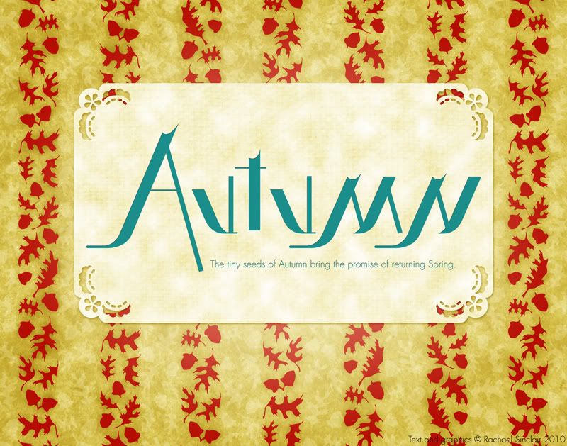
There seems to be a special place in the hearts of many creative types for the season of Autumn. Perhaps it's the colors, maybe the weather, could be the symbolism of death and rebirth. Why autumn warms us is subjective, but the season and thoughts it brings to mind are amazing. That's why I've chosen autumn as this post's Idea Seed.

Crackling fires, marshmallows roasting, apple pie, bright leaves, harvest, Halloween; autumn conjures these things out of the slowly chilling air. As August comes to a close, sit down with a pad and paper, paint and canvas, or needle and thread, and give autumn a creative welcome!

Text reads: The tiny seeds of Autumn bring the promise of returning Spring.

"Autumn"
original digital art
pattern, typography, and verse
© Rachael Sinclair 2010

Thursday, August 19, 2010

Design Dissection: X-Files

When you understand the components of something, you understand more fully how it works. In successful design of any kind, all of the components must fit together with harmony to bring about the right feel. Design Dissection is a feature where I take an existing design, a movie or TV series, book, piece of art, product, anything, and break it down into components. From there, I will show how to reassemble and utilize those components in new designs.


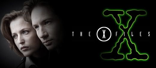
The inaugural Design Dissection is given over to my favorite fandom of all time; The X-Files. Running for nine seasons, spawning two feature films and countless other items, X-Files is a sci-fi cultural phenomenon. As with any series, X-Files has a look and feel that is unmistakable. Let's start from the ground up and examine fonts. With the exception of a distressed typewriter font used for the iconic 'X' and in various other places, the series used mostly san-serif fonts on promotional items and on screen titles. The X-Files 'logo' font, whose exact name I cannot find, is tall and narrow with equal apertures, mid-line crossbars, parallel strokes, and scattered semi-serif tails. It's a perfect 'modern' font for a science fiction program and brings to mind a digital age. Viking Gothic and Evening Edition are two fonts that come close to matching this one, though they don't have all the requirements. The logo itself, much like the series feel as a whole, is airy, with the letters spaced out quite a bit. This treatment helps things breathe and gives the viewer a sense of openness. I've used Steelfish on the examples later on in the post.

The colors of X-Files were mostly cool and dark with the occasional touches of fire. The predominate mood color was an eerie, otherworldly green with a sinister glow. Darkness with glowing accents was a running feature in the cinematography and production design as well. Lighting was key because lighting had to create the right shadows. The sets, wardrobe, and make-up were muted; as if treated with a slight dark umber filter. The series had a feeling similar to paintings by Rembrandt, de La Tour, and Caravaggio who all employed a keen sense of chiaroscuro, strong contrasts between light and dark.


Though UFOs are generally thought to be 'flying saucers', the UFOs in X-Files were very different. The curvilinear form was replaced by a hard-edged shape, usually triagular. Hard lines were prevalent. There's a post-modern feel to the series, a combination of line and form that comes off as very technical. With the exception of neckties, there's not much pattern. Clothing is solid color and tailored. Jewelry is limited as well, with featured pieces, such as Scully's gold cross, being quite understated.


A look at the players and their respective living spaces shows us how important personal appearance and surroundings are to establishing character. Mulder's apartment is dark with mis-matched furniture and is very haphazard. Scully's apartment is more furnished, lit with table lamps to create warmth, and appears clean and neat. Walter Skinner always had a strong, masculine presence with immaculate clothing and metal-rimmed glasses. His home, which we see only briefly, is modern and arranged almost
militarily, much like his personal appearance. C.G.B. Spender, or more commonly known as the Smoking Man, was always rumpled and disconcerting. His wrinkled suits matched his wrinkled skin and his living spaces were those of a vagrant, very utilitarian and sparse.

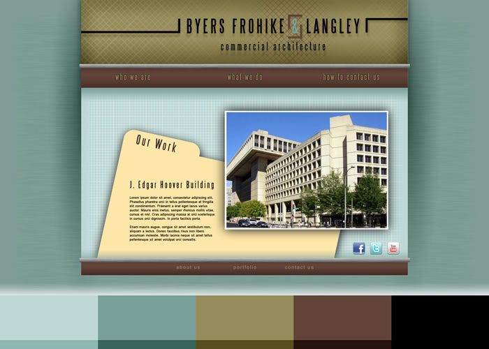
All the elements came together to make beautiful, but often unnerving music. These elements can be transferred to other design projects with ease to create similar moods. First, we must keep in mind what we want to convey with our project. If this is for a client, it's important to remember what these elements mean and what kind of images they bring to mind. As I said above, non-playful san-serif fonts are usually considered modern, sleek, and calculating. They're perfect for technological endeavors and architectural firms. See website example above for Byers, Frohike & Langley (named after The Lone Gunmen) with five-color palette blocked out at the bottom. The fonts are of course great for scientific clients as well, especially theoretical sciences, chemical, pharmaceutical, and research facilities. For an examples of this, see Fenig Chemical (named after one of my favorite minor characters in the X-Files universe, Max Fenig) and the S. Mulder Observatory (named for Mulder's lost sister, Samantha).

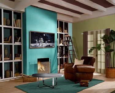
The colors of the X-Files, for the most part, appear damp. The series was filmed in Vancouver for the first five seasons, so the colors would be appropriate for something nautical like the featured Queequeg's Fish & Chips. The mid- and light-tones of these colors are great for offices or bedrooms as they are calming. Furnish spaces with metal-framed furniture, solid-color textiles and leather to complete the clean look. You could even pepper the area with some space-themed art. Remember, X-Files used high contrast between light and dark, so to truly emulate the style, consider small lamps as opposed to large overhead lighting. Also consider heavier window treatments, perhaps accent drapes over tinted sheer curtains.

When you find something that inspires you, whether it be a painting, a photograph, or a television series, it's fun to deconstruct the magic and use components in your work and life. The X-Files created a distinctive and detailed look that has remained the same over two decades. Actors age, styles change, but the atmosphere of the latest venture, I Want to Believe, was the same as the pilot episode in 1993. I hope you've enjoyed this Design Dissection. The truth is out there!