Wednesday, October 26, 2011

Apples: An Infographic

Infographics have been a hot trend for some time. There's something delightful about information put fourth with great, spot-on graphics. Featured often in magazines and through news outlets, infographics may look simple, but they are far from it. Creating a successful infographic (whether the one I've created is successful or not is not for me to say) is a consuming task. First, you must collect accurate and timely data. Then you must illustrate that data in an engaging and clear manner. If executed properly, an infographic can be an excellent learning tool and pleasing piece of art all at once.

In celebration of one of my favorite times of year as well as National Apple Month, I created this little ditty (click image to embiggen). I featured a wide swath of trivia. If you'd like to see more infographics, and let's face it, who wouldn't; you can visit Daily Infographic or Good: Infographics.

Friday, October 7, 2011

Happy Fall

"Those little nimble musicians of the air, that warble forth their curious ditties,
with which nature hath furnished them to the shame of art." -Izaak Walton

Tuesday, August 23, 2011

Iron Designer: MateVana

Imagine a client brings you a brand name, a niche market… and tea. The client wants branding, website design, and a few interior design ideas for an upscale, Japanese-themed cocktail bar named 'Katsu' (Japanese for 'thirst'). Your inspiration is a variety of loose-leaf tea sold by Teavana, the MatéVana®. Iron Designer, begin!

MatéVana® is a blend of mate and red rooibos teas with cocoa, almond, chocolate chips, and enhanced with hazelnut. It's mostly chocolate and nut browns, all with a woody but smooth texture. The tea is accented with a striking violet blue and a few shades of yellow ranging from citrus to sunflower. These portions of the tea are leaf-like and feminine. The client wants something that incorporates the clean, simple lifestyle of traditional Japan with a modern, rich atmosphere.


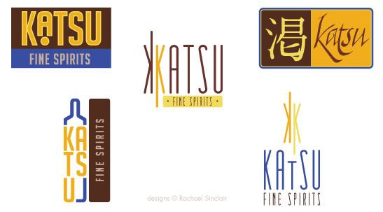
I pulled the palette above from the tea provided. We have a dark rich brown, a milky chocolate, two tones of gold, and a vibrant electric blue. Once we have those, we can apply them to our logo ideas. The client wants something sophisticated, but also evocotive of Japanese design and culture. On that vein, we have the logo ideas below.


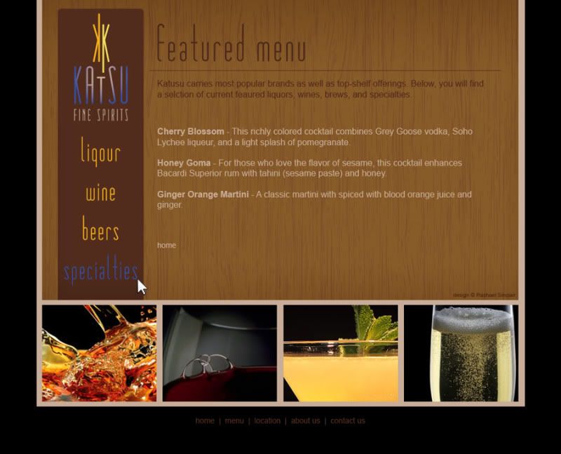
I chose design at the bottom right to fashion a web site. I used the textures of tatami and wood grain. The photographs are simple and all match with black backgrounds. The site design is spartan and clean.


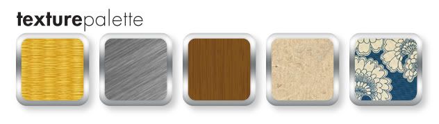
The bar itself should feature the textures of tatami, a touch of brushed metal, dark wood, rice paper, and a nice blue and neutral Japanese print fabric. The fabric brings in the feminine touch we found in the cornflower petals of the tea. Lighting should be intimate and utilize the golds in the palette.


Clients often find inspiration in things you may not expect. Sometimes it's good to practice by figuratively pulling an idea out of a hat. To be an Iron Designer, you have to be versatile and agile and ready to tackle any request. Explore the possibilities and take a second look at the world around you.

Teavana and MatéVana are registered trademarks. No copyright infringement intended.

Monday, August 15, 2011

Project Completion: Knowing When to Stop

"…letting well enough alone – which is the rule for grown artists only." -Winslow Homer

One of the most trying obstacles of art and design is knowing when to stop. Creative people, by nature, are often unimpressed by their own efforts. We can paint, sculpt, and tweak away until something is completely ruined. In order to grow as artists and designers, we must learn to step enough is enough.

When you're working on a personal project or make your money as a fine artist, it's oftentimes more difficult to put your signature on something and call it done. Doing something for yourself intimates a personal attachment and we all want personal things to be perfect. When you're collaborating, a project can be difficult to finish due to the principle of 'too many cooks in the kitchen'. When more than one decision-maker is involved, there are different ideas of 'complete'. How do we combat these roadblocks to success?

Where personal projects are concerned, the path to completion lies in understanding your expectations at the outset. What do you want your piece to accomplish? Do you have plans for the work when it's finished? What's your audience and what does this audience expect? It's also helpful to have a good set of sketches and references handy. As they say in carpentry: measure twice; cut once. This can be applied to art and design. Planning will save you time and help you create a more cohesive final product. When you know where you're going, you know when to stop.

Sometimes, all the planning in the world won't save you from feeling like something isn't quite right with your piece. If this occurs, step away. Speaking from experience, I attest to the difficulty of walking away, but it can really help you gain some perspective. Setting something aside for a while can allow you to revisit it later with fresh eyes.

If you're working collaboratively on a project—for an employer, freelance client, or volunteer project—planning, again, is a great way to avoid a lot of rough patches. Gather as much information as you can. Ask about audience again, be clear on expectations, and involve everyone in discussions about style, colors, and emotions. When everyone has input from the beginning, sticky confrontation down the road will be less prevalent. (I will add, confrontation is usually unavoidable, but the frequency can be lessened.)

Collaborative projects demand a high competency and confidence. Without being pushy or overbearing, speak your mind on technical matters. If someone suggests a typeface or color that just won't work, try to explain to them exactly why. Take your listener's experience into account. If they aren't creative, understand that some of your terms may not make sense. When all the cards are on the table, it will be easier to agree when a project reaches completion.

As with anything, it's possible to ruin a project by going only an inch too far. Planning for completion can really help you know when to step back, add your signature, and move on. Remember, even the masters had to put down their brushes and chisels at some point. Imagine if daVinci had put just one more swath of paint on the Mona Lisa. She may not be the enigmatic treasure she is today.

Tuesday, July 26, 2011

Color Flavor: Mesquite

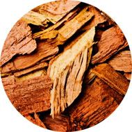
With summer comes the joy of grilling. If one is resourceful, an entire meal can be prepared out of doors. While some prefer gas and others charcoal, many add a touch of smoke to their meal by adding wood chips. The varied, tepid tones of mesquite chips can really spice up design as well.

Mesquite is a small tree, usually shrub size, that grows in the desert and range lands of the southwestern United States and as far south as parts of southern and western South America. It is a hardy plant that withstands droughts because of its long taproot. Used for many things, mesquite is perhaps most well-known as a smoke flavoring for southwestern foods. When the hardwood chips are soaked prior to use on the grill, the deep colors are amplified.

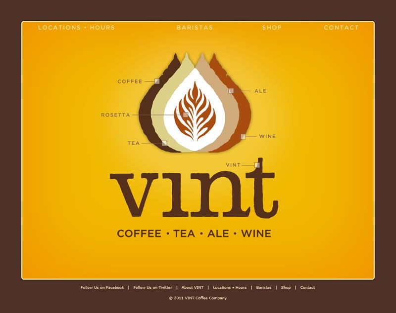
The colors of wood grain run the gamut from the usual umber and chocolate to a bright mustard gold. When combined with the browns, the tinted yellow adds a great deal of interest. In design, these colors are tailor-made for masculine or earthy brands and themes. Food branding is a given for this scheme that is warm, rich, and spicy. Take, for example, this branding for Vint Coffee. It uses all of the tones of mesquite, showcasing the striking gold. The branding brings to mind a classic, easy sense of comfort while maintaining a contemporary style.

This web page and all holdings are © Vint Coffee.

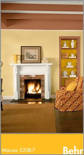
In interior design, the colors work best in rooms where you really want to add energy and warmth all at once. Kitchens, dining rooms, and living rooms benefit from the gold's soothing vigor and the tones naturally work well with wood floors and furnishings. These colors alone may seem bland to some, so feel free to spice up the mood with some graphic print on furniture, pillows, or art. Here, the yellow is used as an accent with Cinnamon Brandy (Behr 23OD-7), Honey Bear (Behr 34OD-4), and Oyster (Behr W-B-720).

Finding inspiration from nature is easy and to find it in food, simply follow your nose and taste buds. The most alluring foods can bring some amazing colors to your life.


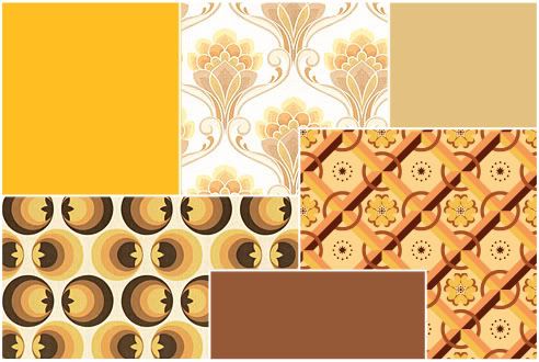
Mesquite
Color by COLOURlovers


Tuesday, July 5, 2011

With Gratitude to the NASA STS

alternate version with Eliot quote

The first space shuttle, Columbia, was launched on April 12, 1981. I grew up to the countdowns and launches, the brilliant trail arches and spacewalks. I mourned for Challenger (posthumously, I was too young at the time) and Columbia. I watched as the shuttle made the International Space Station a reality. This was the ultimate in ingenuity, this was creativity, this was courage to tackle an open-ended dream with an ever-uncertain outcome.

It's a panorama I will remember forever; the bold white shuttle appointed in sun-lit black holds tight to a silo tank of rusted orange. Two missile-shaped boosters stand at the ready like military guards. The countdown begins and soon a flurry of sparks swirl under the engine bells. 4… 3… 2… 1… liftoff! Steam and smoke curl from below the massive machine like a rolling sea of whitecaps. The shuttle is airborne, stretching toward the heavens and chiseling history with each second.

From a design standpoint, the shuttle 'stack' (the external fuel tank, the two solid rocket boosters, and the orbiter itself) is iconic. It isn't terribly flashy in color, but the bleached ivory, charcoal black, metallic titanium, and umber paint a very familiar palette. Over the years the NASA badge has changed, but the font used on the shuttle has always been Helvetica. The U.S. flag flies proud on the side of the shuttle as well on the right wing. The shuttle is an example of how utilitarian design enters into our culture as a comfortable norm.


In season 4 of The X-Files, Fox Mulder gave his partner Dana Scully an Apollo 11 key chain for her birthday. In response, she said: "You never got to tell me why you gave it to me or what it means, but I think I know. I think that you appreciate that there are extraordinary men and women and extraordinary moments when history leaps forward on the backs of these individuals, that what can be imagined can be achieved, that you must dare to dream,  but that there's no substitute for perseverance and hard work and teamwork because no one gets there alone; and that, while we commemorate the… the greatness of these events and the individuals who achieve them, we cannot forget the sacrifice of those who make these achievements and leaps possible."

Great things have been achieved on the backs of these extraordinary individuals. From the ground crew to the commanders of the missions, these flights have been, each and every one, a testament to bravery and commitment. The people we lost along the way, the crews of Challenger and Columbia, will always be remembered for the courage to put themselves on the line for the advancement of man. The science and engineering are truly a nod to the greats before and will be an inspiration to the greats yet to come. Though the Space Transport System takes its final flight this year, the impact on all aspects of our lives will be eternal. I present this poster with gratitude to the NASA Space Transport System. Thank you for 30 breathtaking years; you will be missed. 


Dreams Aloft
original vector art, 11x17
© Rachael Sinclair, 2011

Monday, June 27, 2011

A Country Summer

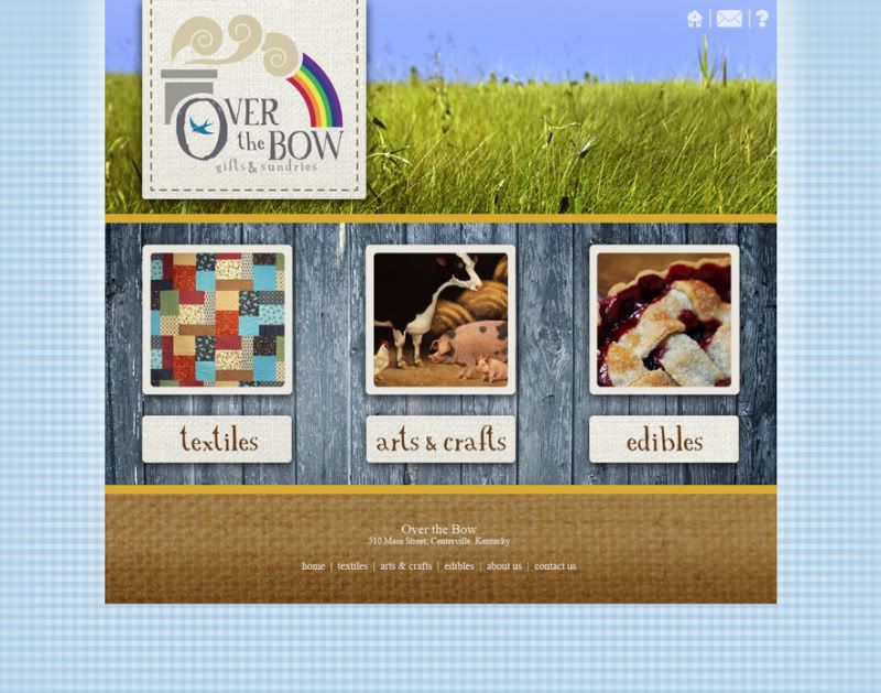
It's in the way the late evening sun plays among the wildflowers. It's in the chill and refreshment of a juicy watermelon on a hot day. It's shooting stars over the clear wide open, whispering streams, screen doors, fireflies, and sun-bleached barns. Summer in the heartland is unlike anything else, full of charm and history, full of freedom. Capturing the authentic feel of this season in the sun may seem like a daunting task to someone who hasn't experienced a country summer first hand. And don't think a country theme always means hackneyed kitsch. Consider this blog post a cheat sheet to the perfect lived-in country style.

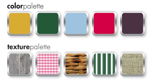
Colors are a good base for any design theme. The colors of a country summer are different than other summer themes. The bright citrus yellows and oranges and azure teals of the tropics are replaced with berry red, harvest wheat gold, and the wick, deep green of corn stalks. Blue is there too, but in more pure hues. The tonal family of aged denim is very fitting. Depending on the time of day, these colors may be stained with gold from the sun and resemble an old photograph faded with age.


Texture and pattern are just as important as color. A country summer highlights the age and wear of slow-paced rural living. Think of breathable fabrics like cotton and linen. Toss in a vintage basket, a faded quilt, and the rough but strong striations of weather-worn wood. If bare wood isn't your thing, consider a wash of white, cream, or one of the colors mentioned above in a creamy 40's pastel tint. The cool metals of the city can visit the country too by adding some chipping enamel and slight spots of rust.

Where patterns are concerned, one can never go wrong with gingham, checks, plaids, and simple polka-dots. A ticking stripe would work with this theme as well. Imagine a well appointed picnic with a red and white blanket, hand-me-down reed picnic basket, and food fresh from the garden.

In design, be mindful of line. Predominately straight, mechanical lines won't look at home here. Consider some rough brushstrokes or lines that appear hand-drawn. There are a lot of hand-drawn resources out there for icons and clip-art. You could also draw things yourself if you're comfortable. By the same token, don't go overboard with roughness and texture unless the design specifically calls for it. Everything in moderation and too much is just campy. Spacing is important as well. It's best to leave things light to aid in the semblance of air and openness.

Stay away from saturated darkness and lots of black. Even the summer night sky has a bit of blue to it. In web design especially, lots of white and light colors can be hard on the eyes. In this case, some darkness is appropriate. If dark colors for backgrounds are necessary, consider a light texture or perhaps a gradient to break up the block.


Fonts should be playful but don't have to be overly so. A thick san serif font may seem overbearing and too modern unless the usage is minimal. Don't be afraid of vintage-looking fonts or ones with a little charming distress. These work wonders for a country feel. If you find a font you like, you can always distress it yourself with some simple effects.

The breeze is magic as evening descends. Fireflies leap luminescent from blades of green grass. The crickets chirp to one another and the rhythmic squeaks and pops of an old porch swing are almost hypnotic. When morning comes, set out in bare feet to feel the dew on your toes, pick some ripe blackberries, and watch the way the sun paints the earth as each hour passes. Adding a little country to your summer design themes can give people a reason to slow down and smell the flowers.

Blackberry_Summer
Color by COLOURlovers