Friday, May 27, 2011

Color Flavor: Coral Bells and Egg Shells

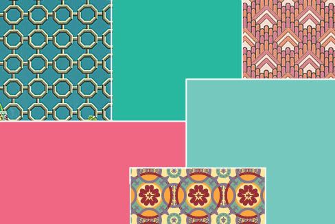
In this double dip of color, the melon-tinged pink of coral bells shares the stage with robin's egg blue. These two colors are a staple of late spring in some areas. Coral Bells (Heuchera) come in many varieties and are prized almost as much for their amazing foliage than they are for the bell-shaped blooms that perch on tall stems. They can thrive in full sun or shade depending on the variety and are a source of great visual interest in landscaping. Though the color of the flowers can vary, the most common flower color is a rich melon pink (PMS 709). This is a creamy color, tart and sweet all at once.

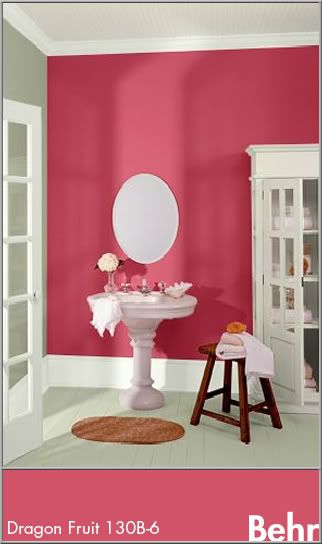
In design, the coral bell hues will naturally be appropriate for feminine ventures. Its freshness is great for food logos and design, such as dessert shops or paired with other bright colors and earth tones for an ethnic feel. This color is used a lot in Indian art and fabrics so it would be great for the logo and decor of an Indian restaurant. Due to the rich nature of this color, it does well as an accent in interior design. Its energy would naturally be at home in a kitchen, dining area, or bathroom. In this bathroom, coral bell pink is used on an accent wall with calm tones of gray (Behr: Hushed White W-F-710) and white (Behr: Off White int. flat enamel 1873).


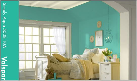
Everyone seems to have a different idea of the exact hue of a robin's egg. Through research by matching a PMS book to an actual egg shell, I acquired the color you see featured in this blog post (PMS 570). A robin's egg is a bright teal with a hint of gray. This color is perfect for a wide array of uses and themes. It fits in well with beach themes or can be great for something with a bit of a vintage look as it is close to the 'pool' blue of the mid-twentieth century. For this look, group the color with black, white, and chrome or earth tones. It's relaxing, but not boring and would be a fresh and peaceful color for a bedroom. Robin's Egg is used here as an all-over color with trim painted in a crisp linen white (Valspar: December Starlight 7003-7).


These two colors add a lot of energy and excitement to any project. They can be very versatile and change feelings depending on their accents. Natural colors like these can tie us to creation without necessarily nailing us down to just bland earth tones. For your next project, see how you can use one of these amazing colors to take the interest up a few notches!


Tuesday, May 24, 2011

Thomas Maitland Cleland


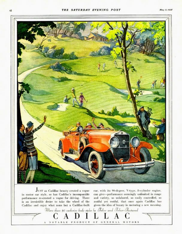
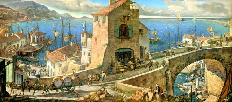
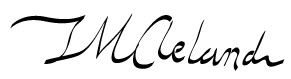
If someone mentions Bauhaus, Bass, Rockwell, Pollack, or Warhol, designers and artists will know the names instantly and probably intimately. But what about Thomas Cleland? Who exactly is this person? Does anyone recognize the artist and designer who went by T. M. Cleland? Years ago, I bought an advertisement for Cadillac taken out of a Saturday Evening Post from 1928. I was enamored with the design and the illustration; the happy 'flappers' and bright red car against the soft green of the golf course. I managed to make out the signature on the ad and have been researching and collecting Cleland ever since.

Thomas Maitland Cleland, the son of a Scottish doctor, was born on September 28th, 1880 in New York. When he was in his mid-teens, he convinced his parents to enrol him in the The Artist-Artisan Institute of New York. He saw this avenue as one that would bring easy success. After some time there, he had yet to find that particular thing to stoke his creative fire. One day, he observed a classmate designing a book ornament with pen and ink. He was in awe of the stark contrast and fine detail. This was the push he needed and soon his natural talent for detail and design blossomed. From here, he became a consummate and driven professional, running his own printing businesses at an early age. He took a break from his work (perhaps his only break from creative work) to serve in WWI.

His talents were almost savant-like. It is said that his knowledge of his field was encyclopaedic and intimidating. He was known to be taciturn at times, controlling, obsessed with perfection, and even 'quite a bit of a snob'. Cleland was proud of his self-taught profession, from print and typeface design (Della Robbia) to his complex and colorful illustrations and even set and costume design for plays.

He was married in 1905 to Elinor (formerly Nellie) Lane Woodruff. Elinor was 13 years his senior and preceded him in death by nearly 20 years; they had no children. He spent most of his later years in his home in rural Connecticut. Here, he continued his work designing and painting, building cabinetry and metalworking. He had an affection for dogs, debate and had quite an interesting circle of friends, one that included the more well-known artist, Rockwell Kent. Kent, who provided the frontispiece portrait of Cleland for the 1929 collection of his work had this to say of the artist, "... I may term myself his disciple. I proudly do. He was the most consummate craftsman of his time in every last least thing he did in all the many arts and crafts he ever undertook. His sensitive perception of beauty made him always keenly sensitive to ugliness..."


Though an innovator and master of his art, Cleland was extremely critical of 'modern' art and design. He felt the 'new' styles were lazy, distasteful, and lacked discipline. In an address to the Society of Typographic Arts on November 5th, 1948, he said, "Art was once the business of artists and not of writers and was taught to artists by other artists and not professors; and its rather wholesome definition seems to have been -- before anything was said about "art for art's sake" -- the doing of anything, from ploughing to painting especially well. Craftsmanship was not suspect or thought to be ruinous to individuality -- or perhaps individualities were not so feeble then that they could not survive the rigors imposed by craftsmanship. I do not know when the term "fine art" was invented and the breach between it and craftsmanship began to widen, but I have come to believe that it was a sorry day for both. For then, it seems to me, the spirit of art departed from its body and the body began to decay and the spirit to wander aimlessly in space."

In his career, he designed for Locomobile, Cadillac, the Red Cross, and served as the art director for 'Fortune' magazine. He's known today for his skill in art direction, but that seems to be the limit of his notoriety. He illustrated countless advertisements and books, many of the Heritage Press Limited Edition club stories of which he also designed the books themselves. His work was sold as prints and used to cap off magnificent wall calendars. Though his career was vast and his impact on those who knew him great, he remains an unknown. To this, I can only say, what a shame. There is much to be learned from a commitment and passion like Cleland's. No matter what style of art and design you choose, his work and words can be of great inspiration. Cleland died on November 9th, 1964, leaving behind a larger-than-life legacy and a collection of work to rival that of any master craftsman.


In his address to the American Institute of Graphic Arts on February 5th, 1940 entitled "Harsh Words", Cleland said, "And, remember, there is always progress to be made within yourselves, no matter if it is the same progress in the same direction that has been made by countless other souls. And there will, I hope, always be things new to you, as there are every day things new to me, even if the sun has seen them all before. I don’t want to live a day longer than I can learn."


Art from my collection: 
Cadillac advertisement from Saturday Evening Post, 1928.
"God Bless America and Her Allies" print, 1943
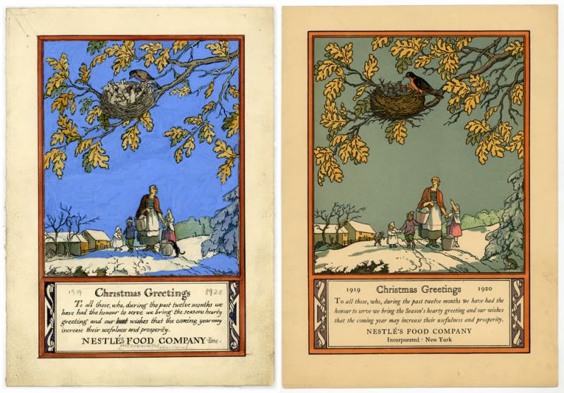
Rare hand-sketched rough and final Christmas greeting for Nestle's, 1919
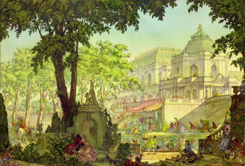
"Romance" print taken from a Harris-Seybold calendar, 1948
Front and back cover illustration "Commerce" for Westvaco's 'Inspiration for Printers' magazine #82, 1933

Monday, May 2, 2011

Heal the Heartland

Heal the Heartland
original vector art, 11x17
©Rachael Sinclair 2011

Tuesday, April 5, 2011

Painted Easter Eggs

Around Easter time as a child, I remember watching my mother use a needle to drill a small hole in either end of an egg. She would then blow the contents into a dish, leaving a light and delicate shell. We would paint the shell in all sorts of styles and patterns; the possibilities were endless! I think projects like these were a primer for what I (with my mother's assistance) would do later on: painting life-sized fiberglass horses for a public art project. When almost anything can be your canvas, limits are few.

For centuries, egg decorating has been a staple in the springtime. Painting and decorating hollowed-out eggs is really fun and, I believe, develops one's patience. I will outline below the tools and procedure needed to create a cute decoration for your home or great gift for a friend.

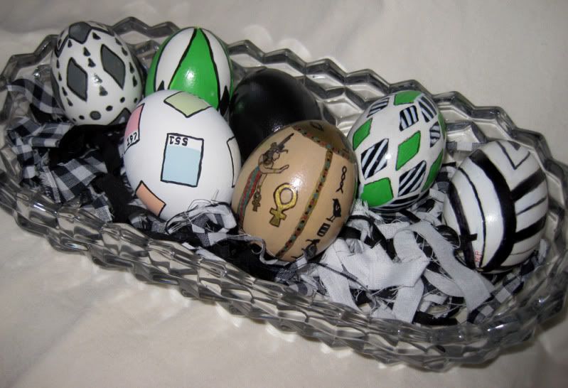
The black, green, and white eggs along the back were done by my mother.
I painted the ancient Egypt egg in my late teens and I did the Pantone chip egg this year.


What You Need:
egg (any type will do, but I prefer plain white large eggs.)
needle (upholstery or leatherworking needles are great, easier to hold and stronger)
bowl
paper towels
acrylic paints
paint brushes
thread and/or small guage wire
spray sealer/fixative
egg cup, pill bottle, or small sturdy object to hold the egg while drying
Optional
hair dryer
glue on jewels
scrapbooking decorations (stickers, embellishments)
beads
beading thread or cord

What To Do:
You will be putting your mouth on the egg, so wash the egg first with soap and warm water. Dry it well and use the needle to slowly poke holes at either end of the egg. I usually do this gradually, making small holes side by side until I make one large enough to allow the insides to escape. Once you start blowing on the egg, you may have to make your hole larger if nothing comes out.

Keep a towel handy to wipe away dampness along the way. With the egg over a bowl to catch the insides, blow through the hole on one end. You may have to use your needle or some small wire to loosen the insides and help break up the yolk. This process isn't swift, so be patient. You will know when the egg is hollow.

Use your faucet with a small stream and try to get some water inside the egg. Hold your fingers over the holes and shake. This will help to rinse out as much of the egg liquid as possible. Blow the water out. You can repeat this process until the water comes out relatively clear. Set the egg, one of the holes down, on some paper towels (like a nest) to drain further. I usually let them drain for 24 hours. Remember to use the egg contents for something great like an omelet or perhaps some cupcakes or cookies!

Once the egg has drained, it's time to decorate! Base coats aren't necessary, but I usually do a coat of white or black acrylic depending on the design I intend to implement. You will find that you cannot paint all of the egg at once (that patience thing I mentioned). Do one half at a time, setting the egg in a cup or rest on the mouth of a pill bottle to dry. Acrylic craft paint usually dries quickly, so you shouldn't have to wait long. If you desire, you can use a hair dryer on cool to speed the process.

If you choose, you can decorate your egg with pre-made embellishments, like the ones used for scrapbooking. Small, flat-backed items like buttons and jewels are also an option. Stick them on a flat-color painted egg for a striking effect. But keep in mind, eggs aren't flat like scrapbook pages. The smaller the items the better since larger items may not lay flat against the round surface.

Once you're satisfied with your egg, you can string some small wire through to give you something to hold to and spray coat the design with fixative. Matte finish is usually best and the easiest to work with. If you've used scrapbook or other elements as a design, this step isn't recommended. You may choose to spray coat the egg before attaching embellishments however. The spray coat helps reinforce the egg a bit, but remember, this is an egg and it is not indestructible. You may break a few, but if you're careful, you won't lose many.

There are many ways to display your eggs. You can string them like ornaments, set them one by one on a mantel, table, or windowsill, or put a group of them in a basket. You may find that once you've made one, you have the compulsion to make more. They make great hand-made gifts and can be reused from year to year if sealed properly and packed carefully. This is a fun craft that really gets the imagination churning. Pick up an egg and... see what hatches!

Wednesday, March 23, 2011

Happy Spring

Winter seems to have gone on forever; the gray days, the piles of snow, every color coated in frost. Though winter has its beauty, there are few things to compare with the trumpeting heralds of spring. The trees and flowers in my area have sprouted colorful wings and they fly like technicolor butterflies against the warming blue March sky. I've kept my camera with me everywhere I go for days! If you love color, if you're creative, now is a special time. Enjoy every second!


Tuesday, March 22, 2011

The Importance of Good Logo Design

It's the first thing the public sees. It's the short mission statement of a business. It can be dynamic, prolific, and legendary. Why then do so many dismiss the importance of good logo design? Creating a logo should be no small task. Any good designer knows distilling something down to its typographical and pictorial bones isn't always easy. A great logo can make a business and move mountains. A bad logo can be a disaster.

A logo should be a simple, yet comprehensive, statement of a person, place, or thing. It tells the world who someone is, what they believe. It explains a product or business in a quick glance, something that's very important in our fast-paced society. It can be a single image, a combination of images and words, or a person's name. Some logos are easy to recognize no matter where you're from or what language you speak. Take Nike for instance. Their iconic 'swoosh' is known almost instantly all over the world. Words aren't needed.


Another logo that succeeds world-wide is the blue oval with the signature of Henry Ford. That signature with the swirled 'F' has been around since the brand's inception. Though a customer may not speak English or read our words, they could recognize the script in the blue oval because of careful marketing strategies and a century of brand stability.

Some logos use simple graphics to elicit different feelings. Amazon's logo is a combination of the company name with an arrow-like 'smile' underneath. That happy appearance, combined with the vibrant, energetic color, assure the customer and liven sales. The arrow denotes speed, a much-desired hallmark in any e-commerce company. Though it's more than an image, (like the 'swoosh') or word (like Ford), this logo succeeds because it remains within the realm of 5-second recognition. The consumer doesn't have to spend a long time 'figuring it out' or trying to make sense of a lot of elements.

A logo must, first and foremost, tell the customer what you do. It must also convey your personal confidence, which in turn will give confidence to your customers. If a logo is hectic, with lots of colors, graphics, and text, the customer may feel ill at ease. Consumers don't feel like they can trust a business or individual who can't nail down a streamlined statement. It shouldn't be muddled with elements that don't translate well across platforms like photos and three-dimensional items. Logo design and reception is highly psychological; as is marketing. If your product or service is stellar, you may not think customers would be disturbed by a bad logo or messy advertisements; but people are wired to react adversely to something that doesn't look quite right.

Branding is the best investment someone can make in their business. Though a logo may change over the years, evolve with the times, a great one becomes an icon. Whether you're selling hand-made goods online, marketing a new brand of ice cream, or running for public office, the logo and materials you choose for yourself are always more important than you may believe. It's better to be safe than sorry, especially when there is so much on the line.

Thursday, March 10, 2011

Saul Bass

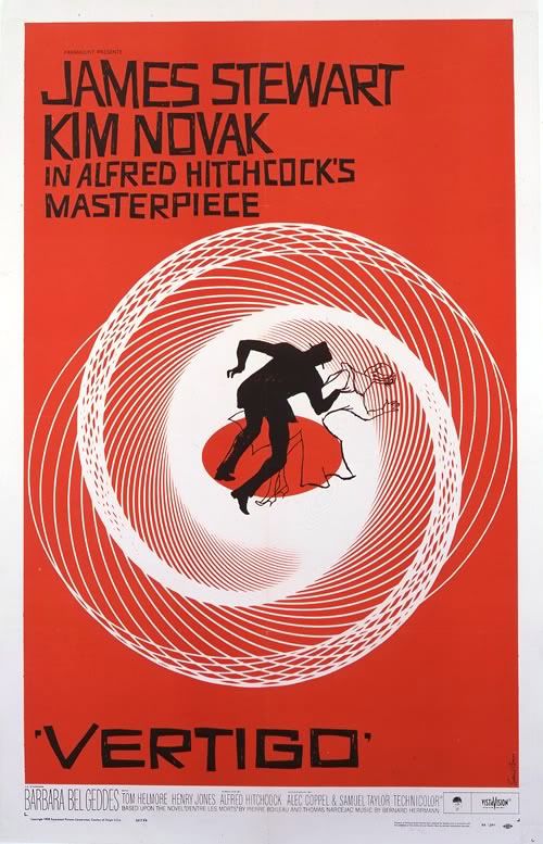
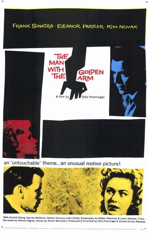
Though you may not have known at the time, you've likely seen the work of Saul Bass. Born in New York in 1920, Saul Bass was a key figure in graphic design. Some of his most notable work came in the form of poster and title design for films. Before Mr. Bass, most movie posters were paintings or head-shot photos of the film's famous stars. With his help, graphic design became an art form!

Perhaps one of his most famous works was the poster for 1955's The Man with the Golden Arm. The film's stars were still featured, but they were arranged in more dramatic fashion, eschewing the campy vignettes of years before. The lines were a bit off-level, a touch wavy; simple shapes had created tension where pearl-white smiles could not. When it came to animated title sequences, Bass was a master. I remember one in particular, the cheeky sequence for It's A Mad, Mad, Mad, Mad, World, one of my favorite movies. He worked with the greats like Alfred Hitchcock, Stanley Kubrick, and Martin Scorsese. He even designed the storyboards for the chilling 'shower scene' in Psycho.

Saul Bass went on to design posters and title sequences for 40 years, all the while, putting his mark on logo design. Ever hear of AT&T? The globe logo was designed by Bass. Like Girl Scout Cookies? That famous logo printed on the box, that's one of his. United Way, Quaker Oats, Kleenex, they're all Saul Bass.


Design started as a trade, but on the shoulders of Bass and visionaries like him, it grew into an art of its own. His work is still salient today, putting both the graphic and art in graphic arts.

Inspired by this amazing artist, I decided to throw a little Saul Bass style into a fun tribute to a favorite film of mine, Arsenic and Old Lace. It's not a straight copy of his style, but the influence shows through. I used haphazard lines and a bold, two-color presentation. The font is called 'Hitchcock' and can be downloaded here. Enjoy!


Arsenic and Old Lace
poster design © Rachael Sinclair 2011
film property of Warner Bros. Entertainment
no copyright infringement intended