Tuesday, December 13, 2011

Merry Christmas 2011

Recently, I joined Pinterest. (You can follow the link in the sidebar to my boards.) I was skeptical at first; there are so many blogs and sharing sites. I found I love being able to 'bookmark' inspirational images and sites by using a visual. Over the past weeks, I've pinned a lot of interesting things, including some vintage typography. You can visit the BibliOdyssey blog post here to see some examples of the Sanborn Fire Insurance Maps that inspired my piece. I went for an old paper look and threw in some decorative elements. 'Merry Christmas' was hand drawn, scanned, and digitized. The moderate amount of work I did on this piece really made me appreciate the old techniques. Every designer needs to know what goes in to something as simple as a word.

Have a happy holiday everyone!

Merry Christmas
original digital art
© Rachael Sinclair, 2011

Sunday, November 20, 2011

Happy Thanksgiving

Over the past year, I've collected a number of the individually packaged Lego Minifigures. I have always loved Legos and I keep my Minifigure collection in my office as a source of smiles and inspirations. As Thanksgiving approached, I couldn't help but see the pilgrims and as Lego Minifigures. I know Lego has made Native Americans, but to my knowledge, they've never made pilgrims. I'd buy that set! I'm thankful for all the blessings in my life and I wish you the happiest of Thanksgivings!

 
A Lego Thanksgiving
original vector art

Wednesday, November 9, 2011

Pasta Fagioli

As winter approaches, we find ourselves seeking warmth. Soup is a great food for the cooler months both for its ability to warm us, but also keep us satisfied. One of my favorite soups is the Italian staple, pasta fagioli. With its bright, autumn-colored vegetables, it's not only filling, it's beautiful.

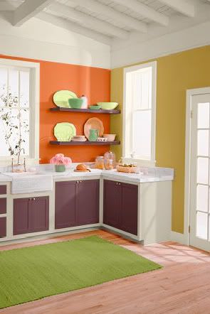
The soup has a base of tomatoes, a deep pinkish red. Add to that the translucent white of onions, the rich orange of carrots, and the wick green of celery. Great northern and dark red kidney beans round out the rustic rainbow with added spice of basil, thyme, and oregano. Use these colors in old fashioned design or anything dealing with cooking, food, or produce. In a room, the hues of pasta fagioli add lots of pop. They're bold and not for everyone, but can be a source of great interest in the right setting. The kitchen here features Behr French Pale Gold (350D-5), Startling Orange (S-G-230), Deep Garnet (110F-7), and Antique White interior flat enamel (1823).
The next time you need a hearty meal, I recommend pasta fagioli. It's fairly simple to make and can feed your creativity as well as your body. The recipe below is the one I use and was originally taken from Top Secret Recipes.

Pasta Fagioli

1 pound ground beef or turkey
1 small onion, diced (about 1 cup)
1 large carrot, julienned (about 1 cup)
3 stalks celery, chopped (about 1 cup)
2 cloves garlic, minced
2 14.5-ounce cans diced tomatoes
1 15-ounce can red kidney beans (with liquid)
1 15-ounce can great northern beans (with liquid)
1 15-ounce can tomato sauce
1 12-ounce can vegetable juice (such as V-8)
1 tablespoon white or balsamic vinegar
1 1/2 teaspoons salt
1 teaspoon oregano
1 teaspoon basil
1/2 teaspoon pepper
1/2 teaspoon thyme
8 ounces (around 1/2 package) ditali pasta

Brown meat in a large saucepan or pot over medium heat and drain. You can add the onion, carrot, celery and garlic with the meat, or transfer meat to a bowl so vegetables get more contact with the pan. Saute the vegetables for about 10 minutes or until they begin to caramelize. Optional: deglaze the pan with a little brewed coffee. Add the remaining ingredients (including the meat if you set it aside), except pasta, and simmer.

After soup has simmered for 45-50 minutes, cook pasta in separate saucepan until al dente. Drain the pasta. Add pasta to soup and cook for 5-10 more minutes. As an option, you can keep the soup and pasta separate as the pasta will continue to absorb liquid, making your soup thick. If you do this, add pasta to the bottom of the serving bowls, pouring the soup on top.

Serve with a sprinkling of Parmesan cheese and fresh-baked garlic or herb bread.


Wednesday, October 26, 2011

Apples: An Infographic

Infographics have been a hot trend for some time. There's something delightful about information put fourth with great, spot-on graphics. Featured often in magazines and through news outlets, infographics may look simple, but they are far from it. Creating a successful infographic (whether the one I've created is successful or not is not for me to say) is a consuming task. First, you must collect accurate and timely data. Then you must illustrate that data in an engaging and clear manner. If executed properly, an infographic can be an excellent learning tool and pleasing piece of art all at once.

In celebration of one of my favorite times of year as well as National Apple Month, I created this little ditty (click image to embiggen). I featured a wide swath of trivia. If you'd like to see more infographics, and let's face it, who wouldn't; you can visit Daily Infographic or Good: Infographics.

Friday, October 7, 2011

Happy Fall

"Those little nimble musicians of the air, that warble forth their curious ditties,
with which nature hath furnished them to the shame of art." -Izaak Walton

Tuesday, August 23, 2011

Iron Designer: MateVana

Imagine a client brings you a brand name, a niche market… and tea. The client wants branding, website design, and a few interior design ideas for an upscale, Japanese-themed cocktail bar named 'Katsu' (Japanese for 'thirst'). Your inspiration is a variety of loose-leaf tea sold by Teavana, the MatéVana®. Iron Designer, begin!

MatéVana® is a blend of mate and red rooibos teas with cocoa, almond, chocolate chips, and enhanced with hazelnut. It's mostly chocolate and nut browns, all with a woody but smooth texture. The tea is accented with a striking violet blue and a few shades of yellow ranging from citrus to sunflower. These portions of the tea are leaf-like and feminine. The client wants something that incorporates the clean, simple lifestyle of traditional Japan with a modern, rich atmosphere.


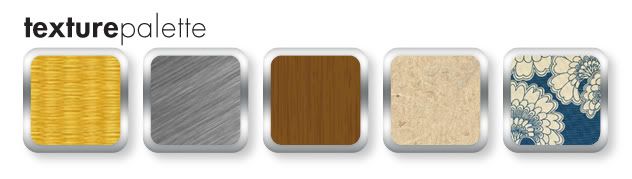
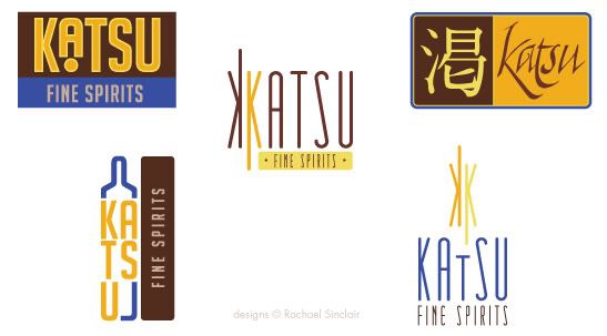
I pulled the palette above from the tea provided. We have a dark rich brown, a milky chocolate, two tones of gold, and a vibrant electric blue. Once we have those, we can apply them to our logo ideas. The client wants something sophisticated, but also evocotive of Japanese design and culture. On that vein, we have the logo ideas below.


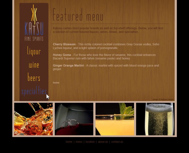
I chose design at the bottom right to fashion a web site. I used the textures of tatami and wood grain. The photographs are simple and all match with black backgrounds. The site design is spartan and clean.


The bar itself should feature the textures of tatami, a touch of brushed metal, dark wood, rice paper, and a nice blue and neutral Japanese print fabric. The fabric brings in the feminine touch we found in the cornflower petals of the tea. Lighting should be intimate and utilize the golds in the palette.


Clients often find inspiration in things you may not expect. Sometimes it's good to practice by figuratively pulling an idea out of a hat. To be an Iron Designer, you have to be versatile and agile and ready to tackle any request. Explore the possibilities and take a second look at the world around you.

Teavana and MatéVana are registered trademarks. No copyright infringement intended.

Monday, August 15, 2011

Project Completion: Knowing When to Stop

"…letting well enough alone – which is the rule for grown artists only." -Winslow Homer

One of the most trying obstacles of art and design is knowing when to stop. Creative people, by nature, are often unimpressed by their own efforts. We can paint, sculpt, and tweak away until something is completely ruined. In order to grow as artists and designers, we must learn to step enough is enough.

When you're working on a personal project or make your money as a fine artist, it's oftentimes more difficult to put your signature on something and call it done. Doing something for yourself intimates a personal attachment and we all want personal things to be perfect. When you're collaborating, a project can be difficult to finish due to the principle of 'too many cooks in the kitchen'. When more than one decision-maker is involved, there are different ideas of 'complete'. How do we combat these roadblocks to success?

Where personal projects are concerned, the path to completion lies in understanding your expectations at the outset. What do you want your piece to accomplish? Do you have plans for the work when it's finished? What's your audience and what does this audience expect? It's also helpful to have a good set of sketches and references handy. As they say in carpentry: measure twice; cut once. This can be applied to art and design. Planning will save you time and help you create a more cohesive final product. When you know where you're going, you know when to stop.

Sometimes, all the planning in the world won't save you from feeling like something isn't quite right with your piece. If this occurs, step away. Speaking from experience, I attest to the difficulty of walking away, but it can really help you gain some perspective. Setting something aside for a while can allow you to revisit it later with fresh eyes.

If you're working collaboratively on a project—for an employer, freelance client, or volunteer project—planning, again, is a great way to avoid a lot of rough patches. Gather as much information as you can. Ask about audience again, be clear on expectations, and involve everyone in discussions about style, colors, and emotions. When everyone has input from the beginning, sticky confrontation down the road will be less prevalent. (I will add, confrontation is usually unavoidable, but the frequency can be lessened.)

Collaborative projects demand a high competency and confidence. Without being pushy or overbearing, speak your mind on technical matters. If someone suggests a typeface or color that just won't work, try to explain to them exactly why. Take your listener's experience into account. If they aren't creative, understand that some of your terms may not make sense. When all the cards are on the table, it will be easier to agree when a project reaches completion.

As with anything, it's possible to ruin a project by going only an inch too far. Planning for completion can really help you know when to step back, add your signature, and move on. Remember, even the masters had to put down their brushes and chisels at some point. Imagine if daVinci had put just one more swath of paint on the Mona Lisa. She may not be the enigmatic treasure she is today.