Tuesday, April 29, 2014

Bourbon Sugar Cookies


I've been working as a freelance illustrator/designer for some months now. I love it and I love that I have more time to cook and bake. It's Derby time again here in the Bluegrass and in celebration, I tinkered with a basic sugar cookie recipe to add the smoky flavor of bourbon. The texture of this cookie is spectacular and the soft center really brings out the hint of Kentucky's signature whiskey. I've included the measurements of some of the ingredients required if you choose to make plain cookies without the bourbon.

Bourbon Sugar Cookies

Ingredients

3 cups all-purpose flour (2 3/4 without bourbon)
1 teaspoon baking soda
1/2 teaspoon baking powder
1 cup butter, softened
1 1/4 cups white sugar (1 1/2 without bourbon)
1 shot quality bourbon (I used Woodford Reserve)
1 egg
1 teaspoon vanilla extract

Directions

Preheat oven to 375 degrees F (190 degrees C). In a small bowl, stir together flour, baking soda, and baking powder. Set aside.

In a large bowl , pour the bourbon over the sugar and let sit for a few minutes. The longer the sugar melds with bourbon, the stronger the flavor will be. I also covered the bowl during this time to cut down on the escape of vapor. Next, cream together the butter and sugar until smooth. Beat in egg and vanilla. Gradually blend in the dry ingredients. Roll rounded teaspoonfuls of dough into balls, and place onto ungreased cookie sheets. (I used parchment. I think it keeps the bottoms of the cookies from getting too brown.)

Bake 8 to 10 minutes in the preheated oven, or until golden. Cookies will puff up during baking and fall with cracked tops upon cooling. Let stand on cookie sheet two minutes before removing to fully cool on wire racks.

Happy Derby everyone!

Wednesday, November 27, 2013

In Thanksgiving: 2013

I haven't been as diligent about posting here in the past year or so. Not for the lack of ideas, I assure you, but rather, the lack of energy. My life wasn't what I wanted. I had hit my 10 year mark as a professional designer and I was certainly not where I had envisioned when it came to my career. I was doing what I thought I had to do, working where I wasn't happy and really wasn't respected. I didn't think I had any other option as beggars for the scant jobs can't be choosers. I was sure money was the only thing of importance, happiness and health be damned. I felt pinned, painted in a corner, hopeless. I had let everyone down, especially myself.

One day, a Twitter friend pointed me in the direction of Zen Pencils. I wasn't sure what it was by the name, but when I landed there, the first thing I saw was this comic. I admit, I had tears in my eyes when I got to the bottom. I got a number of things from this comic. One: you should never let go of what you feel in your soul, the thing that drives you and comes naturally. Two: high acclaim is amazing, but even when it doesn't come, you're making a difference.

I scrolled through the comics that day, not all of them, but quite a few. I felt better, but I was still torn. A crossroads was up ahead and I had to make a decision. Do I keep doing what brought home a paycheck (and made me a shell of a human) or do I do what I NEED to do? A bit later, this comic was published and though it wasn't the singular factor in my decision, it certainly helped. About a month later, I resigned my full-time position to become a freelance illustrator.

I'm thankful for a lot of things this year. I'm so blessed to have a family and a husband who support me. I'm glad to have had the experiences of the past few years as they (though it seemed they were doing the opposite) made me see my true value as a creative and a person. I'm thankful for the new friends and relationships (Kentucky for Kentucky, I'm looking at you) I've gained this year and of course, the exposure I've gotten because of them. I do truly love being an illustrator and this opportunity, though not an easy road, is far better than the road I was travelling.

As I sit down with my family for Thanksgiving this year, I'll see every experience large and small as precious and inspirational. So I would like to thank Zen Pencils for what I know is not a rare occurrence. Serendipity led me to what I needed to see and without this illustrator and his own journey, those sights wouldn't be there. I leave you to your holiday with a few lines from another one of my sources of creative fire, Level Up from Vienna Teng. Happy Thanksgiving for the rest of forever.

"If you are afraid, come forth.
If you are alone, come forth now.
Everybody here has loved and lost,
so level up and love again.

Call it any name you need.
Call it your 2.0, your rebirth, whatever –
So long as you can feel it all,
so long as all your doors are flung wide.
Call it your day #1 in the rest of forever."

Tuesday, October 15, 2013

Pumpkin, Turkey, & Tomato Soup

It's that time of year, when everything is pumpkin, pumpkin, pumpkin. Amid the lattes and muffins, there skulks a more intriguing prospect—at least for me—the recipes for savory pumpkin dishes. Recently, I made up a pot of soup using this pumpkin chili recipe as a springboard. I wanted something lighter, more along the lines of a white chili, but with tomatoes. This soup has a sage and smoke flavor (like sausage) and a bisque-type consistency. It combines two fall staples, turkey and pumpkin, into a hearty, healthy soup that's perfect for lunch or anytime!


Tomato, Turkey, and Pumpkin Soup

Ingredients
1 to 1.5 lbs ground turkey
1 – 15 oz can cannellini beans, drained
2 – 14 oz cans (or 1 28oz can pumpkin puree
2 – 28 oz cans tomatoes (1 crushed and 1 diced)
4 cups chicken broth (I used Swanson low sodium)
1 large onion, diced
1 large green pepper, diced
1 poblano pepper, diced
2 cloves garlic, diced
1.5 tsp coarse sea salt
.5 tsp fennel seed
2 to 2.5 tsp dried sage
1 tsp fresh ground black pepper
.5 tsp smoked chipotle pepper
.5 tsp dried basil
.5 tsp or a few dashes of liquid smoke
1 large bay leaf

Directions

  1. Brown turkey in a large soup pot on medium heat.
  2. Transfer meat to a separate bowl and saute onion, diced green pepper, diced poblano pepper, and garlic until translucent and caramelized. Deglaze the pan with a little stock if necessary. (I like to use black coffee.) Reduce heat a little and reintroduce the turkey.
  3. Add broth, tomatoes, pumpkin, and beans.
  4. With a mortar and pestle, crush the coarse salt with the fennel seed until ground fine. Add the sage, black pepper, chipotle pepper, and basil; grind again. Add this mixture to the liquid with the bay leaf and liquid smoke.
  5. Simmer on low heat for an hour or so, stirring occasionally, scraping the bottom and sides. The soup will be somewhat creamy.
Serve with some light cheese if you like, perhaps fresh grated Parmesan or a little fontina. Popcorn would make a fun side, but the soup is fine on its own. Leftover turkey could be used instead of ground turkey. Toss the meat in with the onions and pepper and make sure everything is warm and evenly seasoned.

Friday, July 5, 2013

How Do You Measure A Year

"What makes the difference between wishing and realizing our wishes? Lots of things, and it may take months or years for wish to come true, but it's far more likely to happen when you care so much about a wish that you'll do all you can to make it happen." - Fred Rogers
For those who wonder why my posts have been so sparse in recent months, let this be the answer. Every day for the last 365 days I have shared a snapshot of creativity with the world. I've researched, sketched, and written a years worth of mini history lessons and posted them on my Facebook page, never missing a day. I amassed over 60 Photoshop files alone with this project, filled with drawings and factoids. Over these past twelve months, there have been times when I wanted to stop. I would have two or three other projects in the works, my day job stressing me out, but I kept going. As I look back on what some may not see as much of an accomplishment, I see just how far I've come. If there's one thing a year-long project will do, it's show you just what the word 'commitment' means in your life.

A Year of Art & Design History
Digital sketches © Rachael Sinclair
Researching these people, objects, structures, and creations has taught me much about where we've been as inspired creatures and where we may go in the future. There has been beauty pulled from darkness and depression, invention pulled from necessity, and awe-struck breath pulled from the lungs of the world over the centuries. Art, music, literature, architecture, craft: these things give us the basic energy we need to soldier on. Without the creativity the arts bring us, we would not know the forms that lie waiting in a slab of marble, the colors hiding in an unpainted canvas, or the way a certain chord or line of prose can bring tears to our eyes.

The milestones as they appeared on my Facebook page.
It's been an amazing journey into history and into my own determination. I've tried new styles and picked up a few bits of trivia. Pearl Buck said, "If you want to understand today, you have to search yesterday." I encourage you to delve into the history of what inspires you. Learn the ins and outs, ups and downs. Strike up a kinship with the past and you will never spend another tomorrow alone.

Tuesday, June 11, 2013

Idea Seeds: Lily of the Valley

Consider the lilies how they grow: they toil not, they spin not; and yet I say unto you, that Solomon in all his glory was not arrayed like one of these. -Luke 12:27

Photo sourced from Wikipedia
The Lily of the Valley (Convallaria majalis) is the flower of the month of May and this installments Idea Seed. It sports thick, striated leaves and soft, bell-shaped flowers distributed on a swooping stem. A woodland plant in the cooler climates and mountains, the highly poisonous lily flowers in late spring. The flowers, white with a tinge of green, have a sweet smell.


The Christian tradition at times refers to the lily of the valley as Our Lady's tears or Mary's tears. This stems from the legend that the flower sprang from the Virgin's tears at the Crucifixion. It is a popular flower for weddings and has a symbolic meaning of sweetness, humility, and return to happiness.

Are you inspired by the forms and colors of a certain flower? The silky bells of the lily of the valley carry a delicate femininity. They conjure the image of a fresh bouquet of wildflowers on an antique kitchen table, the promise of spring, and the song of birds.

Flora and fauna have long been a source of inspirations for artists, musicians, and poets. The lily of the valley has an amazing combination of textures and colors. I encourage you to take heed of the flowers you encounter, stop and smell the roses as it were. What you find may bring you the next great masterwork.


Lily of the Valley
Original vector illustration © Rachael Sinclair
Available for purchase HERE

Tuesday, June 4, 2013

Something for the Fans

I'm a little bit of a nerd. Geek. Fangirl? I have lots of things that bring me joy and movies and television factor into that quite a bit. Hey, they're creative too! Recently, I've been trying to perfect a new digital drawing technique. It's been lots of fun and gave me a couple of great piece ripe for fan convention season. These pieces sprang from the desire to have something of my own for a few stars to sign at the upcoming FandomFest.
First up, we have the Man They Call Jayne. I wanted to portray Firefly and Serenity's Jayne Cobb in startled readiness, but I wasn't finding the right image. What's a fangirl to do? Well, I made it up. With a lot of imagination and posing in the mirror, I finally had my Jayne, complete with damaged calm.
 
The Man They Call Jayne
Original illustration © Rachael Sinclair


Next came the Enigmatic Dr. Scully. The X-Files has been a love of mine since the first episode in 1993. Scully's loyalty to her partner was admirable, even when she was jet lagged and covered in unknown substances.


The Enigmatic Dr. Scully
Original illustration © Rachael Sinclair

Each of these pieces are available for purchase on my Society6 store. The print quality is quite good and I've left great spaces for celebrity signatures. If you're off to a convention soon, I hope it's amazing. Just remember, everything you love, the things that influence you, they were once someone's simple idea. Go out and create. You never know where it will go!

Wednesday, February 27, 2013

Idea Seeds: Tractors

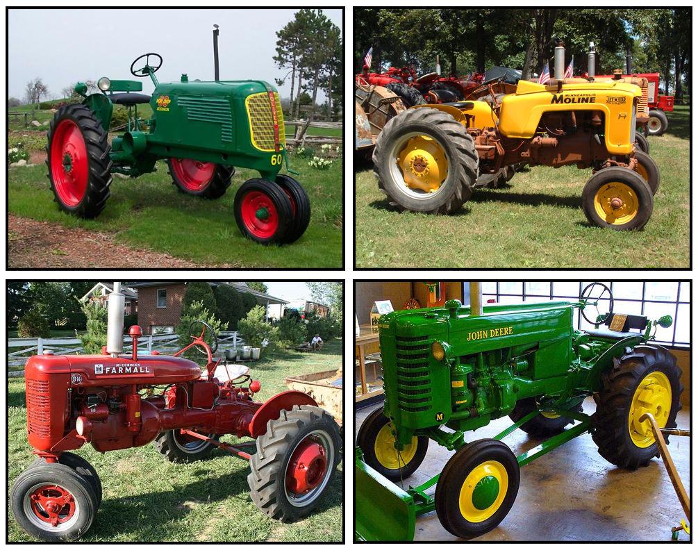
You can find them on the roads of rural America, often a line of traffic trailing. They're chugging along in the fields, left to rust next to old barns, and shined up for shows. They pull our parade floats and help plant, tend, and harvest not only our food, but our imagination. Tractors, especially 'vintage' tractors, are a wealth of nostalgia and design and that's why they're the feature of this Idea Seeds.

Some shallow research uncovers a vast world of color, design, and function. Tractors began as steam engines working in pairs. Now, a large piece of technologically advanced farm machinery can cost more than a house. These mainstays of the 'modern' farm are an indispensable part of crop production.


Images sourced from Wikipedia
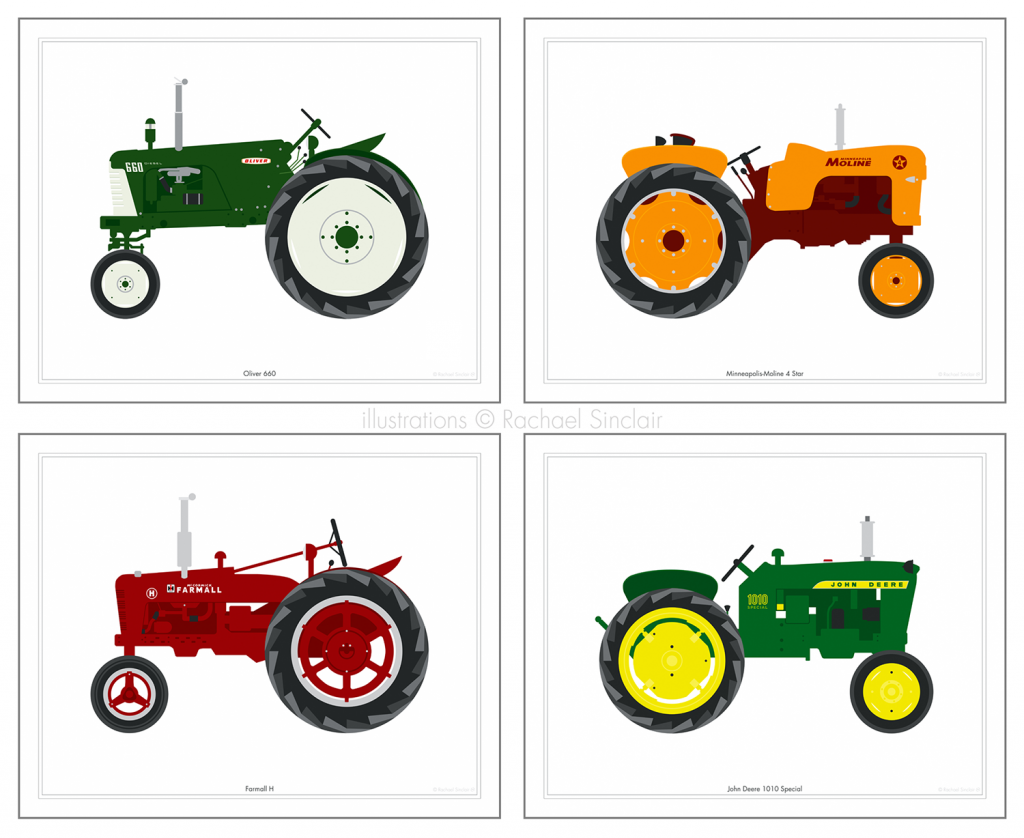
Since these implements took over where horses left off, there have been a large number of manufacturers. There aren't quite as many today as in years past, but that's what makes vintage tractors so much fun. The colors are varied and vibrant, the forms utilitarian, but geometric and beautiful. 

What do you think when you see an old tractor? Do you envision a farmer, perched familiarly atop the metal beast, the sun in his eyes, with a field of corn in his wake? Perhaps you see an easy-going farm dog napping in the shade of an old row-crop. Maybe you focus on the design of the machine, its lines and graphic quality. And it just could be that you see generations of history in every layer of peeling paint.

I invite you to look into the world of farm machinery. Start with the old stuff (as it is oftentimes more visually pleasing) and settle in for quite a ride. You may not go over 20 miles an hour, but the inspiration you cultivate can certainly take you places.


Vintage Tractors
Original vector illustrations © Rachael Sinclair
Available for purchase HERE

Wednesday, February 13, 2013

Happy Valentine's Day

I've never loved Valentine's Day, but I can't say I completely detest it. Who can resist chocolate, right?


Tuesday, January 29, 2013

Pop Inspiration: Fringe

Science fiction isn't for everyone, but one thing's for sure, it's a wild ride. A few weeks ago, television viewers waved goodbye to the dimension/timeline-jumping fun that was Fringe. Not only did the writing tease the boundaries of science, but it challenged our feelings and how we connect with the people and world we love.

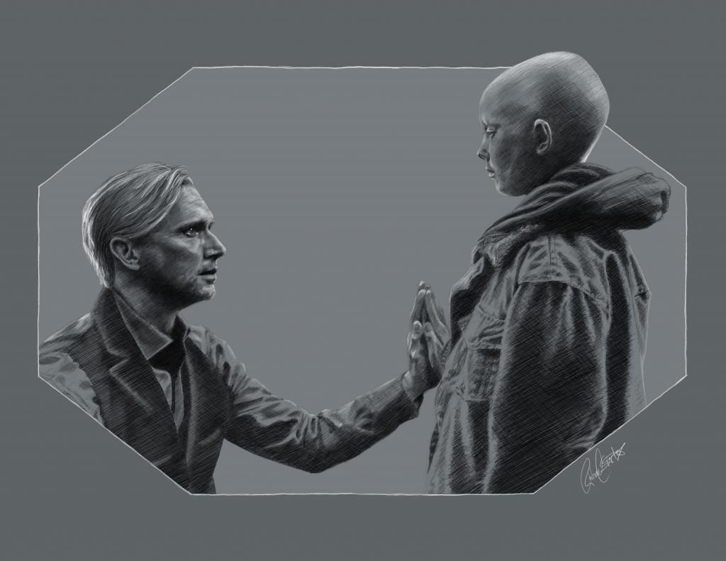
Among the relationships in Fringe I found particularly poignant was the relatively short-lived father/son bond between the former Observer September (now Donald) and Michael. The episode 'The Boy Must Live' gave us this amazingly deep, yet outwardly simple show of affection and communication between the two.

The Boy Must Live
original illustration © Rachael Sinclair

I challenge you to find something inspirational in the immeasurable worlds of science fiction. One of the taglines for the show was "Imagine the Impossibilities". That's what I like to take from science fiction; not a cold, sparse landscape of scoured alien soil, but infinite worlds of beauty and constant learning where the word 'impossible' isn't so limiting after all.

Wednesday, December 19, 2012

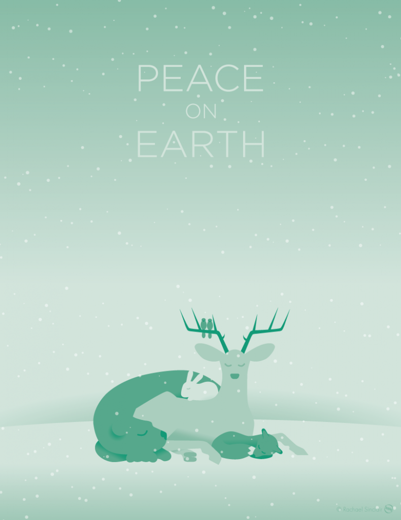
Peace on Earth: Christmas 2012

The holidays should be a time of peace, but often, they are merely a pregnant pause in the hectic and spiteful world. With the hardships in our lives today, it's difficult to be calm and quiet. There are those struggling with loss, pain, and joblessness. There are families and loved ones coping with tragedy and uncertainty. But the Lord has given us His peace and if we can let loose the dams in our hearts, the barriers of prejudice, if only for a moment, we can truly know that peace.

I wish for you a peaceful holiday full of love and kindness. God bless!


A Wish of Peace
original vector illustration
© Rachael Sinclair

Thursday, December 6, 2012

Details Matter: Know Your Subject

'It has long been an axiom of mine that the little things are infinitely the most important.' -Sherlock Holmes, A Case of Identity

Design is an art, true, but design and art are not the same. In art, liberties can be taken, but in design, attention to detail is a must. And it could be said that too much research may never be enough. No matter the size of the client or job, a bit of sleuthing can make the difference between success and failure.

In the late 90's, an ad campaign was launched by Quilted Northern tissue featuring cartoon women quilting. Though the intention was fine, the ladies were 'quilting' using knitting needles. This was a costly mistake, teasing the sensibilities of a large demographic: homemakers and housewives. The campaign was eventually revamped to show quilting instead of knitting, but the lesson wasn't a nice one to learn. This is where research could have saved them a lot of time and embarrassment. Knitting and quilting may both use needles, but that in no way means the two are interchangeable.

Agencies and designers work with a lot of different clients. Though it may be familiar for you to work for a coffee shop if you love coffee and know a lot about it, it may not be a simple when the client deals in something outside your realm of expertise. Don't be afraid to take to the books, so to speak, and learn some things. Start by listening to your client, ask lots of questions. Dig deep and pay attention to the smallest of facts. This will not only make your design better, but can really help establish a trusting relationship.

Next, research every angle. If your client has something to do with music and you aren't a musician, give yourself a lesson in musical theory. Don't go by what you think may be okay, start out with a strong foundation and build your house there. You can have a design that's technically good, but if the base concept isn't sound, that design may end up on the scrap heap. And pay special attention to symbols and what they mean. A symbol or term may have a completely different meaning to one group than it does another.

Designers can be crunched for time more than we'd like, but our clients aren't always of a 'get it to me when you can' mentality themselves. If you've listened to your client, gotten to know them and their business, and done your research, what you deliver will be the cream of the crop. "Measure twice, cut once" as they say also applies to design. When you bring your client something that's thoroughly researched, it's easier to move forward without time-wasting error correction.

Jacks of All Trades, designers are detectives with sketchbooks. Knowing a little something about a lot of subjects isn't only beneficial for a trivia buff or Jeopardy contestant. These days, when information is so readily available, there's no excuse for errors of continuity. Be respectful of your client and good things will happen. And remember, you can't quilt with knitting needles.

Wednesday, December 5, 2012

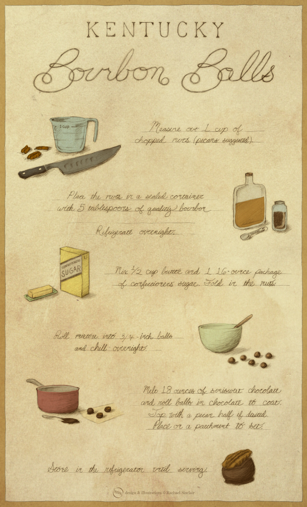
Kentucky Bourbon Balls

Bourbon is a Kentucky tradition and a source of Bluegrass pride. The bourbon ball candy has been around for generations, a potent truffle of liquor, nuts, and chocolate. These little bits of rich, fun goodness (just one of the many types of recipe featured below) would be great for a holiday gift or to serve at a party. Enjoy your treats responsibly!

Click to embiggen!
Kentucky Bourbon Balls
hand drawn recipe
© Rachael Sinclair

Tuesday, November 13, 2012

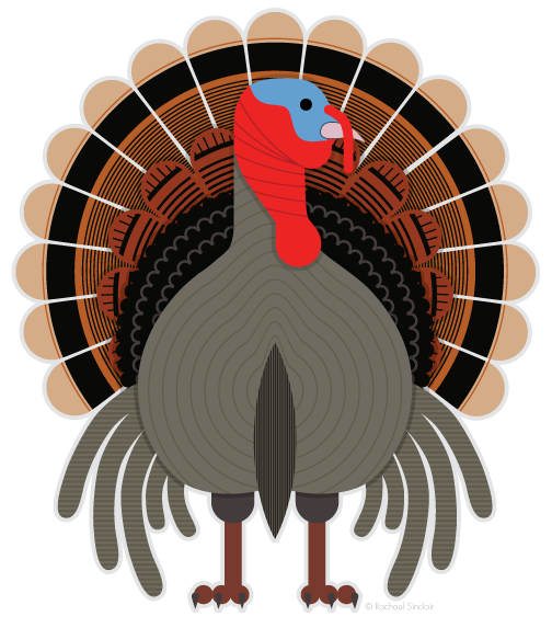
Birds of Kentucky: Eastern Wild Turkey

The varied topography of Kentucky is home to a wide range of plants and wildlife. The feathered variety is no exception. I love wild birds; they're fascinating and all so different. They have been a great inspiration to creatives for eons, not just for their form and color, but for their personalities, songs, and symbolism. In these posts (I hope to do a series) I will introduce you to some of Kentucky's native birds with some facts and a special illustration.

As Thanksgiving approaches, our minds may conjure up the image of Tom Turkey, the jovial nodding character from the Macy's Thanksgiving Day Parade. Kentucky is home to the Eastern subspecies of Wild Turkey (Meleagris gallopavo silvestris), a large, imposing bird. Though most turkeys prepared for the holiday are the domesticated variety, bred from a Mexican turkey subspecies long ago, there's no denying the commanding presence of the wild turkey.


This bird can reach 4 feet tall and males can weigh up to 30 pounds. Their body feathers are warm brownish gray and the males have red and blue featherless skin on their heads. Males also have red waddles at the throat and base of the neck. The tail feathers, a fan of mahogany and cinnamon, are tipped with a chestnut color, thus differentiating them from the other subspecies of wild turkey.

Habitat Diet Nesting Conservation Status
Open Woodland Omnivore Ground Least Concern

In the Bluegrass, wild turkeys can be found in open forests and farmland near wooded areas. They may come out to feed in fields, especially in the late summer and fall after the crops have been harvested. They're a foraging species, feeding on nuts, seeds, berries, insects, and even small reptiles. They make their nests on the ground, in shallow dirt craters protected by forest vegetation. Hens lay an average of 10-14 eggs with the young (called poults) leaving the nest mere days after hatching.

Though some may feel they have a face only a turkey mother could love, wild turkeys are strong, majestic birds in their own right. Native Americans, especially eastern tribes, favored the turkey as a food source, eating not only the meat, but the eggs. The feathers often made their way into ritual dress and equipment. So steeped in tradition was the turkey even in the infancy of the United States, Benjamin Franklin theorized it may be more fit than the Bald Eagle for the national bird. In a letter to his daughter, Franklin called the turkey a "Bird of Courage".

This Thanksgiving, as you gather with your loved ones, pay mind to the turkey. The turkey has been a source of nourishment and conviviality for thousands of years. May the blessing of food, warmth, health, and family be with you this holiday season!

Sources: Cornell Lab of Ornithology and Wikipedia

Wednesday, October 31, 2012

Pop Inspiration: White Zombie

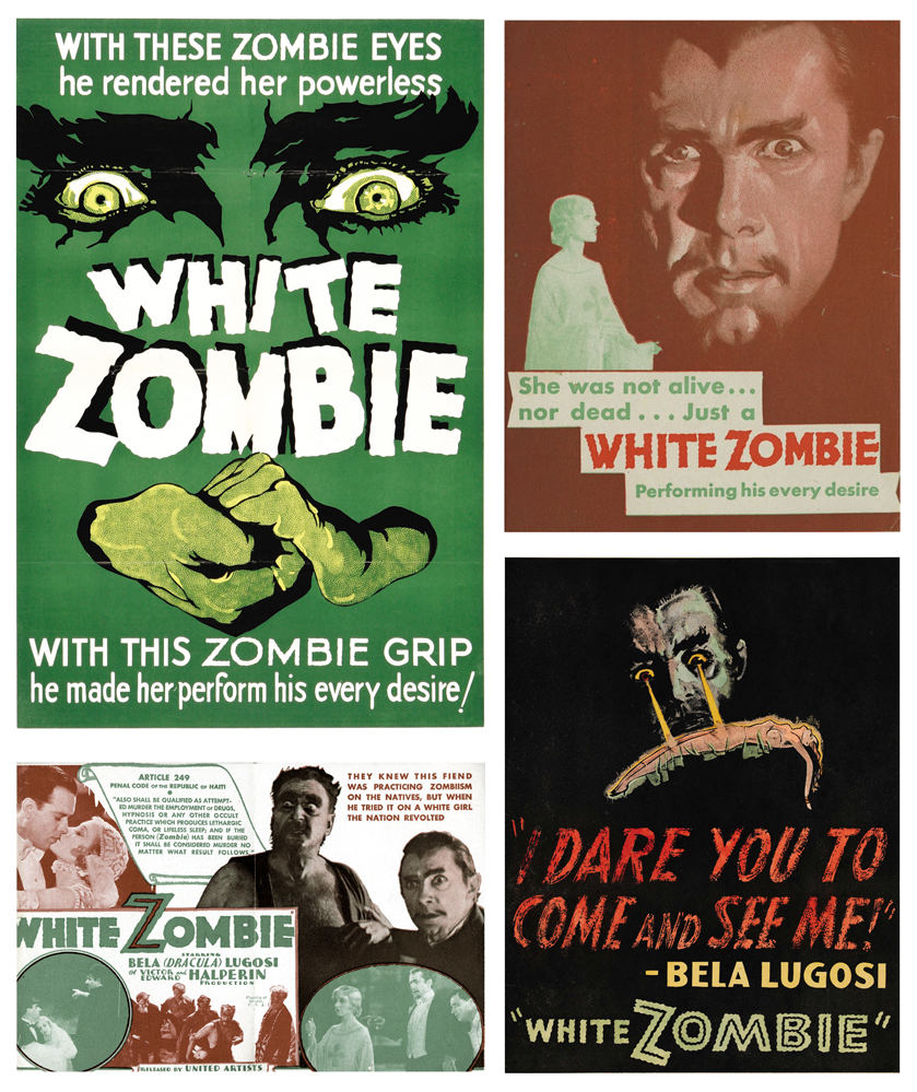
With these zombie eyes, he rendered her powerless. With this zombie grip, he made her perform his every desire!

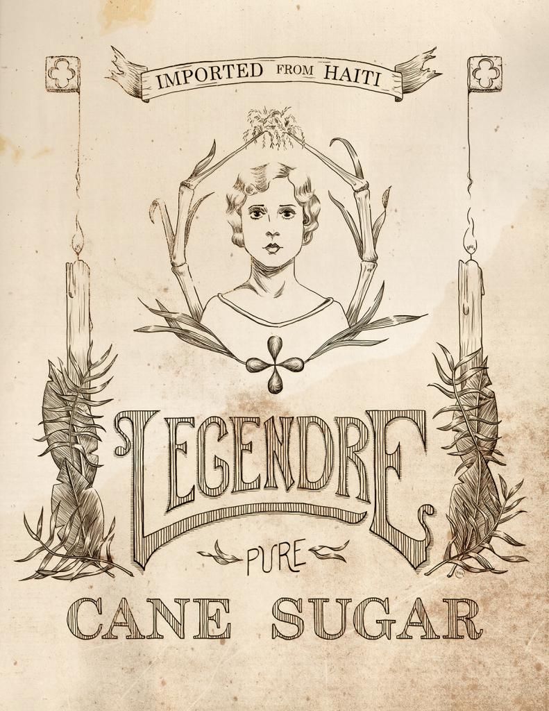
Released in 1932, the film White Zombie is considered the first feature-length zombie film. It starred Bela Lugosi, fresh off his unforgettable role in Dracula. He played a sinister witch doctor, 'Murder' Legendre, the vile owner of a zombie-staffed sugar mill in Haiti. Though it doesn't command the adoration of Dracula or Frankenstein, there's something enchanting (pun perhaps intended) about this film.


The posters and promotional items for the film give us a wealth of fun design. Take the colors for instance. In the pieces featured here, we see a period-perfect palm green, fading to a jade. On the opposite of the spectrum, we have a rusted red, a rich earthy tone. Perhaps subconsciously, these colors can transport us to the film's setting in the tropical world of Haiti in the 1930's.

Typefaces are predominately san serif, chunky and 'modern' in most cases. The titles are in a similar design, but tremulously edged, to give the words more intrigue and almost tribal mystery. The imagery shifts from graphically altered monotone photographs to posterized features and faces, sure to unsettle the nerves. These posters hearken to a time of minimal color usage and bold graphics.


White Zombie is a wealth of nostalgia, a transportation to the world of roaring Hollywood studios and 'monsters' more famous than the actors who played them. The story, the setting, the crackling audio, it's quite fantastic. With a short running time, it's great for wiling away a little over an hour. Have a Happy Halloween and watch out for zombies!


Legendre Sugar
Original lineart label
© Rachael Sinclair

Monday, October 29, 2012

Happy Birthday Bob

Kawaii Bob Ross
original vector art
©Rachael Sinclair
Happy birthday Bob Ross, who would have been 70 years old today. 

Tuesday, October 2, 2012

Color Flavor: Jay Feather and Sorghum

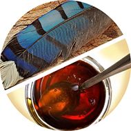
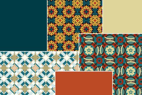
Autumn blows in on the backs of leaves to the calls of the garrulous blue jay. The electric blue feathers stand out against the contrasting golden leaves. Kitchens are thick with the smells of apple pies and pumpkin bread. On foggy mornings, warm biscuits aren't the same without a creamy spread of butter and sorghum. The rich, warm gold of this special syrup from the south paired with the near-holographic blue of a shed jay feather is the perfect combination to welcome the closeness of the season.


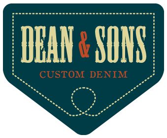
Sampling the darkest tones from the jay feather, we come up with a slightly greenish blue deepened with gray. This color is a little rustic and very natural. In design, the color is great for use on backgrounds (as it is fairly easy on the eyes) and in themes that call for a 'rugged' feel. See the theoretical logo for Dean & Sons Custom Denim. Here, the blue is married with a vellum neutral and the syrup umber. The tones separate well and accent each other perfectly.

In the home, jay feather and sorghum are a recipe for cozy with a touch of class. The colors are rich and deep, but not shocking or heavy. Here, the walls and ceiling are painted in the jay feather color (Behr Kingfisher 520F-7). The window seat inset is in a slightly lighter hue (Shale Gray 540F-4) and the neutral is a cooler cream (Windsong 390C-3). To warm things up, the upholstery and accents come in unadulterated burnt umber and gold. Throw in a rich, warm oriental rug and you're set for a little reading in the afternoon sun.

Jay feather and sorghum are colors of nature in transition. Summer is giving way to autumn's bounty. The jay calls in the blazing trees and the cane is cooked down into semi-liquid gold. If you're in the market for 'country' with a touch of elegance, give these hues a try!


Patterns can be found here, here, and here.

Kentucky_Club
Color by COLOURlovers

P.S. If you'd like a good cookie recipe using sorghum, check out the chewy ginger cookies on my past post here. I mention molasses in the recipe, but I always use good Kentucky sorghum.

Friday, September 28, 2012

Cleland's Harsh Words

Today, I wish a happy birthday to someone who passed before my time but has had a great impact on me. I covered him in a Cultivators of Inspiration post a while ago, so this should come as no surprise. On this day in 1880, Thomas Maitland Cleland was born. He went on to be one of the foremost designers and illustrators of the early 20th century. I have a large collection of his work, including his writing. In celebration of his 132 birthday, I share with you the final bits of an address he gave to the American Institute of Graphic Arts in New York on February 5th, 1940, bound and published as Harsh Words by T.M. Cleland. The world is always changing, but some things hold true from generation to generation. Hard work and effort will always be an integral part of success.

Wednesday, August 29, 2012

The Science of Good Design


Science! Art and science may seem like strage bedfellows, but the pairing flourished in the middle of the 20th century. Engineering and science, chemistry and space travel, these things helped make the 50's and 60's a roaring 'technological' age. Advertisers and designers were used to spread the good word of science and gone were the days of art used only for anatomy illustrations and concept work.

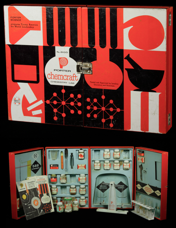
Photo from The Chemical Heritage Foundation
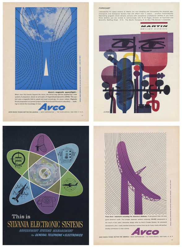
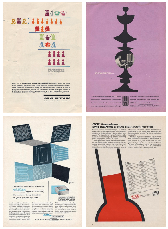
Following in the footsteps of design contemporaries, the people who worked on advertising and product design and promotion for Martin, Packard-Bell, Dupont, and Avco (to name a few) knew the sciences were tailor-made for the modernistic style of the day. In spite of the rigid nature of science and engineering, the designers felt freedom to be a bit more abstract. This helped, to a point, to demystify the sciences.

Let's take a look at this Porter Chemcraft chemistry set from 1958. This set is most indicative of the graphic style of mid-century modern. We see the use of black and white with the addition of bright, unadulterated red. The images are crisp and simplistic. On the inside, close attention is paid to continuity, with each item carefully designed to fit within the overall look. This set wasn't intimidating, it was friendly. A child could be at once in awe of science and eager to learn. How fantastic are these colors!

If we look at the eight samples of advertising below, we see the same use of bright color, oftentimes just one color with black and white much like the Chemcraft set. The illustrations are almost abstract in their simplicity and placement. The ads (all found here on the photostream of bustbright) are attention-grabbing, the text clean and 'futuristic'.


I adore the design of this era and when you add science, well, I love it even more. It's no surprise designers remain inspired by the work of those who, at the time, were on the cutting edge of what was to come. The next time you need some a little boost in the creative engine, try seeing things scientifically. Inspiration is everywhere, much like that thing we call oxygen. Breathe deep!

I took this opportunity to marry design, science, and one of my favorite things on earth, coffee. Invented in 1941 by a scientist, Dr. Peter Schlumbohm PhD, the Chemex coffeemaker uses the proven methods of chemistry to brew a simple, but absolutely perfect cup of coffee.  This poster features the squat copy text that's prevalent on pieces from the mid-century. The word 'Chemex' was hand done in a playful style, something also common to 50's and 60's design.

Scientifically the Best!
Original vector art
Rachael Sinclair

Tuesday, August 21, 2012

Great Art Teachers


Creative people can find inspiration anywhere. A song, a smell, a leaf on the breeze, all of these things can spur someone to get creative. When the impetus hits, you create. But what about those times when being creative is expected on cue? Counter intuitively, school can be crippling for creativity, especially the college classes of an art major. For this installment of Cultivators of Inspiration, I'd like to share with you how I found spark in the dark thanks to someone incredibly special.


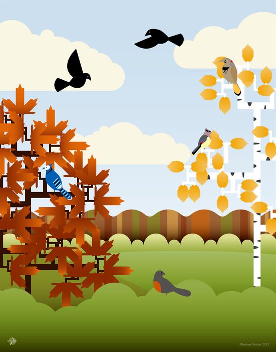
My piece, A Fine Autumnal Day
 
wouldn't be the same without
Sr. Diane's nurturing of my love
for color and nature.
A professor of mine, Sr. Diane Taylor, recently celebrated 45 years of service to my university. As I made my way through the tumultuous years of college, she kept me on track when the rails were broken and the bridge was out. When creativity was expected every day, she helped me look in unexpected places. Whether it was schooling me in the finer points of color theory or teaching me to keep the solder neat on stained glass, she wasn't just a teacher, she was a master and we were the apprentices.

Part of being a success at anything is knowing how to help others succeed. Sr. Diane was especially good at sensing her students' capabilities. She knew what you could do, how well you could do it, and if you didn't push the limit, she firmly but kindly suggested you push harder. She was a great listener and knew how to be silent long enough for you to work out the solution on your own. You would learn how to make amazing messes but also how to clean them up.

It's one thing to be a creative person, to make a life for yourself with your art; it's another thing to be a creative person who helps create other artists. One of the most difficult things about teaching artists is dealing with their odd natures and varying skills. It's like teaching a room full of students in ten different languages. To harness the chaos long enough to not only instruct the student factually but help them hone their varied skills is the mark of a true educator.

Inspiration isn't always the otherworldly things of sweeping landscapes and thunderous symphonies. It doesn't always come though the photographer's lens or the painter's brush. Sometimes inspiration is sculpted by a master of a different kind. Great teachers are sculptors, but great art teachers are extremely rare. If you, as a creative, have known a teacher like mine, you understand. My portfolio is her portfolio. I thank you Momma D for helping to make me what I am today. When times are tough, knowing you believed in me keeps me going.


This piece was done in 
Sr. Diane's stained glass class.

Wednesday, July 25, 2012

My Old Kentucky Home

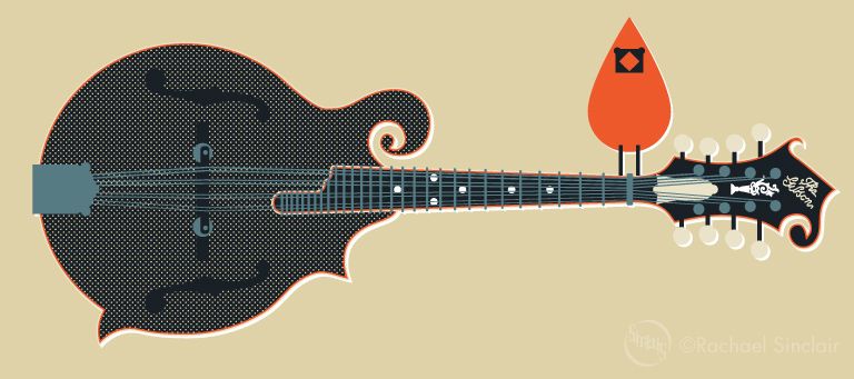
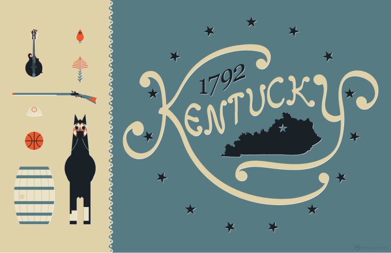
When I started this blog, one of my first posts was about collecting vintage tins. Among the tins I've accumulated is a weathered beauty for Kentucky Club pipe tobacco. I adore this tin. The imagery is wonderful, and the colors, wow. I've always wanted to do a homage to my state, incorporating the things that make Kentucky what it is. I did this poster using the tobacco tin colors, featuring a number of Kentucky icons. You'll find the state bird and flower, an alert thoroughbred in racing gear, a bourbon barrel, basketball, coal miner's helmet, a Kentucky long rifle, and lastly, a Gibson mandolin (the one used by the father of Bluegrass music, Bill Monroe). The word Kentucky was hand done for a more rustic feel and it's surrounded by 15 stars as Kentucky was the 15th state added to the union.

I love the Bluegrass. I love the people, the culture, the heritage, and the natural beauty. This poster is my love letter to my Old Kentucky Home and is likely not the last.

My Old Kentucky Home
original vector art
© Rachael Sinclair

element detail