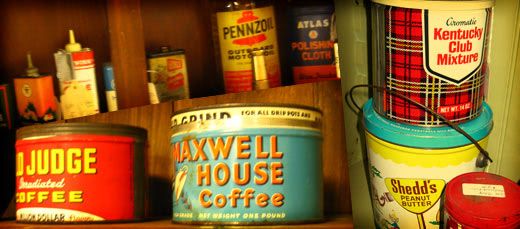
In 1810, Englishman Peter Durand patented the 'tin can'. Ever since, goods of all kinds have been sold in cans. Most cans today are vacuum packed with lids you have to open with a can opener or pull-tab. The tins I speak of in this post were mostly sold with easily removable lids and contained dry goods like coffee and pretzels, fats like lard, or tobacco. Though they were necessity in their time, the ones that survived have become quite collectible.
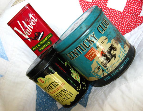
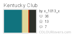
Though I don't boast a large collection of these tins, the ones I do possess have lots of design potential. My two tobacco tins are likely from the mid-20th century. They both sport bold branding and colors. I suspect they were most eye-catching when shiny and new. I spotted the Kentucky Club tin in an antique shop because of the fabulous green-tinted blue that covers most of the surface. The branding is classic with a strong serif font. Most of the graphics are crisp and flat; a dot pattern is clear on the horse and rider where it was screened to create shading. The horse, frozen mid-leap, is energetic, the white rail fencing bringing to mind rolling fields and high-class lifestyles. The secondary font is a simple san-serif.
The tin for Velvet tobacco has a more contemporary style for its time. The Velvet 'logo' is done in an upward-climbing calligraphic font, something popular in advertising from the early- and mid-20th century. The crossbar on the 't' ends in a whirl of smoke and is most playful. Other typefaces, like the secondary fonts on the Kentucky Club tin, are akin to Futura. The red makes this tin most visible on a knickknack shelf. Small things in bright colors are great for accents when you don't want to commit to large bright-colored pieces.
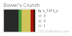
Bower's Cashew Crunch is the odd non-tobacco part of my small collection. This tin is tall and cylindrical with a glossy finish. Since the candy was 'Old Fashioned', the graphics needed to appear that way. This tin was most likely made near the same time as the others however. The fonts are serifs in an engraved style, tall and thin. The font used for 'Old Fashioned' is a 'western' serif, similar to the one used on 'wanted' posters. It can also bring to mind colonial needlework samplers. The accent graphics in red and green are superb, similar to those found in decorative pieces from 19th century New England and the Pennsylvania Dutch.
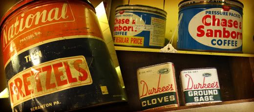
Vintage tins are fantastic decorative pieces. They can add just the right hint of roughness to a modern room. Foodstuff tins are excellent for kitchens. You can find things as large as foot-tall pretzel tins and as small as spice containers. Other tins, like those for tobacco and motor oil are at home anywhere, just be mindful of sticky stains, as some may have had leaks. When shopping for tins, try to look for authenticity as there are many impostors. Genuine tins will have appropriate aging and printing techniques for the time of manufacture. Don't be afraid of a little rust. Tins like these can run anywhere from $1 to $100, depending on age, condition, and rarity. As I've mentioned above, they're a wonderful trove of graphic, color, and typeface inspiration. You never know when you'll need just the right vintage look for a client, art piece, or product. And who knows, the next time someone asks if you have Prince Albert in a can, you may be able to proudly answer yes!

No comments:
Post a Comment