Today, I wish a happy birthday to someone who passed before my time but has had a great impact on me. I covered him in a Cultivators of Inspiration post a while ago, so this should come as no surprise. On this day in 1880, Thomas Maitland Cleland was born. He went on to be one of the foremost designers and illustrators of the early 20th century. I have a large collection of his work, including his writing. In celebration of his 132 birthday, I share with you the final bits of an address he gave to the American Institute of Graphic Arts in New York on February 5th, 1940, bound and published as Harsh Words by T.M. Cleland. The world is always changing, but some things hold true from generation to generation. Hard work and effort will always be an integral part of success.

Friday, September 28, 2012

Wednesday, August 29, 2012
The Science of Good Design
Science! Art and science may seem like strage bedfellows, but the pairing flourished in the middle of the 20th century. Engineering and science, chemistry and space travel, these things helped make the 50's and 60's a roaring 'technological' age. Advertisers and designers were used to spread the good word of science and gone were the days of art used only for anatomy illustrations and concept work.
 |
| Photo from The Chemical Heritage Foundation |
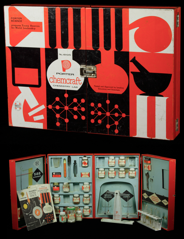
Let's take a look at this Porter Chemcraft chemistry set from 1958. This set is most indicative of the graphic style of mid-century modern. We see the use of black and white with the addition of bright, unadulterated red. The images are crisp and simplistic. On the inside, close attention is paid to continuity, with each item carefully designed to fit within the overall look. This set wasn't intimidating, it was friendly. A child could be at once in awe of science and eager to learn. How fantastic are these colors!
If we look at the eight samples of advertising below, we see the same use of bright color, oftentimes just one color with black and white much like the Chemcraft set. The illustrations are almost abstract in their simplicity and placement. The ads (all found here on the photostream of bustbright) are attention-grabbing, the text clean and 'futuristic'.
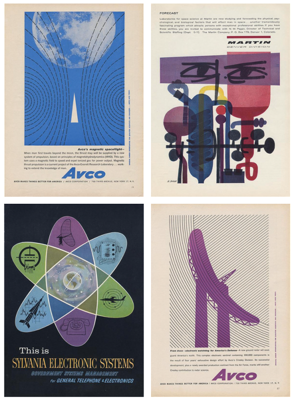
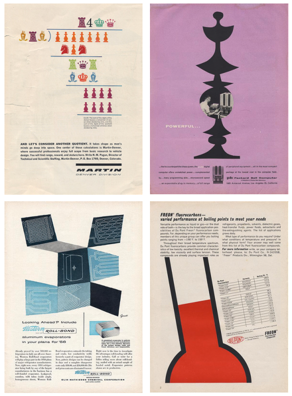
I adore the design of this era and when you add science, well, I love it even more. It's no surprise designers remain inspired by the work of those who, at the time, were on the cutting edge of what was to come. The next time you need some a little boost in the creative engine, try seeing things scientifically. Inspiration is everywhere, much like that thing we call oxygen. Breathe deep!
I took this opportunity to marry design, science, and one of my favorite things on earth, coffee. Invented in 1941 by a scientist, Dr. Peter Schlumbohm PhD, the Chemex coffeemaker uses the proven methods of chemistry to brew a simple, but absolutely perfect cup of coffee. This poster features the squat copy text that's prevalent on pieces from the mid-century. The word 'Chemex' was hand done in a playful style, something also common to 50's and 60's design.
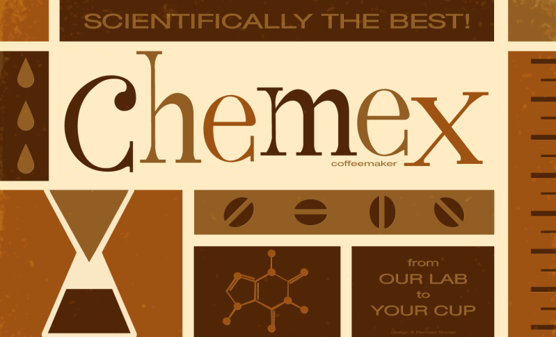 |
| Scientifically the Best! Original vector art Rachael Sinclair |
Tuesday, August 21, 2012
Great Art Teachers
|

Wednesday, July 25, 2012
My Old Kentucky Home
When I started this blog, one of my first posts was about collecting vintage tins. Among the tins I've accumulated is a weathered beauty for Kentucky Club pipe tobacco. I adore this tin. The imagery is wonderful, and the colors, wow. I've always wanted to do a homage to my state, incorporating the things that make Kentucky what it is. I did this poster using the tobacco tin colors, featuring a number of Kentucky icons. You'll find the state bird and flower, an alert thoroughbred in racing gear, a bourbon barrel, basketball, coal miner's helmet, a Kentucky long rifle, and lastly, a Gibson mandolin (the one used by the father of Bluegrass music, Bill Monroe). The word Kentucky was hand done for a more rustic feel and it's surrounded by 15 stars as Kentucky was the 15th state added to the union.
I love the Bluegrass. I love the people, the culture, the heritage, and the natural beauty. This poster is my love letter to my Old Kentucky Home and is likely not the last.
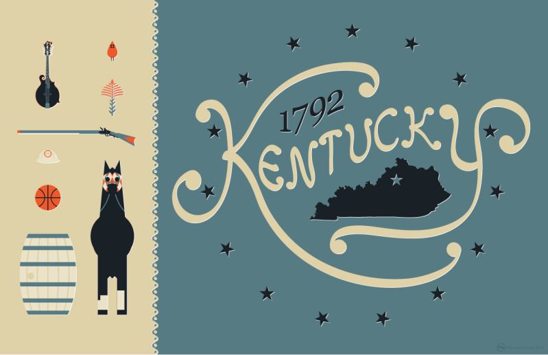
My Old Kentucky Home
original vector art
© Rachael Sinclair
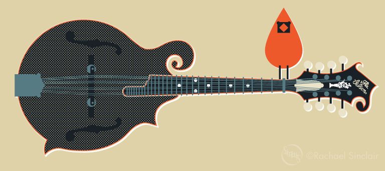
element detail
Thursday, July 12, 2012
Awards Aren't Everything: Working Through Discouragement
"There are two things that I want you to make up your minds to: first, that you are going to have a good time as long as you live - I have no use for the sour-faced man - and next, that you are going to do something worthwhile, that you are going to work hard and do the things you set out to do." -Theodore Roosevelt, 1898
Being creative is difficult sometimes. It's not always masterpieces and accolades. But being a successful artist, designer, writer, musician, or actor isn't just about the praise. It's not easy to ignore the noise about awards and such. The quest for 'fame' can put a serious dent in your self confidence and can ultimately stunt your development in your field.
Being creative is difficult sometimes. It's not always masterpieces and accolades. But being a successful artist, designer, writer, musician, or actor isn't just about the praise. It's not easy to ignore the noise about awards and such. The quest for 'fame' can put a serious dent in your self confidence and can ultimately stunt your development in your field.
Our world is all about the next big thing, the next meme, the next billion in profit. Tastes and styles are constantly shifting. As artists, we may produce amazing work, but if we don't have the right connections or timing, our efforts may be trampled by the herd. The internet has opened many doors of possibility, but those doors are covered in cobwebs of doubt and intimidation. One may see the sheer volume of amazing talent out there and just refuse to try. We can't be discouraged. We must decide what we truly want and why. Would we rather have thousands of pats on the back for something we're not completely proud of or be pleased, deep down, by a project no matter how much stir it causes.
Creativity isn't just a job, it's a part of us. Above all, we must remember to have fun, to enjoy what we do. That can be extremely difficult when our efforts to be noticed go unfulfilled. We must remember that we are unique. Others may be similar, but they don't have the experiences or history we have. When you're feeling ignored, make a list of your accomplishments. You may find you've had more success than you remember. Do something that makes you happy. If you're a designer who's sick of being in front of the computer, take a sketchbook to a comfortable chair and draw what pops into your head. If, as a musician, the songs you've been playing are only making you more frustrated, dig up a song that never fails to bring a smile.
Awards and praise are nice, but that sort of thing is usually fleeting. Yes, having an award on your resume can help you get a job or gig, but the true test of success is longevity and genuinely loving what you do. It's better to prove the ability to follow through with something worthwhile than to come up with a lucky break. Awards can be very political and aren't always the best indication of talent. Hone your skills, do your best, and have fun. If accolades come, good for you! If they don't, it doesn't mean you've failed. Follow your passion with fervor and happiness will tag along!
Tuesday, July 3, 2012
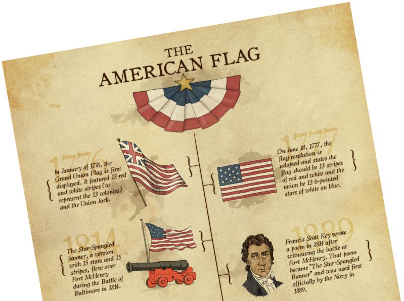
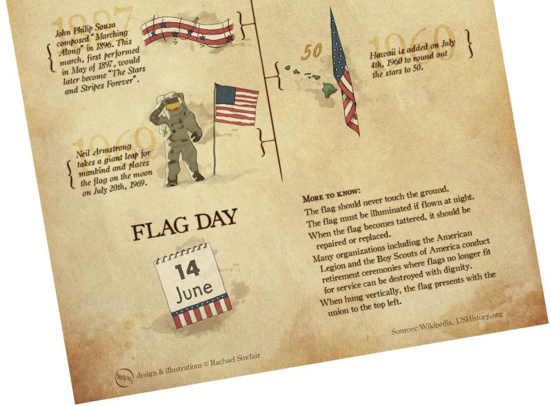
The American Flag: An Infographic
"You're the emblem of the land I love. The home of the free and the brave."-George M. Cohan
The flag of the United States is a beautiful and inspiring thing. On a clear day, against a pale blue sky, the stars and stripes cuts a very regal silhouette. It has deep roots, roots that intertwine with those of its people. From the first pennant of independence to the reverently folded flag of respect for a fallen soldier, our flag is indeed a grand old flag. I wish you a happy and safe Independence Day!

Stars and Stripes Forever
original digital art
© Rachael Sinclair
Enlarge the images below for detail.


Enlarge the images below for detail.
Thursday, June 21, 2012
Color Flavor: Honeysuckle
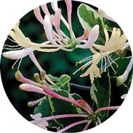
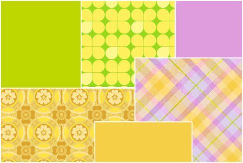
 It's a popular fragrance for soaps and lotions and in the spring and summer, it sweetens the breeze and entices the bees. Honeysuckle comes in tame and wild varieties and doesn't just smell good, it's a great source for color inspiration. This vine can be considered a pest if not controlled, but if you've walked by a bank of it after a rain, you know the scent is like none other. If you stop to study further, you'll notice tones from smooth butter to lively magenta and all tones in between.
In design, these colors are a dream for something fresh or feminine. A bakery or candy shop would be a fitting use for the buttery yellow and zing of fuchsia and tart green. The brightness of these hues would also do well in the branding for a specialty children's store.
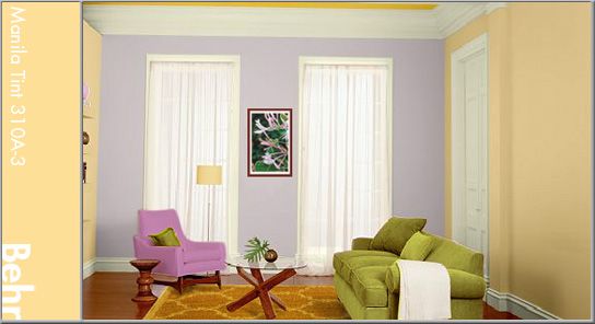
Home is for comfort and these warm tones do just that, comfort us in the arms of a summer day. Use a lighter honeysuckle yellow for the walls. Here, I've used Behr's Manila Tint (310A-3) with a more intense hue for accents (Flame Yellow: 360B-6). Splash around the greens and purple (Brook Trout: 110E-2) to bring attention to certain areas. Warm wood would further brighten the feeling where a contrasting use of cool metal would bring balance.

Subscribe to:
Posts (Atom)