It's in the way the late evening sun plays among the wildflowers. It's in the chill and refreshment of a juicy watermelon on a hot day. It's shooting stars over the clear wide open, whispering streams, screen doors, fireflies, and sun-bleached barns. Summer in the heartland is unlike anything else, full of charm and history, full of freedom. Capturing the authentic feel of this season in the sun may seem like a daunting task to someone who hasn't experienced a country summer first hand. And don't think a country theme always means hackneyed kitsch. Consider this blog post a cheat sheet to the perfect lived-in country style.
Colors are a good base for any design theme. The colors of a country summer are different than other summer themes. The bright citrus yellows and oranges and azure teals of the tropics are replaced with berry red, harvest wheat gold, and the wick, deep green of corn stalks. Blue is there too, but in more pure hues. The tonal family of aged denim is very fitting. Depending on the time of day, these colors may be stained with gold from the sun and resemble an old photograph faded with age.
Colors are a good base for any design theme. The colors of a country summer are different than other summer themes. The bright citrus yellows and oranges and azure teals of the tropics are replaced with berry red, harvest wheat gold, and the wick, deep green of corn stalks. Blue is there too, but in more pure hues. The tonal family of aged denim is very fitting. Depending on the time of day, these colors may be stained with gold from the sun and resemble an old photograph faded with age.
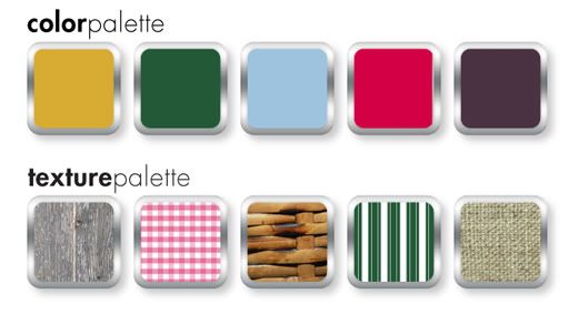
Texture and pattern are just as important as color. A country summer highlights the age and wear of slow-paced rural living. Think of breathable fabrics like cotton and linen. Toss in a vintage basket, a faded quilt, and the rough but strong striations of weather-worn wood. If bare wood isn't your thing, consider a wash of white, cream, or one of the colors mentioned above in a creamy 40's pastel tint. The cool metals of the city can visit the country too by adding some chipping enamel and slight spots of rust.
Where patterns are concerned, one can never go wrong with gingham, checks, plaids, and simple polka-dots. A ticking stripe would work with this theme as well. Imagine a well appointed picnic with a red and white blanket, hand-me-down reed picnic basket, and food fresh from the garden.
In design, be mindful of line. Predominately straight, mechanical lines won't look at home here. Consider some rough brushstrokes or lines that appear hand-drawn. There are a lot of hand-drawn resources out there for icons and clip-art. You could also draw things yourself if you're comfortable. By the same token, don't go overboard with roughness and texture unless the design specifically calls for it. Everything in moderation and too much is just campy. Spacing is important as well. It's best to leave things light to aid in the semblance of air and openness.
Stay away from saturated darkness and lots of black. Even the summer night sky has a bit of blue to it. In web design especially, lots of white and light colors can be hard on the eyes. In this case, some darkness is appropriate. If dark colors for backgrounds are necessary, consider a light texture or perhaps a gradient to break up the block.
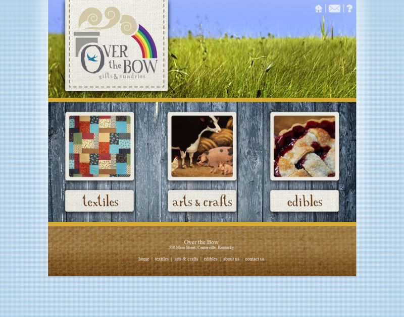
Fonts should be playful but don't have to be overly so. A thick san serif font may seem overbearing and too modern unless the usage is minimal. Don't be afraid of vintage-looking fonts or ones with a little charming distress. These work wonders for a country feel. If you find a font you like, you can always distress it yourself with some simple effects.
The breeze is magic as evening descends. Fireflies leap luminescent from blades of green grass. The crickets chirp to one another and the rhythmic squeaks and pops of an old porch swing are almost hypnotic. When morning comes, set out in bare feet to feel the dew on your toes, pick some ripe blackberries, and watch the way the sun paints the earth as each hour passes. Adding a little country to your summer design themes can give people a reason to slow down and smell the flowers.
The breeze is magic as evening descends. Fireflies leap luminescent from blades of green grass. The crickets chirp to one another and the rhythmic squeaks and pops of an old porch swing are almost hypnotic. When morning comes, set out in bare feet to feel the dew on your toes, pick some ripe blackberries, and watch the way the sun paints the earth as each hour passes. Adding a little country to your summer design themes can give people a reason to slow down and smell the flowers.
Color by COLOURlovers