I wish for you a peaceful holiday full of love and kindness. God bless!
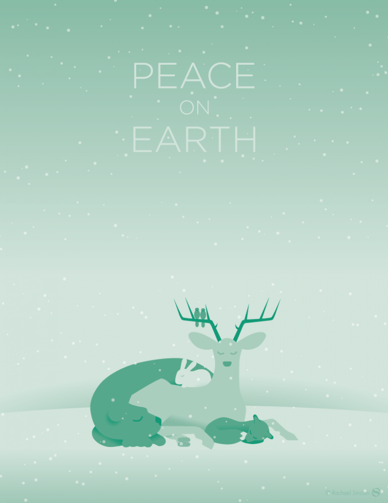
A Wish of Peace
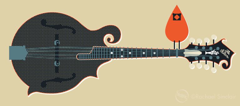
original vector illustration
© Rachael Sinclair

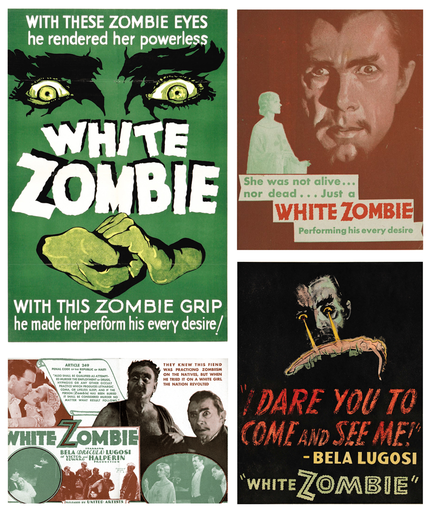
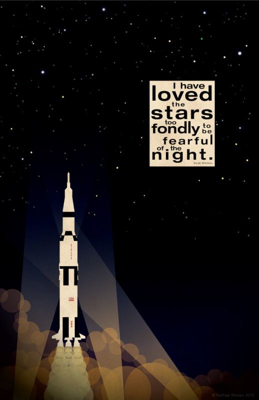
'It has long been an axiom of mine that the little things are infinitely the most important.' -Sherlock Holmes, A Case of Identity

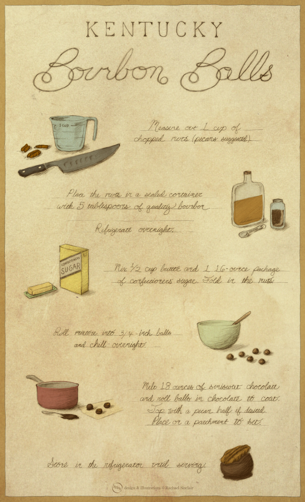 |
| Click to embiggen! |
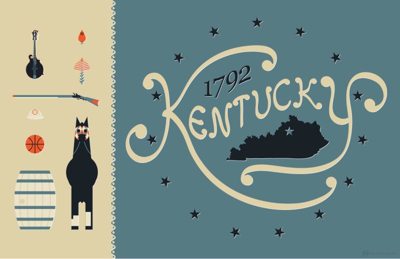
 The varied topography of Kentucky is home to a wide range of plants and wildlife. The feathered variety is no exception. I love wild birds; they're fascinating and all so different. They have been a great inspiration to creatives for eons, not just for their form and color, but for their personalities, songs, and symbolism. In these posts (I hope to do a series) I will introduce you to some of Kentucky's native birds with some facts and a special illustration.
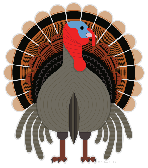
| Habitat | Diet | Nesting | Conservation Status |
 |

|
 |

|
| Open Woodland | Omnivore | Ground | Least Concern |
 |
| Kawaii Bob Ross original vector art ©Rachael Sinclair |
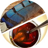
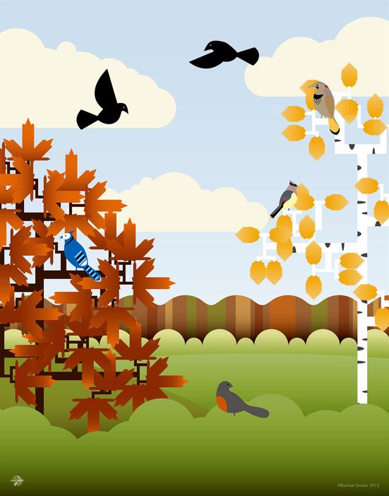
 Autumn blows in on the backs of leaves to the calls of the garrulous blue jay. The electric blue feathers stand out against the contrasting golden leaves. Kitchens are thick with the smells of apple pies and pumpkin bread. On foggy mornings, warm biscuits aren't the same without a creamy spread of butter and sorghum. The rich, warm gold of this special syrup from the south paired with the near-holographic blue of a shed jay feather is the perfect combination to welcome the closeness of the season.
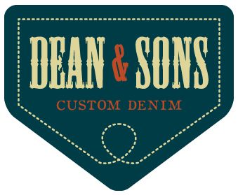
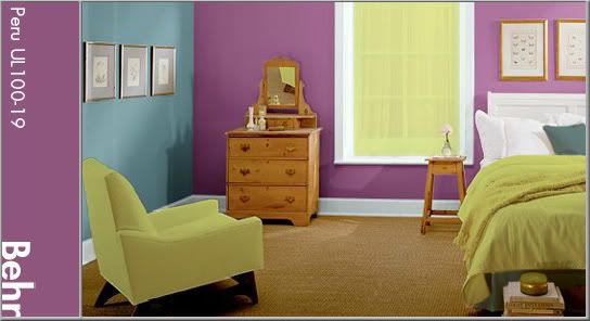
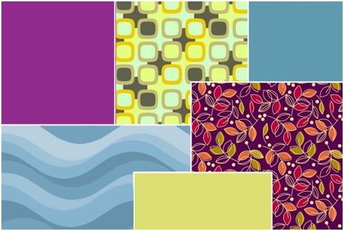
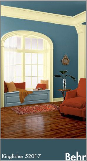 Sampling the darkest tones from the jay feather, we come up with a slightly greenish blue deepened with gray. This color is a little rustic and very natural. In design, the color is great for use on backgrounds (as it is fairly easy on the eyes) and in themes that call for a 'rugged' feel. See the theoretical logo for Dean & Sons Custom Denim. Here, the blue is married with a vellum neutral and the syrup umber. The tones separate well and accent each other perfectly.
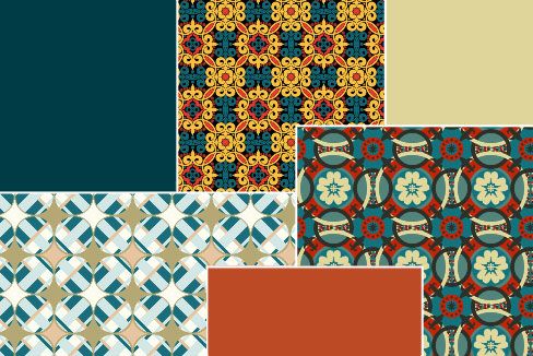
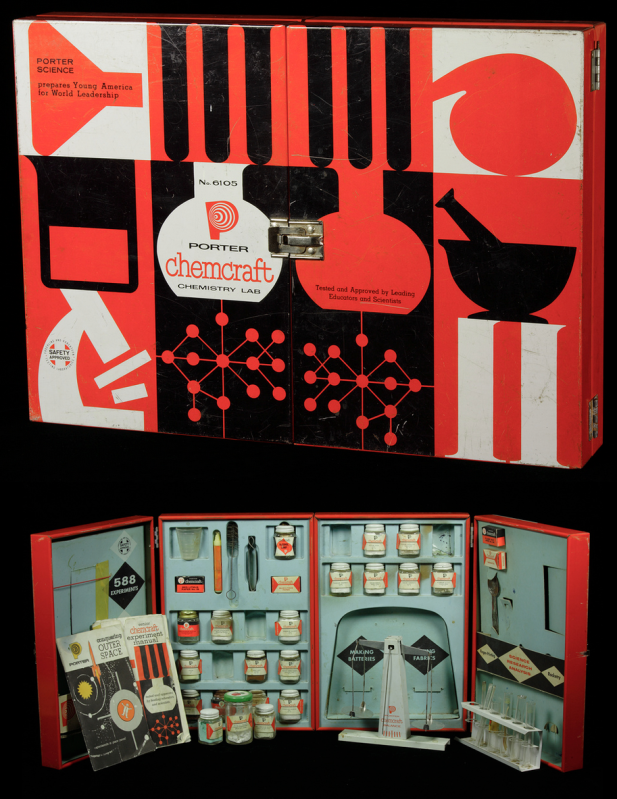 |
| Photo from The Chemical Heritage Foundation |
 |
| Scientifically the Best! Original vector art Rachael Sinclair |
|
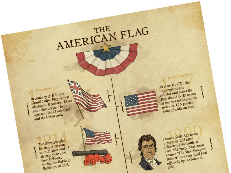
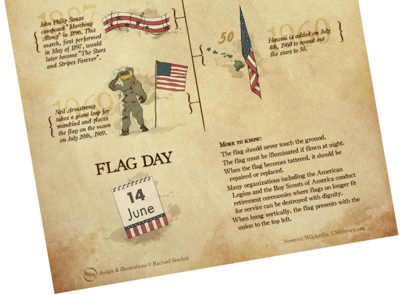
"You're the emblem of the land I love. The home of the free and the brave."-George M. Cohan

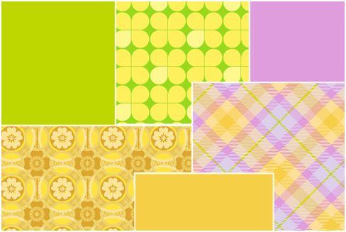
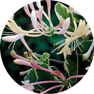 It's a popular fragrance for soaps and lotions and in the spring and summer, it sweetens the breeze and entices the bees. Honeysuckle comes in tame and wild varieties and doesn't just smell good, it's a great source for color inspiration. This vine can be considered a pest if not controlled, but if you've walked by a bank of it after a rain, you know the scent is like none other. If you stop to study further, you'll notice tones from smooth butter to lively magenta and all tones in between.
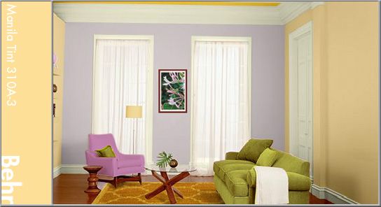
 Whether you have a regular '9 to 5' or work from home, it's easy to get into the routine of bottom in chair, eyes on the computer. Though this is fine when all your cylinders are firing, but if you've run out of ideas, it's time to go idea shopping. The trip doesn't have to be lengthy or really have purpose. Put on your walking shoes and stroll around the neighborhood. Visit a green space or if that's not your style, sit at a coffee shop or bookstore. Whatever you do, distance yourself from your usual working area, enjoy some peace, and observe life around you. The kick-start you need may be in the colors of a pretty day or the smile of a stranger.
 Hat Trick
 In the same vein as 'random word in a hat' is the shuffle. So many of us employ a steady set of skills in our field. Some of us code websites all day while some toil over layouts and illustrations. Sometimes, when our usual work bores us into stagnation, we need to shuffle to something unusual. How about getting creative in the kitchen? Find a recipe and make something. Interested in gardening? Get a new potted plant. Do a word puzzle or play a game. People have a plethora of skills, we just don't use them all in one day. Skills need a break just like pulled muscles.
 Being uninspired, though seemingly monotonous, is something that can push your stress level to critical. Escaping to different surroundings may help in some respects, but remember, there are a lot of parts to the machine that is you. It's important to do diagnostics on everything. Have you laughed today? Has something made you feel like a child again recently? Cutting loose and being silly is great medicine. Shaking the snowglobe of your mind with a little laughter can really help things settle more clearly.
 They are a symbol of peace, civilization, and excellence. The Olympics are the pinnacle of society; athletes from all over the globe participating in friendly competition, living together in a 'village'. This show of goodwill and skill is also an inspiration to artists and why the Olympic Games star in this Idea Seeds post.
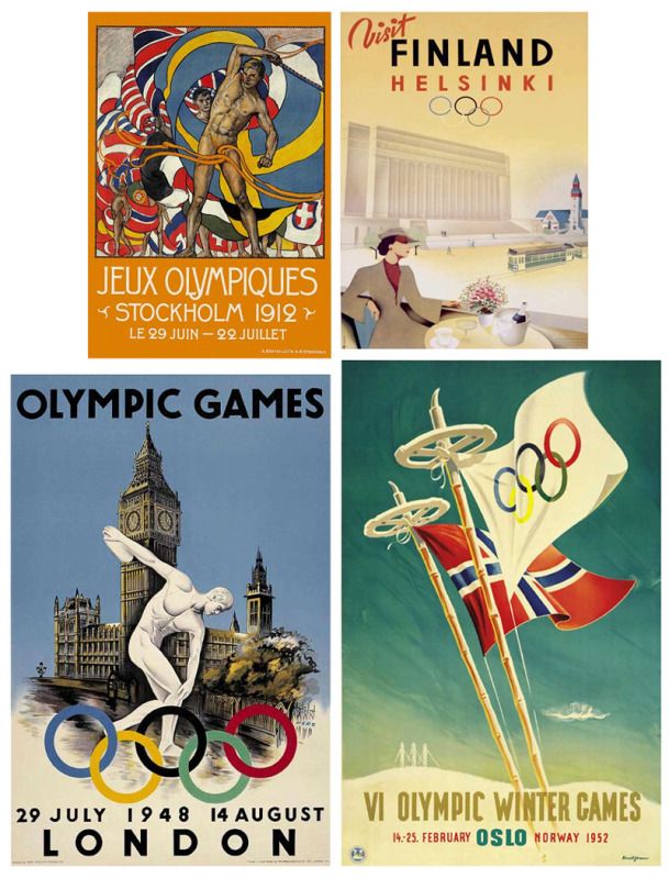


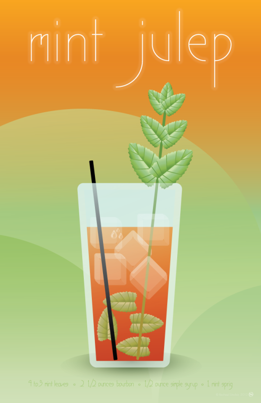 |
| Mint Julep original vector illustration |
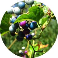 In my youthful explorations, I learned a lot about wildflowers, plants,
and topography. I can instantly identify a number of native flora and
fauna and know where you're likely to find them. A few years ago, I saw
something I'd not seen before, a porcelain berry. A plant native to
Asia, this climbing foliage is considered an invasive species in this
country. It is quickly spreading across from the eastern states and must
be controlled as it can choke out native vegetation.
In my youthful explorations, I learned a lot about wildflowers, plants,
and topography. I can instantly identify a number of native flora and
fauna and know where you're likely to find them. A few years ago, I saw
something I'd not seen before, a porcelain berry. A plant native to
Asia, this climbing foliage is considered an invasive species in this
country. It is quickly spreading across from the eastern states and must
be controlled as it can choke out native vegetation.