Tuesday, December 13, 2011

Merry Christmas 2011

Recently, I joined Pinterest. (You can follow the link in the sidebar to my boards.) I was skeptical at first; there are so many blogs and sharing sites. I found I love being able to 'bookmark' inspirational images and sites by using a visual. Over the past weeks, I've pinned a lot of interesting things, including some vintage typography. You can visit the BibliOdyssey blog post here to see some examples of the Sanborn Fire Insurance Maps that inspired my piece. I went for an old paper look and threw in some decorative elements. 'Merry Christmas' was hand drawn, scanned, and digitized. The moderate amount of work I did on this piece really made me appreciate the old techniques. Every designer needs to know what goes in to something as simple as a word.

Have a happy holiday everyone!

Merry Christmas
original digital art
© Rachael Sinclair, 2011

Sunday, November 20, 2011

Happy Thanksgiving

Over the past year, I've collected a number of the individually packaged Lego Minifigures. I have always loved Legos and I keep my Minifigure collection in my office as a source of smiles and inspirations. As Thanksgiving approached, I couldn't help but see the pilgrims and as Lego Minifigures. I know Lego has made Native Americans, but to my knowledge, they've never made pilgrims. I'd buy that set! I'm thankful for all the blessings in my life and I wish you the happiest of Thanksgivings!

 
A Lego Thanksgiving
original vector art

Wednesday, November 9, 2011

Pasta Fagioli

As winter approaches, we find ourselves seeking warmth. Soup is a great food for the cooler months both for its ability to warm us, but also keep us satisfied. One of my favorite soups is the Italian staple, pasta fagioli. With its bright, autumn-colored vegetables, it's not only filling, it's beautiful.

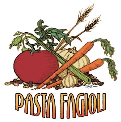
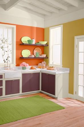
The soup has a base of tomatoes, a deep pinkish red. Add to that the translucent white of onions, the rich orange of carrots, and the wick green of celery. Great northern and dark red kidney beans round out the rustic rainbow with added spice of basil, thyme, and oregano. Use these colors in old fashioned design or anything dealing with cooking, food, or produce. In a room, the hues of pasta fagioli add lots of pop. They're bold and not for everyone, but can be a source of great interest in the right setting. The kitchen here features Behr French Pale Gold (350D-5), Startling Orange (S-G-230), Deep Garnet (110F-7), and Antique White interior flat enamel (1823).

The next time you need a hearty meal, I recommend pasta fagioli. It's fairly simple to make and can feed your creativity as well as your body. The recipe below is the one I use and was originally taken from Top Secret Recipes.

Pasta Fagioli

1 pound ground beef or turkey
1 small onion, diced (about 1 cup)
1 large carrot, julienned (about 1 cup)
3 stalks celery, chopped (about 1 cup)
2 cloves garlic, minced
2 14.5-ounce cans diced tomatoes
1 15-ounce can red kidney beans (with liquid)
1 15-ounce can great northern beans (with liquid)
1 15-ounce can tomato sauce
1 12-ounce can vegetable juice (such as V-8)
1 tablespoon white or balsamic vinegar
1 1/2 teaspoons salt
1 teaspoon oregano
1 teaspoon basil
1/2 teaspoon pepper
1/2 teaspoon thyme
8 ounces (around 1/2 package) ditali pasta

Brown meat in a large saucepan or pot over medium heat and drain. You can add the onion, carrot, celery and garlic with the meat, or transfer meat to a bowl so vegetables get more contact with the pan. Saute the vegetables for about 10 minutes or until they begin to caramelize. Optional: deglaze the pan with a little brewed coffee. Add the remaining ingredients (including the meat if you set it aside), except pasta, and simmer.

After soup has simmered for 45-50 minutes, cook pasta in separate saucepan until al dente. Drain the pasta. Add pasta to soup and cook for 5-10 more minutes. As an option, you can keep the soup and pasta separate as the pasta will continue to absorb liquid, making your soup thick. If you do this, add pasta to the bottom of the serving bowls, pouring the soup on top.

Serve with a sprinkling of Parmesan cheese and fresh-baked garlic or herb bread.


Wednesday, October 26, 2011

Apples: An Infographic

Infographics have been a hot trend for some time. There's something delightful about information put fourth with great, spot-on graphics. Featured often in magazines and through news outlets, infographics may look simple, but they are far from it. Creating a successful infographic (whether the one I've created is successful or not is not for me to say) is a consuming task. First, you must collect accurate and timely data. Then you must illustrate that data in an engaging and clear manner. If executed properly, an infographic can be an excellent learning tool and pleasing piece of art all at once.

In celebration of one of my favorite times of year as well as National Apple Month, I created this little ditty (click image to embiggen). I featured a wide swath of trivia. If you'd like to see more infographics, and let's face it, who wouldn't; you can visit Daily Infographic or Good: Infographics.

Friday, October 7, 2011

Happy Fall

"Those little nimble musicians of the air, that warble forth their curious ditties,
with which nature hath furnished them to the shame of art." -Izaak Walton

Tuesday, August 23, 2011

Iron Designer: MateVana

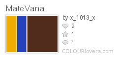
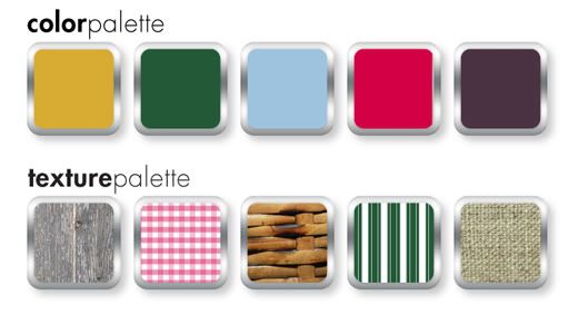
Imagine a client brings you a brand name, a niche market… and tea. The client wants branding, website design, and a few interior design ideas for an upscale, Japanese-themed cocktail bar named 'Katsu' (Japanese for 'thirst'). Your inspiration is a variety of loose-leaf tea sold by Teavana, the MatéVana®. Iron Designer, begin!

MatéVana® is a blend of mate and red rooibos teas with cocoa, almond, chocolate chips, and enhanced with hazelnut. It's mostly chocolate and nut browns, all with a woody but smooth texture. The tea is accented with a striking violet blue and a few shades of yellow ranging from citrus to sunflower. These portions of the tea are leaf-like and feminine. The client wants something that incorporates the clean, simple lifestyle of traditional Japan with a modern, rich atmosphere.


I pulled the palette above from the tea provided. We have a dark rich brown, a milky chocolate, two tones of gold, and a vibrant electric blue. Once we have those, we can apply them to our logo ideas. The client wants something sophisticated, but also evocotive of Japanese design and culture. On that vein, we have the logo ideas below.


I chose design at the bottom right to fashion a web site. I used the textures of tatami and wood grain. The photographs are simple and all match with black backgrounds. The site design is spartan and clean.


The bar itself should feature the textures of tatami, a touch of brushed metal, dark wood, rice paper, and a nice blue and neutral Japanese print fabric. The fabric brings in the feminine touch we found in the cornflower petals of the tea. Lighting should be intimate and utilize the golds in the palette.


Clients often find inspiration in things you may not expect. Sometimes it's good to practice by figuratively pulling an idea out of a hat. To be an Iron Designer, you have to be versatile and agile and ready to tackle any request. Explore the possibilities and take a second look at the world around you.

Teavana and MatéVana are registered trademarks. No copyright infringement intended.

Monday, August 15, 2011

Project Completion: Knowing When to Stop

"…letting well enough alone – which is the rule for grown artists only." -Winslow Homer

One of the most trying obstacles of art and design is knowing when to stop. Creative people, by nature, are often unimpressed by their own efforts. We can paint, sculpt, and tweak away until something is completely ruined. In order to grow as artists and designers, we must learn to step enough is enough.

When you're working on a personal project or make your money as a fine artist, it's oftentimes more difficult to put your signature on something and call it done. Doing something for yourself intimates a personal attachment and we all want personal things to be perfect. When you're collaborating, a project can be difficult to finish due to the principle of 'too many cooks in the kitchen'. When more than one decision-maker is involved, there are different ideas of 'complete'. How do we combat these roadblocks to success?

Where personal projects are concerned, the path to completion lies in understanding your expectations at the outset. What do you want your piece to accomplish? Do you have plans for the work when it's finished? What's your audience and what does this audience expect? It's also helpful to have a good set of sketches and references handy. As they say in carpentry: measure twice; cut once. This can be applied to art and design. Planning will save you time and help you create a more cohesive final product. When you know where you're going, you know when to stop.

Sometimes, all the planning in the world won't save you from feeling like something isn't quite right with your piece. If this occurs, step away. Speaking from experience, I attest to the difficulty of walking away, but it can really help you gain some perspective. Setting something aside for a while can allow you to revisit it later with fresh eyes.

If you're working collaboratively on a project—for an employer, freelance client, or volunteer project—planning, again, is a great way to avoid a lot of rough patches. Gather as much information as you can. Ask about audience again, be clear on expectations, and involve everyone in discussions about style, colors, and emotions. When everyone has input from the beginning, sticky confrontation down the road will be less prevalent. (I will add, confrontation is usually unavoidable, but the frequency can be lessened.)

Collaborative projects demand a high competency and confidence. Without being pushy or overbearing, speak your mind on technical matters. If someone suggests a typeface or color that just won't work, try to explain to them exactly why. Take your listener's experience into account. If they aren't creative, understand that some of your terms may not make sense. When all the cards are on the table, it will be easier to agree when a project reaches completion.

As with anything, it's possible to ruin a project by going only an inch too far. Planning for completion can really help you know when to step back, add your signature, and move on. Remember, even the masters had to put down their brushes and chisels at some point. Imagine if daVinci had put just one more swath of paint on the Mona Lisa. She may not be the enigmatic treasure she is today.

Tuesday, July 26, 2011

Color Flavor: Mesquite

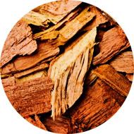
With summer comes the joy of grilling. If one is resourceful, an entire meal can be prepared out of doors. While some prefer gas and others charcoal, many add a touch of smoke to their meal by adding wood chips. The varied, tepid tones of mesquite chips can really spice up design as well.

Mesquite is a small tree, usually shrub size, that grows in the desert and range lands of the southwestern United States and as far south as parts of southern and western South America. It is a hardy plant that withstands droughts because of its long taproot. Used for many things, mesquite is perhaps most well-known as a smoke flavoring for southwestern foods. When the hardwood chips are soaked prior to use on the grill, the deep colors are amplified.

The colors of wood grain run the gamut from the usual umber and chocolate to a bright mustard gold. When combined with the browns, the tinted yellow adds a great deal of interest. In design, these colors are tailor-made for masculine or earthy brands and themes. Food branding is a given for this scheme that is warm, rich, and spicy. Take, for example, this branding for Vint Coffee. It uses all of the tones of mesquite, showcasing the striking gold. The branding brings to mind a classic, easy sense of comfort while maintaining a contemporary style.

This web page and all holdings are © Vint Coffee.

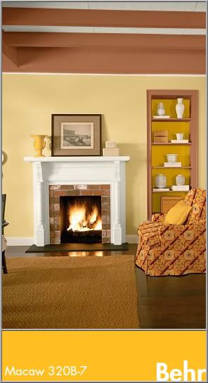
In interior design, the colors work best in rooms where you really want to add energy and warmth all at once. Kitchens, dining rooms, and living rooms benefit from the gold's soothing vigor and the tones naturally work well with wood floors and furnishings. These colors alone may seem bland to some, so feel free to spice up the mood with some graphic print on furniture, pillows, or art. Here, the yellow is used as an accent with Cinnamon Brandy (Behr 23OD-7), Honey Bear (Behr 34OD-4), and Oyster (Behr W-B-720).

Finding inspiration from nature is easy and to find it in food, simply follow your nose and taste buds. The most alluring foods can bring some amazing colors to your life.


Mesquite
Color by COLOURlovers


Tuesday, July 5, 2011

With Gratitude to the NASA STS

alternate version with Eliot quote

The first space shuttle, Columbia, was launched on April 12, 1981. I grew up to the countdowns and launches, the brilliant trail arches and spacewalks. I mourned for Challenger (posthumously, I was too young at the time) and Columbia. I watched as the shuttle made the International Space Station a reality. This was the ultimate in ingenuity, this was creativity, this was courage to tackle an open-ended dream with an ever-uncertain outcome.

It's a panorama I will remember forever; the bold white shuttle appointed in sun-lit black holds tight to a silo tank of rusted orange. Two missile-shaped boosters stand at the ready like military guards. The countdown begins and soon a flurry of sparks swirl under the engine bells. 4… 3… 2… 1… liftoff! Steam and smoke curl from below the massive machine like a rolling sea of whitecaps. The shuttle is airborne, stretching toward the heavens and chiseling history with each second.

From a design standpoint, the shuttle 'stack' (the external fuel tank, the two solid rocket boosters, and the orbiter itself) is iconic. It isn't terribly flashy in color, but the bleached ivory, charcoal black, metallic titanium, and umber paint a very familiar palette. Over the years the NASA badge has changed, but the font used on the shuttle has always been Helvetica. The U.S. flag flies proud on the side of the shuttle as well on the right wing. The shuttle is an example of how utilitarian design enters into our culture as a comfortable norm.


In season 4 of The X-Files, Fox Mulder gave his partner Dana Scully an Apollo 11 key chain for her birthday. In response, she said: "You never got to tell me why you gave it to me or what it means, but I think I know. I think that you appreciate that there are extraordinary men and women and extraordinary moments when history leaps forward on the backs of these individuals, that what can be imagined can be achieved, that you must dare to dream,  but that there's no substitute for perseverance and hard work and teamwork because no one gets there alone; and that, while we commemorate the… the greatness of these events and the individuals who achieve them, we cannot forget the sacrifice of those who make these achievements and leaps possible."

Great things have been achieved on the backs of these extraordinary individuals. From the ground crew to the commanders of the missions, these flights have been, each and every one, a testament to bravery and commitment. The people we lost along the way, the crews of Challenger and Columbia, will always be remembered for the courage to put themselves on the line for the advancement of man. The science and engineering are truly a nod to the greats before and will be an inspiration to the greats yet to come. Though the Space Transport System takes its final flight this year, the impact on all aspects of our lives will be eternal. I present this poster with gratitude to the NASA Space Transport System. Thank you for 30 breathtaking years; you will be missed. 


Dreams Aloft
original vector art, 11x17
© Rachael Sinclair, 2011

Monday, June 27, 2011

A Country Summer

It's in the way the late evening sun plays among the wildflowers. It's in the chill and refreshment of a juicy watermelon on a hot day. It's shooting stars over the clear wide open, whispering streams, screen doors, fireflies, and sun-bleached barns. Summer in the heartland is unlike anything else, full of charm and history, full of freedom. Capturing the authentic feel of this season in the sun may seem like a daunting task to someone who hasn't experienced a country summer first hand. And don't think a country theme always means hackneyed kitsch. Consider this blog post a cheat sheet to the perfect lived-in country style.

Colors are a good base for any design theme. The colors of a country summer are different than other summer themes. The bright citrus yellows and oranges and azure teals of the tropics are replaced with berry red, harvest wheat gold, and the wick, deep green of corn stalks. Blue is there too, but in more pure hues. The tonal family of aged denim is very fitting. Depending on the time of day, these colors may be stained with gold from the sun and resemble an old photograph faded with age.


Texture and pattern are just as important as color. A country summer highlights the age and wear of slow-paced rural living. Think of breathable fabrics like cotton and linen. Toss in a vintage basket, a faded quilt, and the rough but strong striations of weather-worn wood. If bare wood isn't your thing, consider a wash of white, cream, or one of the colors mentioned above in a creamy 40's pastel tint. The cool metals of the city can visit the country too by adding some chipping enamel and slight spots of rust.

Where patterns are concerned, one can never go wrong with gingham, checks, plaids, and simple polka-dots. A ticking stripe would work with this theme as well. Imagine a well appointed picnic with a red and white blanket, hand-me-down reed picnic basket, and food fresh from the garden.

In design, be mindful of line. Predominately straight, mechanical lines won't look at home here. Consider some rough brushstrokes or lines that appear hand-drawn. There are a lot of hand-drawn resources out there for icons and clip-art. You could also draw things yourself if you're comfortable. By the same token, don't go overboard with roughness and texture unless the design specifically calls for it. Everything in moderation and too much is just campy. Spacing is important as well. It's best to leave things light to aid in the semblance of air and openness.

Stay away from saturated darkness and lots of black. Even the summer night sky has a bit of blue to it. In web design especially, lots of white and light colors can be hard on the eyes. In this case, some darkness is appropriate. If dark colors for backgrounds are necessary, consider a light texture or perhaps a gradient to break up the block.


Fonts should be playful but don't have to be overly so. A thick san serif font may seem overbearing and too modern unless the usage is minimal. Don't be afraid of vintage-looking fonts or ones with a little charming distress. These work wonders for a country feel. If you find a font you like, you can always distress it yourself with some simple effects.

The breeze is magic as evening descends. Fireflies leap luminescent from blades of green grass. The crickets chirp to one another and the rhythmic squeaks and pops of an old porch swing are almost hypnotic. When morning comes, set out in bare feet to feel the dew on your toes, pick some ripe blackberries, and watch the way the sun paints the earth as each hour passes. Adding a little country to your summer design themes can give people a reason to slow down and smell the flowers.

Blackberry_Summer
Color by COLOURlovers

Friday, May 27, 2011

Color Flavor: Coral Bells and Egg Shells

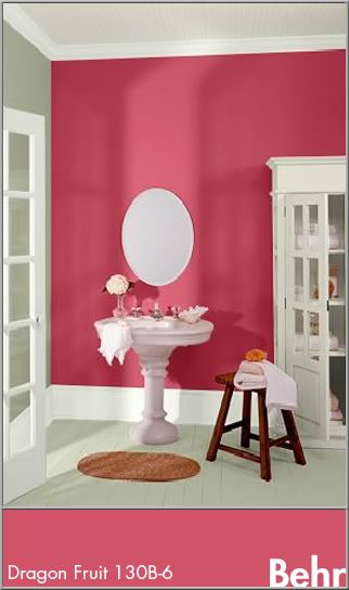
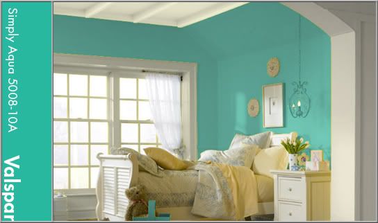
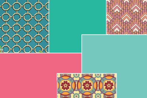
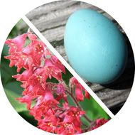
In this double dip of color, the melon-tinged pink of coral bells shares the stage with robin's egg blue. These two colors are a staple of late spring in some areas. Coral Bells (Heuchera) come in many varieties and are prized almost as much for their amazing foliage than they are for the bell-shaped blooms that perch on tall stems. They can thrive in full sun or shade depending on the variety and are a source of great visual interest in landscaping. Though the color of the flowers can vary, the most common flower color is a rich melon pink (PMS 709). This is a creamy color, tart and sweet all at once.

In design, the coral bell hues will naturally be appropriate for feminine ventures. Its freshness is great for food logos and design, such as dessert shops or paired with other bright colors and earth tones for an ethnic feel. This color is used a lot in Indian art and fabrics so it would be great for the logo and decor of an Indian restaurant. Due to the rich nature of this color, it does well as an accent in interior design. Its energy would naturally be at home in a kitchen, dining area, or bathroom. In this bathroom, coral bell pink is used on an accent wall with calm tones of gray (Behr: Hushed White W-F-710) and white (Behr: Off White int. flat enamel 1873).


Everyone seems to have a different idea of the exact hue of a robin's egg. Through research by matching a PMS book to an actual egg shell, I acquired the color you see featured in this blog post (PMS 570). A robin's egg is a bright teal with a hint of gray. This color is perfect for a wide array of uses and themes. It fits in well with beach themes or can be great for something with a bit of a vintage look as it is close to the 'pool' blue of the mid-twentieth century. For this look, group the color with black, white, and chrome or earth tones. It's relaxing, but not boring and would be a fresh and peaceful color for a bedroom. Robin's Egg is used here as an all-over color with trim painted in a crisp linen white (Valspar: December Starlight 7003-7).


These two colors add a lot of energy and excitement to any project. They can be very versatile and change feelings depending on their accents. Natural colors like these can tie us to creation without necessarily nailing us down to just bland earth tones. For your next project, see how you can use one of these amazing colors to take the interest up a few notches!


Tuesday, May 24, 2011

Thomas Maitland Cleland


If someone mentions Bauhaus, Bass, Rockwell, Pollack, or Warhol, designers and artists will know the names instantly and probably intimately. But what about Thomas Cleland? Who exactly is this person? Does anyone recognize the artist and designer who went by T. M. Cleland? Years ago, I bought an advertisement for Cadillac taken out of a Saturday Evening Post from 1928. I was enamored with the design and the illustration; the happy 'flappers' and bright red car against the soft green of the golf course. I managed to make out the signature on the ad and have been researching and collecting Cleland ever since.

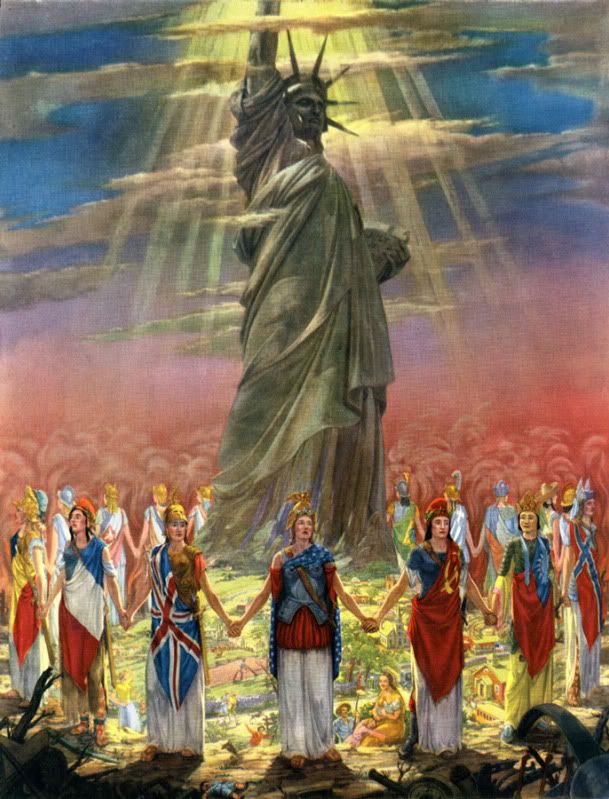
Thomas Maitland Cleland, the son of a Scottish doctor, was born on September 28th, 1880 in New York. When he was in his mid-teens, he convinced his parents to enrol him in the The Artist-Artisan Institute of New York. He saw this avenue as one that would bring easy success. After some time there, he had yet to find that particular thing to stoke his creative fire. One day, he observed a classmate designing a book ornament with pen and ink. He was in awe of the stark contrast and fine detail. This was the push he needed and soon his natural talent for detail and design blossomed. From here, he became a consummate and driven professional, running his own printing businesses at an early age. He took a break from his work (perhaps his only break from creative work) to serve in WWI.

His talents were almost savant-like. It is said that his knowledge of his field was encyclopaedic and intimidating. He was known to be taciturn at times, controlling, obsessed with perfection, and even 'quite a bit of a snob'. Cleland was proud of his self-taught profession, from print and typeface design (Della Robbia) to his complex and colorful illustrations and even set and costume design for plays.

He was married in 1905 to Elinor (formerly Nellie) Lane Woodruff. Elinor was 13 years his senior and preceded him in death by nearly 20 years; they had no children. He spent most of his later years in his home in rural Connecticut. Here, he continued his work designing and painting, building cabinetry and metalworking. He had an affection for dogs, debate and had quite an interesting circle of friends, one that included the more well-known artist, Rockwell Kent. Kent, who provided the frontispiece portrait of Cleland for the 1929 collection of his work had this to say of the artist, "... I may term myself his disciple. I proudly do. He was the most consummate craftsman of his time in every last least thing he did in all the many arts and crafts he ever undertook. His sensitive perception of beauty made him always keenly sensitive to ugliness..."


Though an innovator and master of his art, Cleland was extremely critical of 'modern' art and design. He felt the 'new' styles were lazy, distasteful, and lacked discipline. In an address to the Society of Typographic Arts on November 5th, 1948, he said, "Art was once the business of artists and not of writers and was taught to artists by other artists and not professors; and its rather wholesome definition seems to have been -- before anything was said about "art for art's sake" -- the doing of anything, from ploughing to painting especially well. Craftsmanship was not suspect or thought to be ruinous to individuality -- or perhaps individualities were not so feeble then that they could not survive the rigors imposed by craftsmanship. I do not know when the term "fine art" was invented and the breach between it and craftsmanship began to widen, but I have come to believe that it was a sorry day for both. For then, it seems to me, the spirit of art departed from its body and the body began to decay and the spirit to wander aimlessly in space."

In his career, he designed for Locomobile, Cadillac, the Red Cross, and served as the art director for 'Fortune' magazine. He's known today for his skill in art direction, but that seems to be the limit of his notoriety. He illustrated countless advertisements and books, many of the Heritage Press Limited Edition club stories of which he also designed the books themselves. His work was sold as prints and used to cap off magnificent wall calendars. Though his career was vast and his impact on those who knew him great, he remains an unknown. To this, I can only say, what a shame. There is much to be learned from a commitment and passion like Cleland's. No matter what style of art and design you choose, his work and words can be of great inspiration. Cleland died on November 9th, 1964, leaving behind a larger-than-life legacy and a collection of work to rival that of any master craftsman.


In his address to the American Institute of Graphic Arts on February 5th, 1940 entitled "Harsh Words", Cleland said, "And, remember, there is always progress to be made within yourselves, no matter if it is the same progress in the same direction that has been made by countless other souls. And there will, I hope, always be things new to you, as there are every day things new to me, even if the sun has seen them all before. I don’t want to live a day longer than I can learn."


Art from my collection: 
Cadillac advertisement from Saturday Evening Post, 1928.
"God Bless America and Her Allies" print, 1943
Rare hand-sketched rough and final Christmas greeting for Nestle's, 1919
"Romance" print taken from a Harris-Seybold calendar, 1948
Front and back cover illustration "Commerce" for Westvaco's 'Inspiration for Printers' magazine #82, 1933

Monday, May 2, 2011

Heal the Heartland

Heal the Heartland
original vector art, 11x17
©Rachael Sinclair 2011

Tuesday, April 5, 2011

Painted Easter Eggs

Around Easter time as a child, I remember watching my mother use a needle to drill a small hole in either end of an egg. She would then blow the contents into a dish, leaving a light and delicate shell. We would paint the shell in all sorts of styles and patterns; the possibilities were endless! I think projects like these were a primer for what I (with my mother's assistance) would do later on: painting life-sized fiberglass horses for a public art project. When almost anything can be your canvas, limits are few.

For centuries, egg decorating has been a staple in the springtime. Painting and decorating hollowed-out eggs is really fun and, I believe, develops one's patience. I will outline below the tools and procedure needed to create a cute decoration for your home or great gift for a friend.

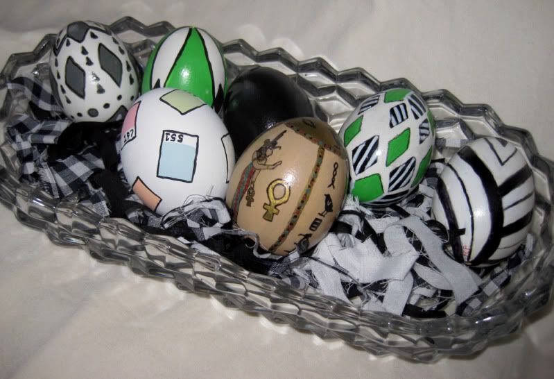
The black, green, and white eggs along the back were done by my mother.
I painted the ancient Egypt egg in my late teens and I did the Pantone chip egg this year.


What You Need:
egg (any type will do, but I prefer plain white large eggs.)
needle (upholstery or leatherworking needles are great, easier to hold and stronger)
bowl
paper towels
acrylic paints
paint brushes
thread and/or small guage wire
spray sealer/fixative
egg cup, pill bottle, or small sturdy object to hold the egg while drying
Optional
hair dryer
glue on jewels
scrapbooking decorations (stickers, embellishments)
beads
beading thread or cord

What To Do:
You will be putting your mouth on the egg, so wash the egg first with soap and warm water. Dry it well and use the needle to slowly poke holes at either end of the egg. I usually do this gradually, making small holes side by side until I make one large enough to allow the insides to escape. Once you start blowing on the egg, you may have to make your hole larger if nothing comes out.

Keep a towel handy to wipe away dampness along the way. With the egg over a bowl to catch the insides, blow through the hole on one end. You may have to use your needle or some small wire to loosen the insides and help break up the yolk. This process isn't swift, so be patient. You will know when the egg is hollow.

Use your faucet with a small stream and try to get some water inside the egg. Hold your fingers over the holes and shake. This will help to rinse out as much of the egg liquid as possible. Blow the water out. You can repeat this process until the water comes out relatively clear. Set the egg, one of the holes down, on some paper towels (like a nest) to drain further. I usually let them drain for 24 hours. Remember to use the egg contents for something great like an omelet or perhaps some cupcakes or cookies!

Once the egg has drained, it's time to decorate! Base coats aren't necessary, but I usually do a coat of white or black acrylic depending on the design I intend to implement. You will find that you cannot paint all of the egg at once (that patience thing I mentioned). Do one half at a time, setting the egg in a cup or rest on the mouth of a pill bottle to dry. Acrylic craft paint usually dries quickly, so you shouldn't have to wait long. If you desire, you can use a hair dryer on cool to speed the process.

If you choose, you can decorate your egg with pre-made embellishments, like the ones used for scrapbooking. Small, flat-backed items like buttons and jewels are also an option. Stick them on a flat-color painted egg for a striking effect. But keep in mind, eggs aren't flat like scrapbook pages. The smaller the items the better since larger items may not lay flat against the round surface.

Once you're satisfied with your egg, you can string some small wire through to give you something to hold to and spray coat the design with fixative. Matte finish is usually best and the easiest to work with. If you've used scrapbook or other elements as a design, this step isn't recommended. You may choose to spray coat the egg before attaching embellishments however. The spray coat helps reinforce the egg a bit, but remember, this is an egg and it is not indestructible. You may break a few, but if you're careful, you won't lose many.

There are many ways to display your eggs. You can string them like ornaments, set them one by one on a mantel, table, or windowsill, or put a group of them in a basket. You may find that once you've made one, you have the compulsion to make more. They make great hand-made gifts and can be reused from year to year if sealed properly and packed carefully. This is a fun craft that really gets the imagination churning. Pick up an egg and... see what hatches!

Wednesday, March 23, 2011

Happy Spring

Winter seems to have gone on forever; the gray days, the piles of snow, every color coated in frost. Though winter has its beauty, there are few things to compare with the trumpeting heralds of spring. The trees and flowers in my area have sprouted colorful wings and they fly like technicolor butterflies against the warming blue March sky. I've kept my camera with me everywhere I go for days! If you love color, if you're creative, now is a special time. Enjoy every second!


Tuesday, March 22, 2011

The Importance of Good Logo Design

It's the first thing the public sees. It's the short mission statement of a business. It can be dynamic, prolific, and legendary. Why then do so many dismiss the importance of good logo design? Creating a logo should be no small task. Any good designer knows distilling something down to its typographical and pictorial bones isn't always easy. A great logo can make a business and move mountains. A bad logo can be a disaster.

A logo should be a simple, yet comprehensive, statement of a person, place, or thing. It tells the world who someone is, what they believe. It explains a product or business in a quick glance, something that's very important in our fast-paced society. It can be a single image, a combination of images and words, or a person's name. Some logos are easy to recognize no matter where you're from or what language you speak. Take Nike for instance. Their iconic 'swoosh' is known almost instantly all over the world. Words aren't needed.


Another logo that succeeds world-wide is the blue oval with the signature of Henry Ford. That signature with the swirled 'F' has been around since the brand's inception. Though a customer may not speak English or read our words, they could recognize the script in the blue oval because of careful marketing strategies and a century of brand stability.

Some logos use simple graphics to elicit different feelings. Amazon's logo is a combination of the company name with an arrow-like 'smile' underneath. That happy appearance, combined with the vibrant, energetic color, assure the customer and liven sales. The arrow denotes speed, a much-desired hallmark in any e-commerce company. Though it's more than an image, (like the 'swoosh') or word (like Ford), this logo succeeds because it remains within the realm of 5-second recognition. The consumer doesn't have to spend a long time 'figuring it out' or trying to make sense of a lot of elements.

A logo must, first and foremost, tell the customer what you do. It must also convey your personal confidence, which in turn will give confidence to your customers. If a logo is hectic, with lots of colors, graphics, and text, the customer may feel ill at ease. Consumers don't feel like they can trust a business or individual who can't nail down a streamlined statement. It shouldn't be muddled with elements that don't translate well across platforms like photos and three-dimensional items. Logo design and reception is highly psychological; as is marketing. If your product or service is stellar, you may not think customers would be disturbed by a bad logo or messy advertisements; but people are wired to react adversely to something that doesn't look quite right.

Branding is the best investment someone can make in their business. Though a logo may change over the years, evolve with the times, a great one becomes an icon. Whether you're selling hand-made goods online, marketing a new brand of ice cream, or running for public office, the logo and materials you choose for yourself are always more important than you may believe. It's better to be safe than sorry, especially when there is so much on the line.

Thursday, March 10, 2011

Saul Bass

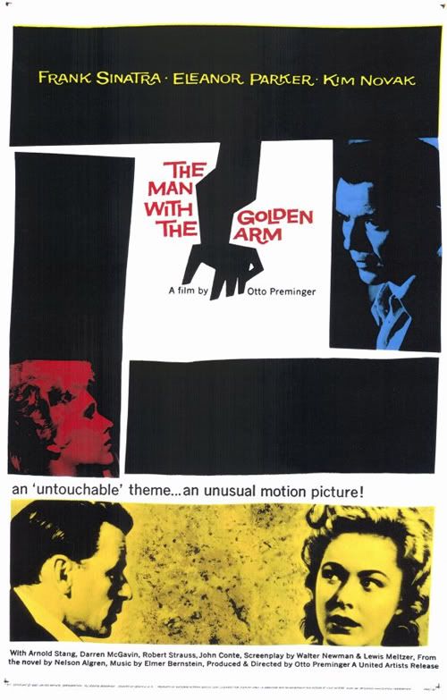
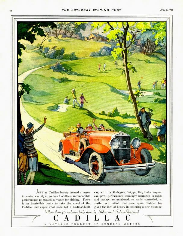
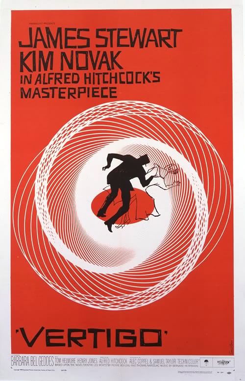
Though you may not have known at the time, you've likely seen the work of Saul Bass. Born in New York in 1920, Saul Bass was a key figure in graphic design. Some of his most notable work came in the form of poster and title design for films. Before Mr. Bass, most movie posters were paintings or head-shot photos of the film's famous stars. With his help, graphic design became an art form!

Perhaps one of his most famous works was the poster for 1955's The Man with the Golden Arm. The film's stars were still featured, but they were arranged in more dramatic fashion, eschewing the campy vignettes of years before. The lines were a bit off-level, a touch wavy; simple shapes had created tension where pearl-white smiles could not. When it came to animated title sequences, Bass was a master. I remember one in particular, the cheeky sequence for It's A Mad, Mad, Mad, Mad, World, one of my favorite movies. He worked with the greats like Alfred Hitchcock, Stanley Kubrick, and Martin Scorsese. He even designed the storyboards for the chilling 'shower scene' in Psycho.

Saul Bass went on to design posters and title sequences for 40 years, all the while, putting his mark on logo design. Ever hear of AT&T? The globe logo was designed by Bass. Like Girl Scout Cookies? That famous logo printed on the box, that's one of his. United Way, Quaker Oats, Kleenex, they're all Saul Bass.


Design started as a trade, but on the shoulders of Bass and visionaries like him, it grew into an art of its own. His work is still salient today, putting both the graphic and art in graphic arts.

Inspired by this amazing artist, I decided to throw a little Saul Bass style into a fun tribute to a favorite film of mine, Arsenic and Old Lace. It's not a straight copy of his style, but the influence shows through. I used haphazard lines and a bold, two-color presentation. The font is called 'Hitchcock' and can be downloaded here. Enjoy!


Arsenic and Old Lace
poster design © Rachael Sinclair 2011
film property of Warner Bros. Entertainment
no copyright infringement intended