Wednesday, December 15, 2010

Palette Cleanser: Holiday Cookie Recipes

I thought I'd deviate from the art and design world for a moment and post some of my favorite cookies recipes. Baked goods make great gifts for almost everyone. All of these would be great with a hot cup of coffee or tea. Celebrate the season by getting creative in the kitchen and have a wonderful holiday!

Best Chocolate Chip Cookies
I like this cookie for a number of reasons. The chopped oats add extra nutrition and a soft, nutty flavor. I like to add whole wheat flour when I can and reduce sugar. I call these my healthy pleasure.
1 c butter
1 c sugar (3/4 c for lighter taste)
1 c brown sugar
2 eggs
1/2 tsp vanilla
2 c flour (optional: 1 c all-purpose, 1 c whole wheat)
2 1/2 c quick oats *
1 tsp baking soda
1 tsp baking powder
1/2 tsp salt
8 oz chocolate chips or candy-coated chocolate pieces (For the cookies in the photo, I used both candy-coated chocolate pieces and mini chocolate chips.)

Cream the butter and both sugars. Add eggs and vanilla. In a separate bowl, combine flour, oatmeal, baking soda, baking powder, and salt. Mix dry into wet ingredients then add chocolate chips. Roll into teaspoon-sized balls, flatten in your palms, and place two inches apart on a cookie sheet. Bake for 10 minutes at 375 °. Cool on wire rack.

*Place measured oats in blender or food processor and chop into a flour-like powder.

Chewy Ginger Cookies
This cookie is a hit and they never last long. For a lover of ginger, they're a soft wonder enrobed in caramelized sugar. Another not, when made at a reasonable size, each cookie works out to 1 point in the Weight Watcher's point system.
6 tbls butter, softened
2/3 c sugar
1/4 c molasses
1 egg
2 c all-purpose flour
2 tsp baking soda
1 tsp ground ginger
1 tsp ground cinnamon
1/2 tsp ground nutmeg
3 tbls sugar

Cream butter; gradually add 2/3 cup sugar, beating until light and fluffy. Add molasses and egg; beat well. Combine flour and next 4 ingredients; gradually add to creamed mixture, stirring until well blended. Wrap dough in plastic wrap, and freeze for 30 minutes. Shape dough into 1-inch balls, and roll in remaining 3 tablespoons sugar. Place 2 inches apart on cookie sheets coated with cooking spray. Bake at 350º for 12 minutes or until lightly browned. Remove from sheets; cool on wire racks.

Grandma's Peanut Butter Cookies
The is the recipe my grandmother and I used to bake when I was a child. They hold a special place in my heart. They're not overly nutty, but just enough. Baked just right, they melt in your mouth!
1 c sugar
1 c brown sugar
1 c butter (or 1/2 c butter and 1/2 c shortening)
1 c peanut butter, crunchy or creamy
2 eggs
1 tsp vanilla
3 c (approximately) all-purpose flour
2 tsp baking soda
1/8 tsp salt

Combine sugars and butter, beat until creamy. Add peanut butter, eggs, and vanilla. Combine dry ingredients in a separate bowl and add to peanut butter mixture gradually. Roll teaspoon amounts of dough into balls and place on a cookie sheet. Dip a fork in sugar and make a crisscross pattern on top of the cookie, flattening slightly. If dough is too sticky to roll immediately, refrigerate for about 30 minutes before rolling. Bake in a preheated 350º oven for 8 to 12 minutes or until lightly browned around the edges. Cool on wire rack.

Chewy Chocolate-Ginger Cookies
I decided to try this recipe (I usually don't like Martha's recipes) and I'm glad I did. I love the heat brought by the fresh grated ginger. They're especially nice with a nice steaming cup of artisan dark roast coffee!
You can find this recipe at here through Martha Stewart's Web site.


Wednesday, December 8, 2010

Idea Seeds: Santa Claus

Santa Claus is one of the most recognizable symbols of the holiday season. His rosy cheeks, hearty laughter, and flowing white beard seem synonymous with jollity. He's had songs written about him, poems, been featured in plays and movies. He's the star of the most famous parade in America, the Macy's Thanksgiving Parade. Santa has also been used in a consecutively successful advertising campaign by none other than Coca-Cola.

Though Santa Claus has a rich and sometimes polarizing history, the version we think of most today was spearheaded by cartoonist and illustrator Thomas Nast in the mid-1800's. Nast was also the 'father' of the Republican and Democrat animal mascots. His Santa, featured on the cover of Harper's Weekly, was portly, wore a hat and fur-trimmed coat, and had a long beard.

A figure like Santa was bound to be popular, but his popularity and image reached new heights when he was tapped to be the holiday spokesperson for Coca-Cola in the 1930's. This image, designed by Haddon Sundbloom, brought the jovial elf into thousands of homes and even caused some to speculate red and white had been chosen for his clothes because they were Coca-Cola's colors. It is believed, however, Santa wore red and white long before then.

Santa Claus is not so much a person as he is a feeling. Most of us can recall the days and nights leading up to Christmas and how excited we all were at the thought of being visited by the man from the North Pole. Being so popular, Santa has been depicted in a myriad of ways. I charge you to use this Idea Seed to come up with your own image of Santa. Be creative, be different, be you. Merry Christmas to all and to all a good night!


"Ho, Ho, Ho Like An Egyptian"
original digital art

Hieroglyphs translate roughly as:
Across the top: Christ the King is born today.
Left side border: Joy to the world
Right side border: the Lord is come
Within the frame: Santa Claus says Merry Christmas

Wednesday, November 24, 2010

Happy Thanksgiving

Thanksgiving has always been my favorite holiday. Even as a child, I looked forward to the Thursday in November almost more than I did the gift giving of Christmas. There's something pure about Thanksgiving, something selfless. On this holiday, let us celebrate the blessed things in our lives. Let us put away our worries and fears. As we join with our families and loved ones over a hearty meal, let us truly give thanks. Have a wonderful holiday everyone!


Give Thanks
Illustration and Typography
© Rachael Sinclair 2010

Color Flavor: Pumpkin

November brings the promise of food, family, and fellowship. Many may celebrate the month and the Thanksgiving holiday by partaking in a slice of pumpkin pie. Creamy and hearty with a dollop of whipped cream, there's almost nothing that says autumn like this dessert. We may also decorate our homes with gourds of all types, a festive reminder of harvest. The earthy umber of pumpkin is a perfect hue for design.

Pumpkin is not as bright and jarring as some orange tints. When a color, especially a warm color, is used in its pure form, it can appear cheap and unnatural. Pumpkin tints orange with browns and golds to ease the brightness, but manages to stay warm and vivid. Consider the different hues of the pumpkin flesh as opposed to the inside of the gourd. The flesh is oftentimes dusted with dirt and bleached by the sun where the inside of the pumpkin is damp and saturated with color. Each of these variants can be used in design to invoke a number of feelings.

Being a warm color and taken from a food, pumpkin is great for promotional items about food and cooking. Orange is an appetite stimulator, so use with these types of things is almost a given. Pumpkin is also a bit spicy and would work well with things that need an ethnic and worldly touch. Being a shade of orange makes pumpkin an energy stimulant. Vibrant and alive, it's a perfect accent color for things you want people to see quickly. Being close in relation to the color of a basketball, pumpkin would work as a color for sports promotion as well.

Using pumpkin in interior design is a tasty treat. As it is an energetic color and on the warm side, I recommend using it in office and kitchen areas. In this office, a brighter, fresher pumpkin is featured on an accent wall. The rest of the space is done in a buttery cream and warm putty color. A light sky blue placed strategically adds a hint of wide-open relaxation to the highly stimulating work area.


In this kitchen, the pumpkin hue is more matched to a gourd's flesh. It's a dusty, yet spicy color and plays well with the eggplant aubergine. It's used again on an accent wall as not to overwhelm. White trim pops with freshness, aided by a corn husk-like gold and springy green.


When you indulge in a slice of pumpkin pie, take in the color. This treat is more than just a slice of harvest heaven, it's ripe with inspiration. The next time you need an energetic spark of happy, try pumpkin in your design recipe.

Patterns sampled from here.

Monday, November 8, 2010

Jennie Augusta Brownscombe

Among the artistic depictions of the first Thanksgiving shines one by 'Colonial Revival' artist Jennie Augusta Brownscombe. This particular oil on canvas (titled aptly, 'The First Thanksgiving') was painted in 1914 and published in Life magazine where it reached a wide audience. The sweeping composition and attention to detail make her view of Thanksgiving's advent particularly engaging.

Given the distinction by some as being 'the Norman Rockwell of her time', Brownscombe was born in Pennsylvania in 1850. Her mother, Elvira Kennedy, was a descendant of an original Mayflower passenger. She was an artist from an early age and by 1868 was supporting herself with her craft by selling illustrations to magazines and licensing her paintings for reproduction. She studied in New York and France, lived in Rome and had exhibits of her work there and in London.

Studies of every day life have long been a passion for artists. There's a sense of oneness with the art when you can relate to its subject. In one piece, we see the happy faces of a family reunited while a cat looks on, the rustic shingles on the house testifying to Brownscombe's skill. In another, we join a procession of colonials on their way to church on Sunday morning. It is peppered with such minute details as a branch in the young boy's hand and cattle grazing in the background. Brownscombe painted what she knew, emotions she could connect with. Her use of color was joyful and engaging, her subjects like family.

Jennie Brownscombe was a pilgrim in her own way, making a name and life for herself in a time when most women were still housewives and mothers. She tapped into a talent and nostalgia that warmed the hearts of her viewers. Artists like Brownscombe place a mirror to our lives, forcing us to see the beauty in every day. Creative types can sometimes become bogged down with visions of the fantastic. A reminder of the subtle grace of life is always welcome.


Sunday, October 31, 2010

Happy Halloween

Ghost House
by Robert Frost

I dwell in a lonely house I know
That vanished many a summer ago,
   And left no trace but the cellar walls,
   And a cellar in which the daylight falls,
And the purple-stemmed wild raspberries grow.

O’er ruined fences the grape-vines shield
The woods come back to the mowing field;
   The orchard tree has grown one copse
   Of new wood and old where the woodpecker chops;
The footpath down to the well is healed.

I dwell with a strangely aching heart
In that vanished abode there far apart
   On that disused and forgotten road
   That has no dust-bath now for the toad.
Night comes; the black bats tumble and dart;

The whippoorwill is coming to shout
And hush and cluck and flutter about:
   I hear him begin far enough away
   Full many a time to say his say
Before he arrives to say it out.

It is under the small, dim, summer star.
I know not who these mute folk are
   Who share the unlit place with me—
   Those stones out under the low-limbed tree
Doubtless bear names that the mosses mar.

They are tireless folk, but slow and sad,
Though two, close-keeping, are lass and lad,—
   With none among them that ever sings,
   And yet, in view of how many things,
As sweet companions as might be had.

Friday, October 29, 2010

Design Dissection: Sleepy Hollow

“What was to be done? To turn and fly was now too late; and besides, what chance was there of escaping ghost or goblin, if such it was, which could ride upon the wings of the wind?” -Washington Irving, The Legend of Sleepy Hollow


There are few things as frightening as a ghost that can haunt and kill without necessity of a head. The original text of "The Legend of Sleepy Hollow" was included in The Sketch Book of Geoffrey Crayon, published in 1820. Set in the 1790's, Legend follows the story of Ichabod Crane, a nervous schoolmaster. Ichabod relocates to a glen of Tarry Town called Sleepy Hollow, where he encounters the horrific tale of the Headless Horseman. In 1999, Tim Burton released his own adaptation of the story starring Johnny Depp as Crane, a forensic investigator from New York. Burton's story, though it deviates from the original, was an amazing romp. The visuals and atmosphere were particularly notable. "The Legend of Sleepy Hollow" is one of my favorite scary stores of all time so I've chosen Burton's film for this installment of Design Dissection.

From the first, Sleepy Hollow swaths the viewer in a dusty, faded shroud of terror. We're party to the first killings of the horseman against a tumultuous evening sky. Gelatinous blood splatters on the foreboding face of a scarecrow and the stage is set. The promotional title is wrought in a jagged, heavy-inked script, a typeface that looks like the writing of calligrapher who is under great emotional distress. The tails on the font are drawn down like the slice of a blade, most apropos. The film titles are aged but elegant in serif small caps. Text appears against shots of the New England countryside and the hurried trek of a carriage. The letters react to their visual field, fading like fog, wavering like sun through the trees, and falling like autumn leaves.

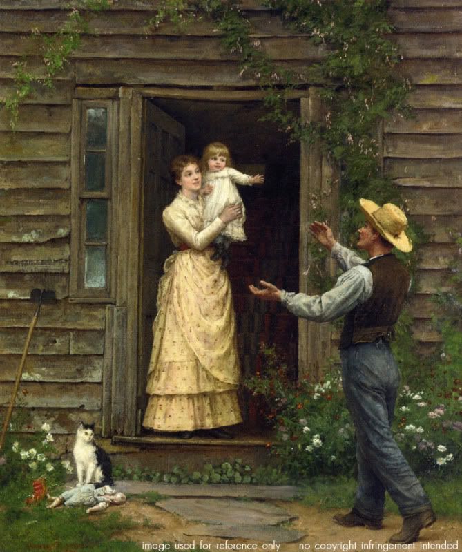
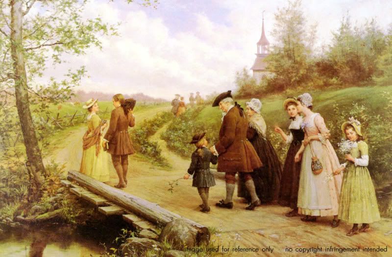
Costuming is period appropriate. The men wear breeches, buckled shoes or riding boots, longcoats, cravats, and powdered wigs. The women are laced in corsets, their dresses flaring in large bells. To match the atmosphere, everyone seems washed out, something that gives the red of spilled blood even more impact. An interesting color note; most of the blacks in costuming and even the sets are a dusty tone, more like charcoal. True blacks are used sparingly. The overall feel of the film is reminiscent of an early 19th century portrait or perhaps a folk-art painting. The sets, even those 'out of doors' are intimate, like a stage production (as is natural considering nearly everything was filmed inside a studio building). The cinematography places actors and structures like elements of a folksy illustration. Symmetry is used as a character itself, creating stiffness and tension against the wispy mist and twisted trees.

The Headless Horseman merits mention all to himself. The costume designer, Colleen Atwood, did a magnificent job with the wardrobe. The 'Hessian' looks all the part of a long-dead phantom with a worm-eaten cape and body armor in a perpetual coating of Hudson Valley mud. Though otherworldly, the horseman is all too real, from his thorny spurs and snake-hilted sword to his frothing black charge. The hellfire is in the actions of this ghost, not spewing from the nostrils of his horse.

As I mentioned before, Burton's film is faded and weather-worn. Grays, browns, sun-bleached blues and yellows are abound. The reds are artificial, like the stain of old rouge on a powder-white cheek. The startlingly clean and soft hair treatments and luxurious wardrobe fabrics add a softer touch to the textures of the film. Without them, we would have only element-tortured wood and leaf-littered forest floor.

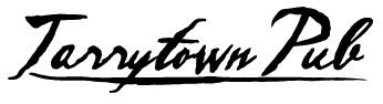
It's easy to get bogged down in the theme of a film like this and find it difficult to appreciate the elements and feel on their own. As usual, we will start with typefaces. Inked scripts like the one used for the promotional title can conjure a few things. Scripts in general are more organic, as one might expect from something patterned after handwriting. Calligraphic scripts are elegant; simple ones appearing masculine while those with long sweeping tails can seem more feminine. Meter of stroke is important as well. The typeface used for the promotional title is thick as if the stylus was held with the wide part of the nib perpendicular to the baseline. The ink flows freely and heavily. For this reason, the words aren't always easy to make out at a distance. Usage should be contained to one or two words. This breed of script would be good for masculine branding and perhaps a fine clothier or a pub-like eatery.

The film titles are done in a serif font that appears to have oxidized over time. The strokes waver, but remain strong. This type of lettering is useful for blocks of text as well as names and titles. As a basic serif, the uses are endless, but this one, with its added age character, is especially good for things relating to 'old world', antique, or well-worn and treasured items. This face would be appropriate on materials for a high-end furniture store, attractions relating to history, financial institutions, or blogs.


Atmosphere is key in designing with Sleepy Hollow elements. As stated above, the feel of the film is heavy, foreboding, and misty, yet artificial and nonthreatening; much like the Hammer films that lent Burton inspiration. Lighting remains soft and mostly even. This lighting can be used to decrease the dark sharpness of any design and is good for things that need to appear aged or vintage. Use colors, textures, and effects that play up and with diffused light. Use black perhaps only in logos, accent items, or text.

Speaking of colors, 
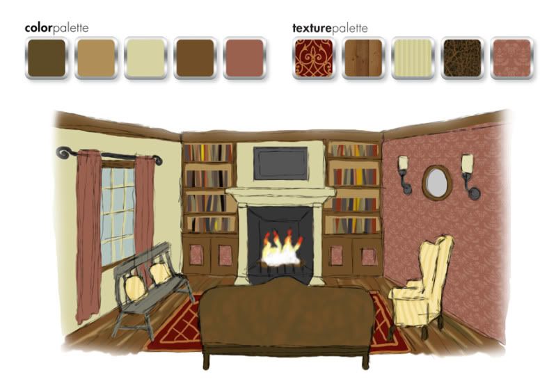
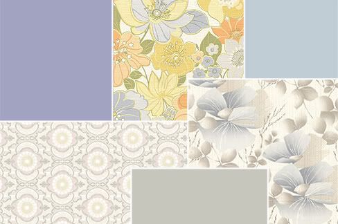
Sleepy Hollow presents a rather muted rainbow. Presumably set in late autumn/early winter, the colors are washed out and heavily tinted brown. Colors like these, again, are good for vintage schemes, but also for earthy palettes and seasonal items. Textures are those of era-appropriate fabrics and furnishings. Damask print, faint stripes, satin, lace, and rough wood can be used to infuse any design with a late 19th century Hudson Valley feel. Low contrast patterns are excellent as backgrounds for web sites or print media. Don't be afraid to use wood grains in these schemes as well.


When decorating a space in Sleepy Hollow style, remember it only takes a few steps too far to lose your head. I suggest this look for a dining area, living room, or bedroom. For this example, I've chosen a living room with a fireplace. Start with neutral walls in your preferred film hue. Pale mustard, muted moss, or misty gray blue would be nice. Choose an accent wall and adorn with a damask print (or a black and white stripe, something featured quite a bit in Burton design) that coordinates with the other wall colors. For furniture, choose classic pieces but nothing overly ornate. Wood constructed lounge chairs work well, as do spindle-back chairs and benches. This time period was reserved in a lot of respects; the simplicity in furnishings due partially to availability of supplies and labor in the small farm towns.

For window treatments, I suggest plain drapes that extend to the floor in a coordinating color. Hang these from a wrought-iron-looking rod with swirled finials. (Tim Burton's style often includes swirls.) Rustic paneled shutters would work too. Wall adornments should be sparse. If you wish to hang art or mirrors, choose modest frames. Electric wall sconces or 'wireless' ones with large candles or oil lamps would be appropriate. Choose a sconce that is antique in design. Table and floor lamps would be nice, perhaps ones with a rustic iron finish. Built-in bookcases in stained wood are optimal, ones with decorative molding at the top and bottom. Hide the bottom shelves (if you have some) behind modest doors, perhaps inlaid with the damask pattern from the walls. This shelving should frame the fireplace, the mantel being understated but still maintain a presence

Texture is always important. As I've stated before, bare rustic wood is fitting. You can upholster modestly in stripes and less modestly in leather. Instead of heavy upholstery, consider cushions in muslin or pillows in quilt prints. Wood floors are best, but area rugs in understated 'oriental' patterns can add the right touch regardless of flooring.


A gore-filled film about decapitation is a treat on Halloween, but the design is just the trick for all kinds of looks. So when the air gusts cold and the Jack-o-lanterns burn, cast an eye to the western woods and capture some chilling design inspiration.

Monday, September 27, 2010

Color Flavor: Mistflower

Autumn gives spring a run for it's money when it comes to color. The majestic displays of harvest have few rivals in the beauty department. When we think of autumn, we usually think of golds, reds, oranges, and browns. Perhaps we throw in a bit of yellow-green for good measure. But autumn holds a secret, a small clutch of color that's often overlooked because the competition is so energetic. I speak of the pale dusky lavender of the Mistflower.

A late-blooming perennial, the Mistflower can be found in fields, on the roadside, or in the wooded areas. It has a head of bunched flowers in delicate purple with wispy star-burst petals. A color like this is almost guaranteed to calm. It's soft and cool, but not cold thanks to a slight tint of purple. Mistflower would be perfect for a children's store logo, a country-themed craft business, or a yoga web site. Though blue is often considered masculine, this color is a bit more feminine and can add gentleness to logos, promotional materials, web sites, or rooms.

When using Mistflower in interior design, it's important to remember the attitude of the color. As stated above, Mistflower is calming with a hint of warmth. It doesn't have quite the warmth of lavender, but it's perfect for bedrooms, baby's rooms, and odd spaces like entry ways. Use this color where you'd like a bit of peace. In the samples, two tones of Mistflower are used. In the first sample, a bedroom, the ceiling and corresponding rug frame an accent wall in cool peacock blue. A fruity, buttery peach adds warmth on the trim and in the linens with a luke-warm white rounding out the wall color.


This entry way uses a slightly more blue version of our color on the walls. A darker Atlantic blue deepens the ceiling. The warm golden oak wood of the door frame and trim pairs well with the wheat on the door, carpet, and staircase insets. Though the walls and ceiling are blue, traditionally a cold color, the entryway is warm and comforting. It's just the right recipe to welcome those who enter the home.


When the wind whistles chilly and the trees are set aflame by season's change, remember that autumn's splendor isn't always in drapes of crimson and gold. The next time you need a color with just the right balance of warmth and serenity, give Mistflower a try.

Patterns sampled from here.

Thursday, September 23, 2010

Idea Seeds: Rhapsody in Blue


George Gershwin was a perhaps one of the most talented and prolific composers the United States has ever seen. In his relatively short life, he composed a number of symphonic pieces, an opera, and many pop-style songs, many of which featured lyrics written by his brother Ira. George's work has a style that speaks to his time, a time of prosperity and progress. Rhapsody in Blue is arguably his most famous piece with it's energetic allegros and sweeping melody. It's very lyrical and imaginative, something particularly engaging for a creative thinker. This is why I chose the piece for this installment of Idea Seeds.

Disney incorporated the piece into its second Fantasia collection and did an amazing job capturing what many of us imagine when we hear the music. Today, if you have a moment, find a recording of Rhapsody in Blue and listen. Close your eyes and let your mind take you on an amazing journey.


Rhapsody
vector illustration
© Rachael Sinclair 2010

Tuesday, September 14, 2010

A Bright Place to Lay Their Heads

I was browsing blogs one day and came across a post on Made about ConKerr Cancer: A Case for Smiles. The fabric used in the post caught my eye and I read the post, not really knowing what it was about. When I learned about ConKerr and what they do, I decided I had to help. ConKerr Cancer distributes handmade pillowcases to children in hospitals. Those pillowcases help to bring a little warmth and comfort in a scary time.

I took down my measurements and went shopping, eventually buying enough fabric for ten pillowcases. I used the 'hot-dog' method, something you can find on ConKerr's site. The tutorial on Made is great too. Once I got started, the cases became easier and easier to construct. I loved watching them come together.

If you sew, even if you're just starting out, these cases are a relatively easy project that really warm the heart. Visit ConKerr's site, linked above, for complete details and a list of representatives in your area. They made me smile and I hope they will do the same for the children.

Thursday, September 9, 2010

Design Dissection: Kojak


Who loves ya baby? Kojak loves ya. Telly Savalas turned a name into an icon in the 70's series Kojak. Theo Kojak was a tough New York detective with a soft spot for nearly lost causes, cigarillos, pretty ladies, and lollipops. In true 70's form, the series was full of smoky rooms, gritty streets, drab earthtones, and ugly cars. But there is something to learn from the look an attitude of a television series no matter when it was made or the era in which it was set.

A series about a police detective, especially one set in the rough city of New York needs a font that conveys authority. The Kojak title font (word in all caps) is something akin to Boris Black Bloxx or Musa. This is a san-serif with thick strokes and a more circular 'o'. It's got authority, but doesn't take itself too seriously as noted by the squat letters. Credit fonts were san-serif as well, keeping with the theme nicely.

The colors of Kojak were the quintessential colors of the 1970's. Browns, golds, and reds are abound. The scenes seemed to all be tinted slightly yellow. Though action took place outside of the squad room quite often, a look at the scenes within the precinct headquarters gives us a more Kojak-specific color and texture range. As one may have expected for the time and area, the Manhattan South squad room was housed in an old building. The furnishings were haphazard and everything was awash in a thin film of aged grime. The walls, painted various shades of institutional green, were peppered with posters and tattooed with cracks and stains. The equipment, phones, and dingy holding cell were all very rough. The only spot of freshness in the musty squad room was Savros' houseplant.

When it came to wardrobe, each character had a particular style. Kojak went for gray and pinstriped three-piece suits, long overcoats with popped collars, and black fedora hats. Bobby Crocker was a tweed and corduroy kind of guy, mostly in tones of khaki, camel, and brown. Captain McNeil was the grandfatherly type, wearing drab, loose-fitting suits and blazers. He seemed like he would be perfectly at home in an old cardigan. In black or brown pants, white shirt, and skinny tie, Saperstein was the classic overworked officer. Stavros was the token sloppy guy who always seemed to have his tie undone just a bit.

To dissect Kojak and reassemble the elements is easy baby! First, as in any dissection, one needs to think about the kind of feeling these things convey. For instance, san-serifs are usually considered a bit more laid-back than serif fonts, but they can also carry an air of stiffness. This font is blocky and thick, indicating strength with a little playfulness. Nothing says playful quite like a toy store. Lollipops Toys & Gifts is a great example.

A font with a squat stature allows for a circular 'o', something that adds even more 'common grit' as elongated letters often convey aristocracy and elegance. This font would work well as a title font for a novel or other entertainment endeavor in the gritty, witty mystery department. See example for 'Mojo'.

Another font choice with a Kojak feel would be a typewriter font. In this age before office computers and printers, typewriters were still prevalent. A handwritten script would also be acceptable considering the fact that messages would have been written and not emailed as we do today. The logo for Stella's Couture has a bit of both with a script 'S' and typewriter name. This logo also features a 70's inspired pattern. Bold, oftentimes monochromatic, patterns figured greatly into the fashion and décor of the 70's. This particular pattern would have been wallpaper in a victim's home or the print on a woman's dress. Kojak himself favored stripes and the occasional silk paisley.

Tiled patterns are great for web sites. Use monochromatic patterns with gradations or low contrast as backgrounds. Don't get too busy though as this may tire the viewer's eyes. Natural fabric textures, coffee ring-stained paper and clean or distressed metals are good for backgrounds too. These can play well as canvases for compartmentalized page elements. 70's colors are also good on the web, but beware of overly bright warm tones. Use these in accents only.

Using Kojak as an inspiration in décor can sound like a acid-trip disaster. A little bit of the 70's can go a long way and you certainly don't want to overdo it. Consider for an office an earthy moss green such as Aloe Essence (460D-4) on the upper wall and Billiard Room (480D-6) on the beadboard wainscoting with a trim color of Informal Ivory (330E-1), all from Behr. Build on that with a vintage metal desk and an understated office chair perhaps upholstered in tweed. Don't be shy of tall metal filing cabinets. In the right color, one of these in the corner can be a great place for storage of all kinds. Adorn windows with roman shades in natural muslin textures. A vintage-looking fan adds perfect punctuation, as does a few framed prints, perhaps black and white photos of Manhattan. Further accent with small potted plants on a low mod-styled table and a 60's or 70's-styled desk phone.


See, we've solved the mystery and like that. When you put aside the blatant time-period styles of something like an old TV show and focus on the pieces alone, you can create something new and fun. No matter what flavor Tootsie Pop you like, you're sure to find something useful in the life of Detective Theo Kojak.

Wednesday, September 8, 2010

Fashion Frankenstein: New Life for Old Clothes

In an earlier post, I discussed how unexpected things can be repurposed as storage. But that's not as far as repurposing goes. What happens when you get a stain on your favorite shirt or there's a rip in those jeans you now can't bear to wear in public? What about thrift shopping? Can a $2.50 sweatshirt really get a new life? I say yes!

Sometimes I grab something like a spent pair of my husband's jeans or a team sweatshirt from Goodwill and stare at it. I literally eye-ball the thing with a vengeance, trying to see what's 'inside' it. Just because something started as pants or a shirt, doesn't mean it can't be something else. After all, these things are simply pattern pieces cut from fabric just like anything else. 

Jeans, paired with sewing scraps, perhaps those from an old button-down shirt, can become a stuffed animal like these owls.

A sweatshirt, paired with another one for lining, can be deconstructed and given a new life as a shoulder bag. This purse had a material cost of under $10. I even used the left-over scraps and stretchy band from the bottom to make some fingerless mittens. They're toasty!

So what do you have lying around? Do you have some fabric that is currently living life as an old skirt with a bleach spot or a pullover with a tear. Is it secretly dreaming of being something more? Have some one-on-one time with your old clothes, ask them what they want to be, and make it happen! If you doubt your creativity at first, there are a number of sites and blogs with patterns and instructions. Do a search and go from there. But the next time you think of tossing out those clothes, don't; let them be reborn!

Sunday, September 5, 2010

Idea Seeds: Orchard

Orchards are beautiful places, not just for the scenery, but for the produce. I've been going to orchards since I was a child. There's nothing quite like picking your own fruit and vegetables. I especially love to pick apples. Picking apples is a rite of passage from summer to fall. They signal the beginning of pie and cider season. 

Today's Idea Seed is orchard. Have you ever been to an orchard? If so, what memories do you have? What creative things spring to mind? Maybe you got to take a hay ride. Maybe you saw how they pressed apples to make cider. If you've never visited an orchard and there's one within a reasonable distance, make a point to pop in.

Pie Potential
photography
© Rachael Sinclair 2010

Tuesday, August 31, 2010

Charles Rennie Mackintosh


Art nouveau, arts and crafts, and art deco are some of the most popular types of art and architecture. There's something breathtaking and decadent about the lines and materials. In the midst of artists like Tamara de Lempicka and Erté and the achievements of architects the world over, we find Charles Rennie Mackintosh. Born in Glasgow, Scotland, Mackintosh was talented in many creative fields, but is perhaps most well known for his architecture.

Throughout his life, Mackintosh displayed a singular style, one that ran closely with those of his contemporaries, but still had its own flair. One of his signature elements was a highly stylized rose. You can find it on a number of his pieces, whether architecturally or in paintings. He utilized vertical lines in long succession, peaceful symmetry, and tone saturation in paint and materials. The lines, textures, and figures were a pleasing hybrid of nouveau and deco. His less architectural work still maintained a bone of structure that was very Mackintosh. Human figures and flower stems were long and lean, curving like ceiling trusses.


What's popular is often imitated, most of the time by 'small fish in big pond' artists and architects, people whose names escape the scholar's tongue. The art styles of the day can bring accolades, but a true craftsman must always put a individual stamp on his or her work. Mackintosh was a quintessential creative of his era, but his work is one that people can instantly recognize. For that reason, he set himself apart and made himself a singular cultivator of inspiration.

Sunday, August 29, 2010

Imagine the Possibilities: Unexpected Organization

It seems we're always searching for ways to organize our lives. Sometimes, those of us with a stubborn creative streak (and a stubborn thrifty streak) try to organize in fun, cost-efficient ways. In an environmentally conscious world, we could all use to reuse. So why not look for unexpected ways to store and organize?


Over the years, I've kept a keen eye out for new ways to recycle, collect, surprise, and store. It all started with an old GE refrigerator we bought for $5 at a Habitat ReStore. We needed more cabinet space in our tiny kitchen without the thousands of dollars spent for a remodel. We gutted the fridge, cleaning out the old cooling motor and coils, insulation and rust, then repainted the outside. The 'fridge' holds cereal, snacks, chips, and canned goods. The door shelves are perfect for medications and vitamins. The small white Westinghouse cabinet followed as a way to store dog treats and food. On the wall hangs a medicine cabinet. This holds my spices and the mirror makes the small room seem a little bigger.

As a crafter, I'm always trying to find better ways to store my supplies. This folding magazine rack doubles as a filing cabinet. The two Sears Happi-Time toy kitchen pieces are essentially metal cabinets painted to look like a fridge and sink. I picked these up in an antique store's rough room at a steal. Canvas storage bins keep my fabric safe from the minimal rust. They may not look like storage, but they fit the bill while being ridiculously cute and vintage.

Storage and décor doesn't always have to march to the same old drummer. Finding new and creative ways to reuse furniture and various other things is almost as fun as painting, designing, sewing, or blogging. When you see something at a thrift shop, vintage or antique store, estate or yard sale, look at it with an eye to the potential. With a little imagination, elbow grease, and soapy water, something old can be new again in more ways than one!