Tuesday, August 31, 2010

Charles Rennie Mackintosh


Art nouveau, arts and crafts, and art deco are some of the most popular types of art and architecture. There's something breathtaking and decadent about the lines and materials. In the midst of artists like Tamara de Lempicka and Erté and the achievements of architects the world over, we find Charles Rennie Mackintosh. Born in Glasgow, Scotland, Mackintosh was talented in many creative fields, but is perhaps most well known for his architecture.

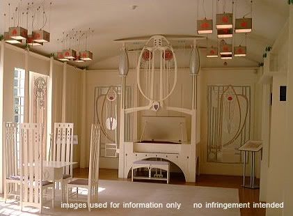
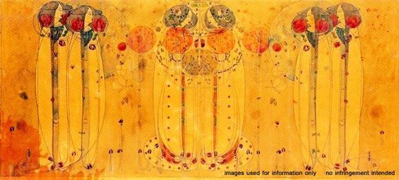
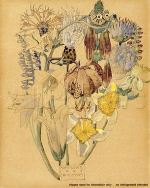
Throughout his life, Mackintosh displayed a singular style, one that ran closely with those of his contemporaries, but still had its own flair. One of his signature elements was a highly stylized rose. You can find it on a number of his pieces, whether architecturally or in paintings. He utilized vertical lines in long succession, peaceful symmetry, and tone saturation in paint and materials. The lines, textures, and figures were a pleasing hybrid of nouveau and deco. His less architectural work still maintained a bone of structure that was very Mackintosh. Human figures and flower stems were long and lean, curving like ceiling trusses.


What's popular is often imitated, most of the time by 'small fish in big pond' artists and architects, people whose names escape the scholar's tongue. The art styles of the day can bring accolades, but a true craftsman must always put a individual stamp on his or her work. Mackintosh was a quintessential creative of his era, but his work is one that people can instantly recognize. For that reason, he set himself apart and made himself a singular cultivator of inspiration.

Sunday, August 29, 2010

Imagine the Possibilities: Unexpected Organization

It seems we're always searching for ways to organize our lives. Sometimes, those of us with a stubborn creative streak (and a stubborn thrifty streak) try to organize in fun, cost-efficient ways. In an environmentally conscious world, we could all use to reuse. So why not look for unexpected ways to store and organize?


Over the years, I've kept a keen eye out for new ways to recycle, collect, surprise, and store. It all started with an old GE refrigerator we bought for $5 at a Habitat ReStore. We needed more cabinet space in our tiny kitchen without the thousands of dollars spent for a remodel. We gutted the fridge, cleaning out the old cooling motor and coils, insulation and rust, then repainted the outside. The 'fridge' holds cereal, snacks, chips, and canned goods. The door shelves are perfect for medications and vitamins. The small white Westinghouse cabinet followed as a way to store dog treats and food. On the wall hangs a medicine cabinet. This holds my spices and the mirror makes the small room seem a little bigger.

As a crafter, I'm always trying to find better ways to store my supplies. This folding magazine rack doubles as a filing cabinet. The two Sears Happi-Time toy kitchen pieces are essentially metal cabinets painted to look like a fridge and sink. I picked these up in an antique store's rough room at a steal. Canvas storage bins keep my fabric safe from the minimal rust. They may not look like storage, but they fit the bill while being ridiculously cute and vintage.

Storage and décor doesn't always have to march to the same old drummer. Finding new and creative ways to reuse furniture and various other things is almost as fun as painting, designing, sewing, or blogging. When you see something at a thrift shop, vintage or antique store, estate or yard sale, look at it with an eye to the potential. With a little imagination, elbow grease, and soapy water, something old can be new again in more ways than one!

Thursday, August 26, 2010

Idea Seeds: Autumn


There seems to be a special place in the hearts of many creative types for the season of Autumn. Perhaps it's the colors, maybe the weather, could be the symbolism of death and rebirth. Why autumn warms us is subjective, but the season and thoughts it brings to mind are amazing. That's why I've chosen autumn as this post's Idea Seed.

Crackling fires, marshmallows roasting, apple pie, bright leaves, harvest, Halloween; autumn conjures these things out of the slowly chilling air. As August comes to a close, sit down with a pad and paper, paint and canvas, or needle and thread, and give autumn a creative welcome!

Text reads: The tiny seeds of Autumn bring the promise of returning Spring.

"Autumn"
original digital art
pattern, typography, and verse
© Rachael Sinclair 2010

Wednesday, August 25, 2010

Acorn Ornament


When I craft, it's a haphazard process of found objects and random purchases. The September issue of Better Homes and Gardens featured a great autumn décor idea: using acorns as 'ornaments' for a centerpiece. They painted their acorns, but when I found some on a walk, I couldn't bear to cover their natural beauty. I stared at the pile of them trying to come up with some crafty way to display them. And thus this project was born.

What you'll need:
  • acorns with caps and a bit of stem (one for each hanging, two if you're adventurous)
  • felt (I used a camel color to coordinate with my thread and ribbon. See below for my color palette.)
  • oak leaf pattern (cookie cutters work really well)
  • embroidery floss in the color of your choosing (mine is Sullivans #45118)
  • ribbon, wired or regular (I found this great frilly peacock green stuff at Michaels in the $1 bin)
  • heavy twine or small rope (This is Natural Jute 4 ply from Hobby Lobby)
  • fun medium to large buttons (these are natural shell buttons from Hancock Fabrics)
  • large needle
  • scissors
  • fabric pen, marker, or pencil

I first cut out the oak leaves. I used two of my cookie cutters in graduated size. Trace around the pattern then cut inside your lines. You don't want marker-tinted edges showing up in the final product. Once you've cut out your leaves, thread your needle with a length of floss. I did not separate my floss because I wanted a chunky look. Make a line of large, loose stitches from top to bottom of the leaf. Before you tie it off, cinch the thread a little to crinkle the leaf ever so slightly.

Next, cut a small length of twine and make a loop. Stack the leaf stems on top of the loop bottom and a button over where they all meet. Using the same thread, stitch through the twine, overlapped leaves, and button a few times. Make sure everything's secure. I didn't cut the thread before pulling it through the stack again, this time under the button instead of through it. I then tied the thread in a double knot around the stem of the acorn, making sure it hung just a bit under the button. We don't want to hide our pretty button! I stitched back through the felt and twine again, making sure the threads holding the acorn were equal. Tie off your thread on the back and trim.

Lastly, I cut a length of ribbon and tied it in a bow around the twine loop just above the button and leaves. Your speedy autumn ornament is finished! These are great for door décor or to hang in your office to bring in the beauty of fall. Use them to spice up a gift box or bag. The loop also hangs well on the neck of a wine bottle. For something a little different, use them as Christmas decorations. Who says acorns and leaves are just for autumn? Beauty is for all seasons!

Monday, August 23, 2010

Color Flavor: Maple


Red is a color that demands attention. Depending on its hue and tint, it can bring to mind war, adventure, spice, speed, heritage, luxury, or warmth. In some cultures, red means blood, in others, joy. Used a lot in advertising, red is the ultimate color for drawing the eye.

The red I've chosen for this Color Flavor is maple. Not all maples turn red in autumn; some are gold, some a mixture into orange. The color produced when a maple's leaves turn red is quite stunning. It's a warm red, but also harbors a slight shade of purple. That touch of purple is where the depth and richness come in. This particular brand of red is good for when you need an aged richness. It looks especially good on wine labels, chocolate and coffee packaging, and luxury cars.
In decorating, maple red is an exciting accent color. As you can see by these two examples, red brings spice to the room. Because of this, it's best to use in kitchens and dining areas. In the first example, a craftsman-type dining room, a maple with blue undertones is used at eye level complimented by a light earthy green and frothy cream (Valspar Sangria Red [CI113], Celery [6007-10A], and Hazy Dawn [3004-2B] respectively). This red will enhance the tones in darker wood and tends to go well with oriental rugs and tapestries.

In the kitchen sample, a warmer maple (Behr Grenadine S-G-180) is paired with a maritime blue (Behr Tropical Skies S-H-530). To complete the colonial feel, a khaki color is used as an accent against the white cabinetry (Behr Beachwalk 340F-S). This red is good for bringing life to lighter woods as seen with the floor and ceiling.

Maple is an ageless color of beauty and fire. Bringing a hint of this color into your life can be just the right kind of indulgence. As stated above, maple works well with branding and advertising that requires more richness. It looks great with black and gold. It's also good for Asian-themed designs, as shown by the lamp, fish, and tea cup in the photo. Be careful, however, for maple red isn't quite a fresh color. The undertones of blue and brown do age the hue and dull the brightness, so it may not be best to use in advertisements of fresh produce or something similar. It's a nice color as an accent on web sites, but I hesitate to recommend it for large portions as it may become tiresome to the eyes. As with many good things, it is possible to have too much.

Friday, August 20, 2010

Vintage Tins with Lots of Heart

Do you have Prince Albert in a can? I'm sure we've all heard that at least once before, but do we all know what it's about? The joke refers to Prince Albert tobacco sold in a tin can. Tins used to be the container of choice for all sorts of things from tobacco to candy. Now these tins are collectibles, great for interior design, and hold more than Prince Albert; they hold inspiration!


In 1810, Englishman Peter Durand patented the 'tin can'. Ever since, goods of all kinds have been sold in cans. Most cans today are vacuum packed with lids you have to open with a can opener or pull-tab. The tins I speak of in this post were mostly sold with easily removable lids and contained dry goods like coffee and pretzels, fats like lard, or tobacco. Though they were necessity in their time, the ones that survived have become quite collectible.

Though I don't boast a large collection of these tins, the ones I do possess have lots of design potential. My two tobacco tins are likely from the mid-20th century. They both sport bold branding and colors. I suspect they were most eye-catching when shiny and new. I spotted the Kentucky Club tin in an antique shop because of the fabulous green-tinted blue that covers most of the surface. The branding is classic with a strong serif font. Most of the graphics are crisp and flat; a dot pattern is clear on the horse and rider where it was screened to create shading. The horse, frozen mid-leap, is energetic, the white rail fencing bringing to mind rolling fields and high-class lifestyles. The secondary font is a simple san-serif.


The tin for Velvet tobacco has a more contemporary style for its time. The Velvet 'logo' is done in an upward-climbing calligraphic font, something popular in advertising from the early- and mid-20th century. The crossbar on the 't' ends in a whirl of smoke and is most playful. Other typefaces, like the secondary fonts on the Kentucky Club tin, are akin to Futura. The red makes this tin most visible on a knickknack shelf. Small things in bright colors are great for accents when you don't want to commit to large bright-colored pieces.

Bower's Cashew Crunch is the odd non-tobacco part of my small collection. This tin is tall and cylindrical with a glossy finish. Since the candy was 'Old Fashioned', the graphics needed to appear that way. This tin was most likely made near the same time as the others however. The fonts are serifs in an engraved style, tall and thin. The font used for 'Old Fashioned' is a 'western' serif, similar to the one used on 'wanted' posters. It can also bring to mind colonial needlework samplers. The accent graphics in red and green are superb, similar to those found in decorative pieces from 19th century New England and the Pennsylvania Dutch.


Vintage tins are fantastic decorative pieces. They can add just the right hint of roughness to a modern room. Foodstuff tins are excellent for kitchens. You can find things as large as foot-tall pretzel tins and as small as spice containers. Other tins, like those for tobacco and motor oil are at home anywhere, just be mindful of sticky stains, as some may have had leaks. When shopping for tins, try to look for authenticity as there are many impostors. Genuine tins will have appropriate aging and printing techniques for the time of manufacture. Don't be afraid of a little rust. Tins like these can run anywhere from $1 to $100, depending on age, condition, and rarity. As I've mentioned above, they're a wonderful trove of graphic, color, and typeface inspiration. You never know when you'll need just the right vintage look for a client, art piece, or product. And who knows, the next time someone asks if you have Prince Albert in a can, you may be able to proudly answer yes!


Thursday, August 19, 2010

Design Dissection: X-Files

When you understand the components of something, you understand more fully how it works. In successful design of any kind, all of the components must fit together with harmony to bring about the right feel. Design Dissection is a feature where I take an existing design, a movie or TV series, book, piece of art, product, anything, and break it down into components. From there, I will show how to reassemble and utilize those components in new designs.


The inaugural Design Dissection is given over to my favorite fandom of all time; The X-Files. Running for nine seasons, spawning two feature films and countless other items, X-Files is a sci-fi cultural phenomenon. As with any series, X-Files has a look and feel that is unmistakable. Let's start from the ground up and examine fonts. With the exception of a distressed typewriter font used for the iconic 'X' and in various other places, the series used mostly san-serif fonts on promotional items and on screen titles. The X-Files 'logo' font, whose exact name I cannot find, is tall and narrow with equal apertures, mid-line crossbars, parallel strokes, and scattered semi-serif tails. It's a perfect 'modern' font for a science fiction program and brings to mind a digital age. Viking Gothic and Evening Edition are two fonts that come close to matching this one, though they don't have all the requirements. The logo itself, much like the series feel as a whole, is airy, with the letters spaced out quite a bit. This treatment helps things breathe and gives the viewer a sense of openness. I've used Steelfish on the examples later on in the post.

The colors of X-Files were mostly cool and dark with the occasional touches of fire. The predominate mood color was an eerie, otherworldly green with a sinister glow. Darkness with glowing accents was a running feature in the cinematography and production design as well. Lighting was key because lighting had to create the right shadows. The sets, wardrobe, and make-up were muted; as if treated with a slight dark umber filter. The series had a feeling similar to paintings by Rembrandt, de La Tour, and Caravaggio who all employed a keen sense of chiaroscuro, strong contrasts between light and dark.


Though UFOs are generally thought to be 'flying saucers', the UFOs in X-Files were very different. The curvilinear form was replaced by a hard-edged shape, usually triagular. Hard lines were prevalent. There's a post-modern feel to the series, a combination of line and form that comes off as very technical. With the exception of neckties, there's not much pattern. Clothing is solid color and tailored. Jewelry is limited as well, with featured pieces, such as Scully's gold cross, being quite understated.


A look at the players and their respective living spaces shows us how important personal appearance and surroundings are to establishing character. Mulder's apartment is dark with mis-matched furniture and is very haphazard. Scully's apartment is more furnished, lit with table lamps to create warmth, and appears clean and neat. Walter Skinner always had a strong, masculine presence with immaculate clothing and metal-rimmed glasses. His home, which we see only briefly, is modern and arranged almost
militarily, much like his personal appearance. C.G.B. Spender, or more commonly known as the Smoking Man, was always rumpled and disconcerting. His wrinkled suits matched his wrinkled skin and his living spaces were those of a vagrant, very utilitarian and sparse.

All the elements came together to make beautiful, but often unnerving music. These elements can be transferred to other design projects with ease to create similar moods. First, we must keep in mind what we want to convey with our project. If this is for a client, it's important to remember what these elements mean and what kind of images they bring to mind. As I said above, non-playful san-serif fonts are usually considered modern, sleek, and calculating. They're perfect for technological endeavors and architectural firms. See website example above for Byers, Frohike & Langley (named after The Lone Gunmen) with five-color palette blocked out at the bottom. The fonts are of course great for scientific clients as well, especially theoretical sciences, chemical, pharmaceutical, and research facilities. For an examples of this, see Fenig Chemical (named after one of my favorite minor characters in the X-Files universe, Max Fenig) and the S. Mulder Observatory (named for Mulder's lost sister, Samantha).

The colors of the X-Files, for the most part, appear damp. The series was filmed in Vancouver for the first five seasons, so the colors would be appropriate for something nautical like the featured Queequeg's Fish & Chips. The mid- and light-tones of these colors are great for offices or bedrooms as they are calming. Furnish spaces with metal-framed furniture, solid-color textiles and leather to complete the clean look. You could even pepper the area with some space-themed art. Remember, X-Files used high contrast between light and dark, so to truly emulate the style, consider small lamps as opposed to large overhead lighting. Also consider heavier window treatments, perhaps accent drapes over tinted sheer curtains.

When you find something that inspires you, whether it be a painting, a photograph, or a television series, it's fun to deconstruct the magic and use components in your work and life. The X-Files created a distinctive and detailed look that has remained the same over two decades. Actors age, styles change, but the atmosphere of the latest venture, I Want to Believe, was the same as the pilot episode in 1993. I hope you've enjoyed this Design Dissection. The truth is out there!

Tuesday, August 17, 2010

Idea Seeds: Transparent

Time for more word association! Today's Idea Seed is transparent. Transparent can mean different things. Literally, it's something you can see through either clearly or partially. When referring to a person, it can mean someone with a poorly veiled personality or intentions. What does 'transparent' mean to you? Does it bring to mind a thing, a person, a time in your life? Pick your brain and pick up a pencil!


"Transparent"
Photography with Photoshop filters
© Rachael Sinclair 2010

Friday, August 13, 2010

Charles Sheeler


Precision can be a scary term. It can put one in mind of mechanical things whirring away, sterile workplaces, frightening scores of algorithms. But precision can be beautiful. Engineering, mechanical things, these things are as much creativity and art as any painting or sculpture. Precisionism was a term coined by Charles Sheeler, an artist and photographer at the forefront of modernism in its early stages in the United States.

Born in 1883, Sheeler's painting went hand-in-hand with his photography and vise-versa. He eschewed organic forms, keeping humans and other living things far from his work. But to say his work lacked character and brilliance would be a falsehood.


In 1927, Sheeler spent weeks photographing and basking in the glory of one of Henry Ford's 'modern' car plants. He was terribly impressed with it, going as far as to trumpet this revolution in machinery as 'religious expression'. His painting "American Landscape" is possibly the epitome of his precisionism. This breathtaking composition of steel, iron, smoke, and sky spoke volumes to what inspired Sheeler.

Creative people, especially fine artists and photographers, tend to learn by example of what is beautiful. Flowers, landscapes, rubenesque women; these things are widely accepted as pleasing. Sheeler's eye to the man-made can lead us down a different path. Industry isn't ugly, not if you view it with the right perspective. Precision is tackling every aspect of something with text-book perfection. Sheeler studied line, form, and color so closely that even the cold and mundane became a masterpiece.

Sources: The Artchive, Wikipedia, Art Knowledge News

Thursday, August 12, 2010

Scrap Fabric Bracelets

When I was a small child, I played under the table while my mother used the sewing machine. At times, I would become enthralled with the pedal and chance to push it. She would wail at me to stop as the needle worked a line of stitches where they didn't belong. As soon as I was able to learn, Mom taught me to sew. Ever since, I've been tinkering with fabric and embroidery. Though I don't do a lot of garment projects, I do like to craft with fabric. As it is with fabric work in general, there are times when you wind up with strips that get thrown away or pieces of torn clothing you meant to fix or reuse that gather dust. I thought, "There has to be a way to use this stuff." These bracelets are an answer to that quandary.

I started with a strip of fabric roughly 2 1/2 inches wide and a little over 8 inches long. It's best to work with small-print calicoes or something that still looks good when you see only a small sliver. Cotton is always a safe bet as it is one of the simplest fabrics to work with. I chose to back this particular cotton with black duck canvas, but any moderately heavy fabric will work. For my first bracelet, I used a scrap from a pair of my husband's old corduroy pants. Note: if you plan to use denim, be aware, denim and some upholstery fabric will ravel. But using what you may have around is great. Reduce and reuse!

Measure your wrist with seamstress' tape or by wrapping a ribbon or string around your wrist, crimping, and laying along a ruler. You want a reasonably snug fit, so allow 1/4 inch for overlap and snaps. Mark your length with a pencil or fabric pencil. It's good to do this on the underside of the fabric just in case. Using your main fabric as a guide, trim your backing fabric. Turn both to face each other (back sides out), press with a steam iron if your fabric will take the steam, and pin the two together.

Using a plain straight stitch, sew the two long sides together leaving the ends open. Note: You can do this with a needle and thread, but a sewing machine will give you the strongest and most consistent results. I try to leave a small seam as to make the widest bracelet possible, but the width is up to you. Keep in mind, however, you will have to turn this back right side out and thin things are difficult to turn. When you've done the sewing, trim off the edges until you have roughly an 1/8 inch of fabric outside your seam.

Now, turn the piece by folding the outside edges of the open ends down and pulling the inside out. I use an unsharpened pencil or dowel to help shove sometimes. When you've turned the 'tube' of fabric, press it flat. Turn the open ends inward to leave nice, clean edges. Stitch them closed. Remember, as always, back-stitching is your friend!

Using extra strong thread and a needle, sew on the two components to the snaps by hand. I find I'm not quite skilled enough with the sewing machine for that job. I used small snaps. One side of the snap will go on the top side of one end, the other side on the underside of the other end. When you've added your snaps, you're good to go! Some options would be to add embellishments like beads or buttons, but I like the simplicity of the fabric. There are a number of great patterned calicoes that speak for themselves.

When you sew, keeping small scraps may seem silly. But you never know what useful and fun things you may come up with that could make use of scraps. If you don't know how to sew, I suggest you give it a try. Fabric, needle, and thread can be as creative as paint, brushes, and canvas. This tiny project is a perfect way to get the most of fabric and wear inspiration not on, but as a sleeve!


My vintage ceramic deer modeling three of the bracelets I've made.

Wednesday, August 11, 2010

Color Flavor: Sea glass

The June 2010 issue of Better Homes and Gardens featured the color sea glass. Sea glass is glass from bottles, plates, windows, all sorts of sources, that has been tumbled and frosted by a time in the waves. It can be found on beaches and is collected for its beauty. With much of it hovering between green and blue, sea glass is a beautiful color for decorating as well as art. Adding this hue to your living spaces or art can bring a sense of serenity. In marketing, sea glass is used to calm the viewer as it combines the refreshing qualities of green with the relaxing touch of blue. It stands to reason the color would be popular in bedding and yoga products.

As with any color, soft blue-greens and aquas go well with analogous hues. The bedroom here features two similar sea glass tones. The walls are Peridot (43OC-3), the focus wall Garden View (47OD-4) and the trim Magnolia Blossom (W-B-300) all by Behr.

Valspar brings us this bathroom, using the complementary tones of orange and cream. This combination is a time-tested classic. The walls are UP Oatlands Spring Kiss (5007-SB), the window Eddie Bauer Butternut (EB27-3), and the accent Eddie Bauer Zest (EB1-2).

I own a few things in this amazing hue. The lamp (you see here only a portion of the base) is a vintage piece from the 60's in grayed pool blue. The bud vase a piece from much the same era featuring a charming fawn. The transparent glass object is an old electrical insulator I picked up at a yard sale because of its amazing color. The fabrics are both part of my huge calico collection.