Monday, September 27, 2010

Color Flavor: Mistflower

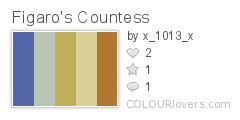
Autumn gives spring a run for it's money when it comes to color. The majestic displays of harvest have few rivals in the beauty department. When we think of autumn, we usually think of golds, reds, oranges, and browns. Perhaps we throw in a bit of yellow-green for good measure. But autumn holds a secret, a small clutch of color that's often overlooked because the competition is so energetic. I speak of the pale dusky lavender of the Mistflower.

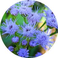
A late-blooming perennial, the Mistflower can be found in fields, on the roadside, or in the wooded areas. It has a head of bunched flowers in delicate purple with wispy star-burst petals. A color like this is almost guaranteed to calm. It's soft and cool, but not cold thanks to a slight tint of purple. Mistflower would be perfect for a children's store logo, a country-themed craft business, or a yoga web site. Though blue is often considered masculine, this color is a bit more feminine and can add gentleness to logos, promotional materials, web sites, or rooms.

When using Mistflower in interior design, it's important to remember the attitude of the color. As stated above, Mistflower is calming with a hint of warmth. It doesn't have quite the warmth of lavender, but it's perfect for bedrooms, baby's rooms, and odd spaces like entry ways. Use this color where you'd like a bit of peace. In the samples, two tones of Mistflower are used. In the first sample, a bedroom, the ceiling and corresponding rug frame an accent wall in cool peacock blue. A fruity, buttery peach adds warmth on the trim and in the linens with a luke-warm white rounding out the wall color.


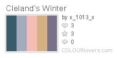
This entry way uses a slightly more blue version of our color on the walls. A darker Atlantic blue deepens the ceiling. The warm golden oak wood of the door frame and trim pairs well with the wheat on the door, carpet, and staircase insets. Though the walls and ceiling are blue, traditionally a cold color, the entryway is warm and comforting. It's just the right recipe to welcome those who enter the home.


When the wind whistles chilly and the trees are set aflame by season's change, remember that autumn's splendor isn't always in drapes of crimson and gold. The next time you need a color with just the right balance of warmth and serenity, give Mistflower a try.

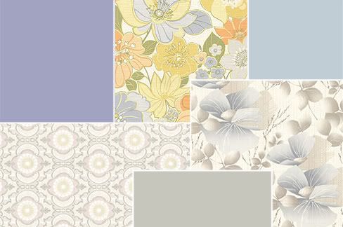
Patterns sampled from here.

Thursday, September 23, 2010

Idea Seeds: Rhapsody in Blue


George Gershwin was a perhaps one of the most talented and prolific composers the United States has ever seen. In his relatively short life, he composed a number of symphonic pieces, an opera, and many pop-style songs, many of which featured lyrics written by his brother Ira. George's work has a style that speaks to his time, a time of prosperity and progress. Rhapsody in Blue is arguably his most famous piece with it's energetic allegros and sweeping melody. It's very lyrical and imaginative, something particularly engaging for a creative thinker. This is why I chose the piece for this installment of Idea Seeds.

Disney incorporated the piece into its second Fantasia collection and did an amazing job capturing what many of us imagine when we hear the music. Today, if you have a moment, find a recording of Rhapsody in Blue and listen. Close your eyes and let your mind take you on an amazing journey.


Rhapsody
vector illustration
© Rachael Sinclair 2010

Tuesday, September 14, 2010

A Bright Place to Lay Their Heads

I was browsing blogs one day and came across a post on Made about ConKerr Cancer: A Case for Smiles. The fabric used in the post caught my eye and I read the post, not really knowing what it was about. When I learned about ConKerr and what they do, I decided I had to help. ConKerr Cancer distributes handmade pillowcases to children in hospitals. Those pillowcases help to bring a little warmth and comfort in a scary time.

I took down my measurements and went shopping, eventually buying enough fabric for ten pillowcases. I used the 'hot-dog' method, something you can find on ConKerr's site. The tutorial on Made is great too. Once I got started, the cases became easier and easier to construct. I loved watching them come together.

If you sew, even if you're just starting out, these cases are a relatively easy project that really warm the heart. Visit ConKerr's site, linked above, for complete details and a list of representatives in your area. They made me smile and I hope they will do the same for the children.

Thursday, September 9, 2010

Design Dissection: Kojak


Who loves ya baby? Kojak loves ya. Telly Savalas turned a name into an icon in the 70's series Kojak. Theo Kojak was a tough New York detective with a soft spot for nearly lost causes, cigarillos, pretty ladies, and lollipops. In true 70's form, the series was full of smoky rooms, gritty streets, drab earthtones, and ugly cars. But there is something to learn from the look an attitude of a television series no matter when it was made or the era in which it was set.

A series about a police detective, especially one set in the rough city of New York needs a font that conveys authority. The Kojak title font (word in all caps) is something akin to Boris Black Bloxx or Musa. This is a san-serif with thick strokes and a more circular 'o'. It's got authority, but doesn't take itself too seriously as noted by the squat letters. Credit fonts were san-serif as well, keeping with the theme nicely.

The colors of Kojak were the quintessential colors of the 1970's. Browns, golds, and reds are abound. The scenes seemed to all be tinted slightly yellow. Though action took place outside of the squad room quite often, a look at the scenes within the precinct headquarters gives us a more Kojak-specific color and texture range. As one may have expected for the time and area, the Manhattan South squad room was housed in an old building. The furnishings were haphazard and everything was awash in a thin film of aged grime. The walls, painted various shades of institutional green, were peppered with posters and tattooed with cracks and stains. The equipment, phones, and dingy holding cell were all very rough. The only spot of freshness in the musty squad room was Savros' houseplant.

When it came to wardrobe, each character had a particular style. Kojak went for gray and pinstriped three-piece suits, long overcoats with popped collars, and black fedora hats. Bobby Crocker was a tweed and corduroy kind of guy, mostly in tones of khaki, camel, and brown. Captain McNeil was the grandfatherly type, wearing drab, loose-fitting suits and blazers. He seemed like he would be perfectly at home in an old cardigan. In black or brown pants, white shirt, and skinny tie, Saperstein was the classic overworked officer. Stavros was the token sloppy guy who always seemed to have his tie undone just a bit.

To dissect Kojak and reassemble the elements is easy baby! First, as in any dissection, one needs to think about the kind of feeling these things convey. For instance, san-serifs are usually considered a bit more laid-back than serif fonts, but they can also carry an air of stiffness. This font is blocky and thick, indicating strength with a little playfulness. Nothing says playful quite like a toy store. Lollipops Toys & Gifts is a great example.

A font with a squat stature allows for a circular 'o', something that adds even more 'common grit' as elongated letters often convey aristocracy and elegance. This font would work well as a title font for a novel or other entertainment endeavor in the gritty, witty mystery department. See example for 'Mojo'.

Another font choice with a Kojak feel would be a typewriter font. In this age before office computers and printers, typewriters were still prevalent. A handwritten script would also be acceptable considering the fact that messages would have been written and not emailed as we do today. The logo for Stella's Couture has a bit of both with a script 'S' and typewriter name. This logo also features a 70's inspired pattern. Bold, oftentimes monochromatic, patterns figured greatly into the fashion and décor of the 70's. This particular pattern would have been wallpaper in a victim's home or the print on a woman's dress. Kojak himself favored stripes and the occasional silk paisley.

Tiled patterns are great for web sites. Use monochromatic patterns with gradations or low contrast as backgrounds. Don't get too busy though as this may tire the viewer's eyes. Natural fabric textures, coffee ring-stained paper and clean or distressed metals are good for backgrounds too. These can play well as canvases for compartmentalized page elements. 70's colors are also good on the web, but beware of overly bright warm tones. Use these in accents only.

Using Kojak as an inspiration in décor can sound like a acid-trip disaster. A little bit of the 70's can go a long way and you certainly don't want to overdo it. Consider for an office an earthy moss green such as Aloe Essence (460D-4) on the upper wall and Billiard Room (480D-6) on the beadboard wainscoting with a trim color of Informal Ivory (330E-1), all from Behr. Build on that with a vintage metal desk and an understated office chair perhaps upholstered in tweed. Don't be shy of tall metal filing cabinets. In the right color, one of these in the corner can be a great place for storage of all kinds. Adorn windows with roman shades in natural muslin textures. A vintage-looking fan adds perfect punctuation, as does a few framed prints, perhaps black and white photos of Manhattan. Further accent with small potted plants on a low mod-styled table and a 60's or 70's-styled desk phone.


See, we've solved the mystery and like that. When you put aside the blatant time-period styles of something like an old TV show and focus on the pieces alone, you can create something new and fun. No matter what flavor Tootsie Pop you like, you're sure to find something useful in the life of Detective Theo Kojak.

Wednesday, September 8, 2010

Fashion Frankenstein: New Life for Old Clothes

In an earlier post, I discussed how unexpected things can be repurposed as storage. But that's not as far as repurposing goes. What happens when you get a stain on your favorite shirt or there's a rip in those jeans you now can't bear to wear in public? What about thrift shopping? Can a $2.50 sweatshirt really get a new life? I say yes!

Sometimes I grab something like a spent pair of my husband's jeans or a team sweatshirt from Goodwill and stare at it. I literally eye-ball the thing with a vengeance, trying to see what's 'inside' it. Just because something started as pants or a shirt, doesn't mean it can't be something else. After all, these things are simply pattern pieces cut from fabric just like anything else. 

Jeans, paired with sewing scraps, perhaps those from an old button-down shirt, can become a stuffed animal like these owls.

A sweatshirt, paired with another one for lining, can be deconstructed and given a new life as a shoulder bag. This purse had a material cost of under $10. I even used the left-over scraps and stretchy band from the bottom to make some fingerless mittens. They're toasty!

So what do you have lying around? Do you have some fabric that is currently living life as an old skirt with a bleach spot or a pullover with a tear. Is it secretly dreaming of being something more? Have some one-on-one time with your old clothes, ask them what they want to be, and make it happen! If you doubt your creativity at first, there are a number of sites and blogs with patterns and instructions. Do a search and go from there. But the next time you think of tossing out those clothes, don't; let them be reborn!

Sunday, September 5, 2010

Idea Seeds: Orchard

Orchards are beautiful places, not just for the scenery, but for the produce. I've been going to orchards since I was a child. There's nothing quite like picking your own fruit and vegetables. I especially love to pick apples. Picking apples is a rite of passage from summer to fall. They signal the beginning of pie and cider season. 

Today's Idea Seed is orchard. Have you ever been to an orchard? If so, what memories do you have? What creative things spring to mind? Maybe you got to take a hay ride. Maybe you saw how they pressed apples to make cider. If you've never visited an orchard and there's one within a reasonable distance, make a point to pop in.

Pie Potential
photography
© Rachael Sinclair 2010