

Wednesday, March 23, 2011
Happy Spring
Winter seems to have gone on forever; the gray days, the piles of snow, every color coated in frost. Though winter has its beauty, there are few things to compare with the trumpeting heralds of spring. The trees and flowers in my area have sprouted colorful wings and they fly like technicolor butterflies against the warming blue March sky. I've kept my camera with me everywhere I go for days! If you love color, if you're creative, now is a special time. Enjoy every second!

Tuesday, March 22, 2011
The Importance of Good Logo Design
It's the first thing the public sees. It's the short mission statement of a business. It can be dynamic, prolific, and legendary. Why then do so many dismiss the importance of good logo design? Creating a logo should be no small task. Any good designer knows distilling something down to its typographical and pictorial bones isn't always easy. A great logo can make a business and move mountains. A bad logo can be a disaster.
A logo should be a simple, yet comprehensive, statement of a person, place, or thing. It tells the world who someone is, what they believe. It explains a product or business in a quick glance, something that's very important in our fast-paced society. It can be a single image, a combination of images and words, or a person's name. Some logos are easy to recognize no matter where you're from or what language you speak. Take Nike for instance. Their iconic 'swoosh' is known almost instantly all over the world. Words aren't needed.
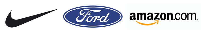
Another logo that succeeds world-wide is the blue oval with the signature of Henry Ford. That signature with the swirled 'F' has been around since the brand's inception. Though a customer may not speak English or read our words, they could recognize the script in the blue oval because of careful marketing strategies and a century of brand stability.
Some logos use simple graphics to elicit different feelings. Amazon's logo is a combination of the company name with an arrow-like 'smile' underneath. That happy appearance, combined with the vibrant, energetic color, assure the customer and liven sales. The arrow denotes speed, a much-desired hallmark in any e-commerce company. Though it's more than an image, (like the 'swoosh') or word (like Ford), this logo succeeds because it remains within the realm of 5-second recognition. The consumer doesn't have to spend a long time 'figuring it out' or trying to make sense of a lot of elements.
A logo must, first and foremost, tell the customer what you do. It must also convey your personal confidence, which in turn will give confidence to your customers. If a logo is hectic, with lots of colors, graphics, and text, the customer may feel ill at ease. Consumers don't feel like they can trust a business or individual who can't nail down a streamlined statement. It shouldn't be muddled with elements that don't translate well across platforms like photos and three-dimensional items. Logo design and reception is highly psychological; as is marketing. If your product or service is stellar, you may not think customers would be disturbed by a bad logo or messy advertisements; but people are wired to react adversely to something that doesn't look quite right.
Branding is the best investment someone can make in their business. Though a logo may change over the years, evolve with the times, a great one becomes an icon. Whether you're selling hand-made goods online, marketing a new brand of ice cream, or running for public office, the logo and materials you choose for yourself are always more important than you may believe. It's better to be safe than sorry, especially when there is so much on the line.
Thursday, March 10, 2011
Saul Bass

 Though you may not have known at the time, you've likely seen the work of Saul Bass. Born in New York in 1920, Saul Bass was a key figure in graphic design. Some of his most notable work came in the form of poster and title design for films. Before Mr. Bass, most movie posters were paintings or head-shot photos of the film's famous stars. With his help, graphic design became an art form!
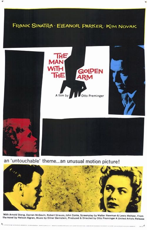
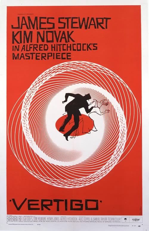
Perhaps one of his most famous works was the poster for 1955's The Man with the Golden Arm. The film's stars were still featured, but they were arranged in more dramatic fashion, eschewing the campy vignettes of years before. The lines were a bit off-level, a touch wavy; simple shapes had created tension where pearl-white smiles could not. When it came to animated title sequences, Bass was a master. I remember one in particular, the cheeky sequence for It's A Mad, Mad, Mad, Mad, World, one of my favorite movies. He worked with the greats like Alfred Hitchcock, Stanley Kubrick, and Martin Scorsese. He even designed the storyboards for the chilling 'shower scene' in Psycho.
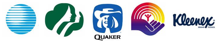
Saul Bass went on to design posters and title sequences for 40 years, all the while, putting his mark on logo design. Ever hear of AT&T? The globe logo was designed by Bass. Like Girl Scout Cookies? That famous logo printed on the box, that's one of his. United Way, Quaker Oats, Kleenex, they're all Saul Bass.
Design started as a trade, but on the shoulders of Bass and visionaries like him, it grew into an art of its own. His work is still salient today, putting both the graphic and art in graphic arts.
Inspired by this amazing artist, I decided to throw a little Saul Bass style into a fun tribute to a favorite film of mine, Arsenic and Old Lace. It's not a straight copy of his style, but the influence shows through. I used haphazard lines and a bold, two-color presentation. The font is called 'Hitchcock' and can be downloaded here. Enjoy!

Arsenic and Old Lace
poster design © Rachael Sinclair 2011
film property of Warner Bros. Entertainment
no copyright infringement intended
Subscribe to:
Posts (Atom)