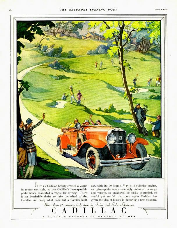
If someone mentions Bauhaus, Bass, Rockwell, Pollack, or Warhol, designers and artists will know the names instantly and probably intimately. But what about Thomas Cleland? Who exactly is this person? Does anyone recognize the artist and designer who went by T. M. Cleland? Years ago, I bought an advertisement for Cadillac taken out of a Saturday Evening Post from 1928. I was enamored with the design and the illustration; the happy 'flappers' and bright red car against the soft green of the golf course. I managed to make out the signature on the ad and have been researching and collecting Cleland ever since.
Thomas Maitland Cleland, the son of a Scottish doctor, was born on September 28th, 1880 in New York. When he was in his mid-teens, he convinced his parents to enrol him in the The Artist-Artisan Institute of New York. He saw this avenue as one that would bring easy success. After some time there, he had yet to find that particular thing to stoke his creative fire. One day, he observed a classmate designing a book ornament with pen and ink. He was in awe of the stark contrast and fine detail. This was the push he needed and soon his natural talent for detail and design blossomed. From here, he became a consummate and driven professional, running his own printing businesses at an early age. He took a break from his work (perhaps his only break from creative work) to serve in WWI.
His talents were almost savant-like. It is said that his knowledge of his field was encyclopaedic and intimidating. He was known to be taciturn at times, controlling, obsessed with perfection, and even 'quite a bit of a snob'. Cleland was proud of his self-taught profession, from print and typeface design (
Della Robbia) to his complex and colorful illustrations and even set and costume design for plays.
He was married in 1905 to Elinor (formerly Nellie) Lane Woodruff. Elinor was 13 years his senior and preceded him in death by nearly 20 years; they had no children. He spent most of his later years in his home in rural Connecticut. Here, he continued his work designing and painting, building cabinetry and metalworking. He had an affection for dogs, debate and had quite an interesting circle of friends, one that included the more well-known artist, Rockwell Kent. Kent, who provided the frontispiece portrait of Cleland for the 1929 collection of his work had this to say of the artist,
"... I may term myself his disciple. I proudly do. He was the most consummate craftsman of his time in every last least thing he did in all the many arts and crafts he ever undertook. His sensitive perception of beauty made him always keenly sensitive to ugliness..."
Though an innovator and master of his art, Cleland was extremely critical of 'modern' art and design. He felt the 'new' styles were lazy, distasteful, and lacked discipline. In an address to the Society of Typographic Arts on November 5th, 1948, he said,
"Art was once the business of artists and not of writers and was taught to artists by other artists and not professors; and its rather wholesome definition seems to have been -- before anything was said about "art for art's sake" -- the doing of anything, from ploughing to painting especially well. Craftsmanship was not suspect or thought to be ruinous to individuality -- or perhaps individualities were not so feeble then that they could not survive the rigors imposed by craftsmanship. I do not know when the term "fine art" was invented and the breach between it and craftsmanship began to widen, but I have come to believe that it was a sorry day for both. For then, it seems to me, the spirit of art departed from its body and the body began to decay and the spirit to wander aimlessly in space."
In his career, he designed for Locomobile, Cadillac, the Red Cross, and served as the art director for 'Fortune' magazine. He's known today for his skill in art direction, but that seems to be the limit of his notoriety. He illustrated countless advertisements and books, many of the Heritage Press Limited Edition club stories of which he also designed the books themselves. His work was sold as prints and used to cap off magnificent wall calendars. Though his career was vast and his impact on those who knew him great, he remains an unknown. To this, I can only say, what a shame. There is much to be learned from a commitment and passion like Cleland's. No matter what style of art and design you choose, his work and words can be of great inspiration. Cleland died on November 9th, 1964, leaving behind a larger-than-life legacy and a collection of work to rival that of any master craftsman.
In his address to the American Institute of Graphic Arts on February 5th, 1940 entitled "Harsh Words", Cleland said,
"And, remember, there is always progress to be made within yourselves, no matter if it is the same progress in the same direction that has been made by countless other souls. And there will, I hope, always be things new to you, as there are every day things new to me, even if the sun has seen them all before. I don’t want to live a day longer than I can learn."
Art from my collection:
Cadillac advertisement from Saturday Evening Post, 1928.
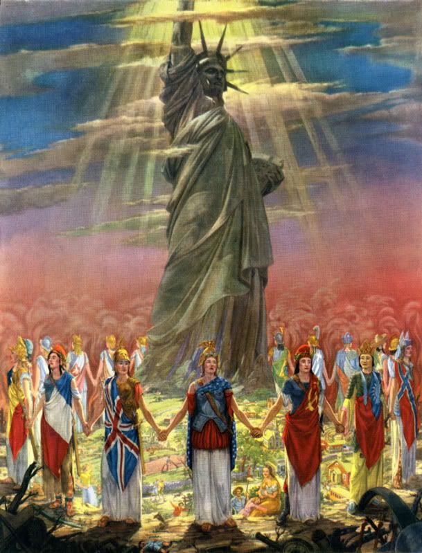
"God Bless America and Her Allies" print, 1943
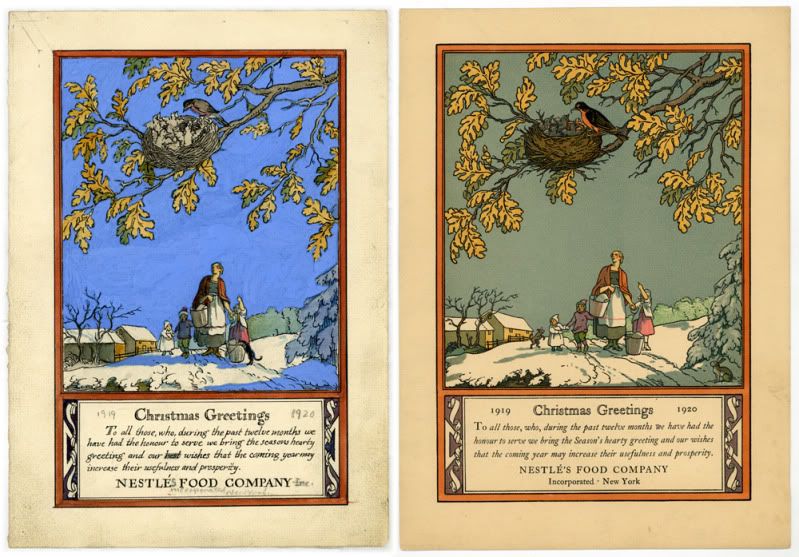
Rare hand-sketched rough and final Christmas greeting for Nestle's, 1919
"Romance" print taken from a Harris-Seybold calendar, 1948
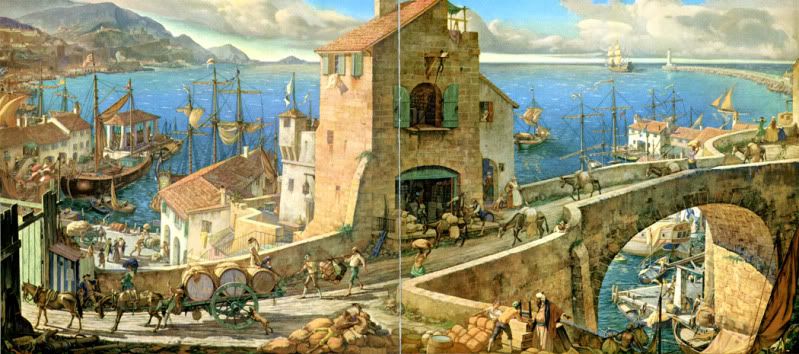
Front and back cover illustration "Commerce" for Westvaco's 'Inspiration for Printers' magazine #82, 1933


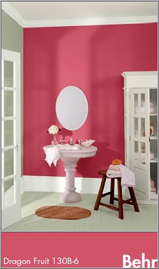
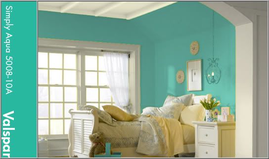
 In this double dip of color, the melon-tinged pink of coral bells shares the stage with robin's egg blue. These two colors are a staple of late spring in some areas. Coral Bells (Heuchera) come in many varieties and are prized almost as much for their amazing foliage than they are for the bell-shaped blooms that perch on tall stems. They can thrive in full sun or shade depending on the variety and are a source of great visual interest in landscaping. Though the color of the flowers can vary, the most common flower color is a rich melon pink (PMS 709). This is a creamy color, tart and sweet all at once.