 Imagine a client brings you a brand name, a niche market… and tea. The client wants branding, website design, and a few interior design ideas for an upscale, Japanese-themed cocktail bar named 'Katsu' (Japanese for 'thirst'). Your inspiration is a variety of loose-leaf tea sold by Teavana, the MatéVana®. Iron Designer, begin!
MatéVana® is a blend of mate and red rooibos teas with cocoa, almond, chocolate chips, and enhanced with hazelnut. It's mostly chocolate and nut browns, all with a woody but smooth texture. The tea is accented with a striking violet blue and a few shades of yellow ranging from citrus to sunflower. These portions of the tea are leaf-like and feminine. The client wants something that incorporates the clean, simple lifestyle of traditional Japan with a modern, rich atmosphere.
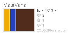
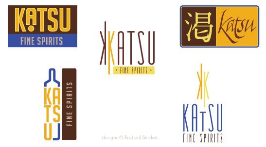
I pulled the palette above from the tea provided. We have a dark rich brown, a milky chocolate, two tones of gold, and a vibrant electric blue. Once we have those, we can apply them to our logo ideas. The client wants something sophisticated, but also evocotive of Japanese design and culture. On that vein, we have the logo ideas below.
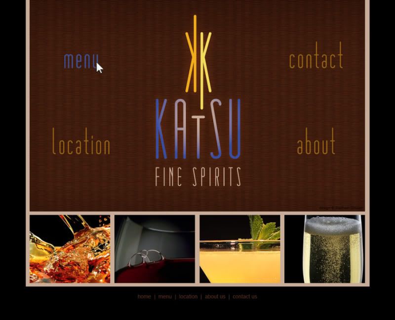
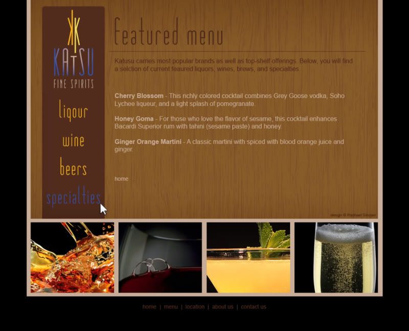
I chose design at the bottom right to fashion a web site. I used the textures of tatami and wood grain. The photographs are simple and all match with black backgrounds. The site design is spartan and clean.
The bar itself should feature the textures of tatami, a touch of brushed metal, dark wood, rice paper, and a nice blue and neutral Japanese print fabric. The fabric brings in the feminine touch we found in the cornflower petals of the tea. Lighting should be intimate and utilize the golds in the palette.
Clients often find inspiration in things you may not expect. Sometimes it's good to practice by figuratively pulling an idea out of a hat. To be an Iron Designer, you have to be versatile and agile and ready to tackle any request. Explore the possibilities and take a second look at the world around you.
Teavana and MatéVana are registered trademarks. No copyright infringement intended.

