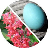
In this double dip of color, the melon-tinged pink of coral bells shares the stage with robin's egg blue. These two colors are a staple of late spring in some areas. Coral Bells (Heuchera) come in many varieties and are prized almost as much for their amazing foliage than they are for the bell-shaped blooms that perch on tall stems. They can thrive in full sun or shade depending on the variety and are a source of great visual interest in landscaping. Though the color of the flowers can vary, the most common flower color is a rich melon pink (PMS 709). This is a creamy color, tart and sweet all at once.
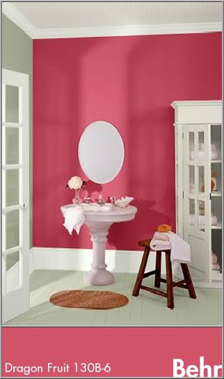
In design, the coral bell hues will naturally be appropriate for feminine ventures. Its freshness is great for food logos and design, such as dessert shops or paired with other bright colors and earth tones for an ethnic feel. This color is used a lot in Indian art and fabrics so it would be great for the logo and decor of an Indian restaurant. Due to the rich nature of this color, it does well as an accent in interior design. Its energy would naturally be at home in a kitchen, dining area, or bathroom. In this bathroom, coral bell pink is used on an accent wall with calm tones of gray (Behr: Hushed White W-F-710) and white (Behr: Off White int. flat enamel 1873).

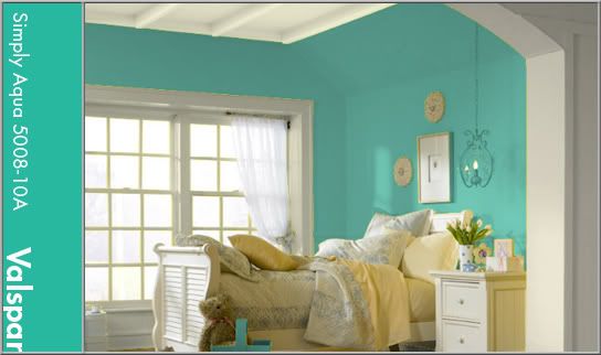
Everyone seems to have a different idea of the exact hue of a robin's egg. Through research by matching a PMS book to an actual egg shell, I acquired the color you see featured in this blog post (PMS 570). A robin's egg is a bright teal with a hint of gray. This color is perfect for a wide array of uses and themes. It fits in well with beach themes or can be great for something with a bit of a vintage look as it is close to the 'pool' blue of the mid-twentieth century. For this look, group the color with black, white, and chrome or earth tones. It's relaxing, but not boring and would be a fresh and peaceful color for a bedroom. Robin's Egg is used here as an all-over color with trim painted in a crisp linen white (Valspar: December Starlight 7003-7).
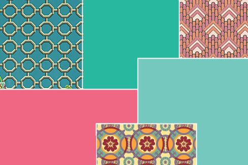
These two colors add a lot of energy and excitement to any project. They can be very versatile and change feelings depending on their accents. Natural colors like these can tie us to creation without necessarily nailing us down to just bland earth tones. For your next project, see how you can use one of these amazing colors to take the interest up a few notches!


No comments:
Post a Comment