
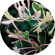
 It's a popular fragrance for soaps and lotions and in the spring and summer, it sweetens the breeze and entices the bees. Honeysuckle comes in tame and wild varieties and doesn't just smell good, it's a great source for color inspiration. This vine can be considered a pest if not controlled, but if you've walked by a bank of it after a rain, you know the scent is like none other. If you stop to study further, you'll notice tones from smooth butter to lively magenta and all tones in between.
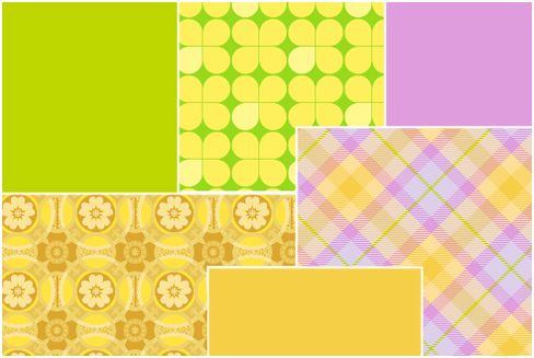
In design, these colors are a dream for something fresh or feminine. A bakery or candy shop would be a fitting use for the buttery yellow and zing of fuchsia and tart green. The brightness of these hues would also do well in the branding for a specialty children's store.
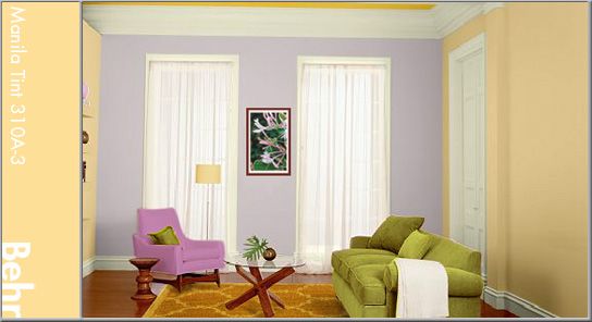
Home is for comfort and these warm tones do just that, comfort us in the arms of a summer day. Use a lighter honeysuckle yellow for the walls. Here, I've used Behr's Manila Tint (310A-3) with a more intense hue for accents (Flame Yellow: 360B-6). Splash around the greens and purple (Brook Trout: 110E-2) to bring attention to certain areas. Warm wood would further brighten the feeling where a contrasting use of cool metal would bring balance.

No comments:
Post a Comment