
Science! Art and science may seem like strage bedfellows, but the pairing flourished in the middle of the 20th century. Engineering and science, chemistry and space travel, these things helped make the 50's and 60's a roaring 'technological' age. Advertisers and designers were used to spread the good word of science and gone were the days of art used only for anatomy illustrations and concept work.
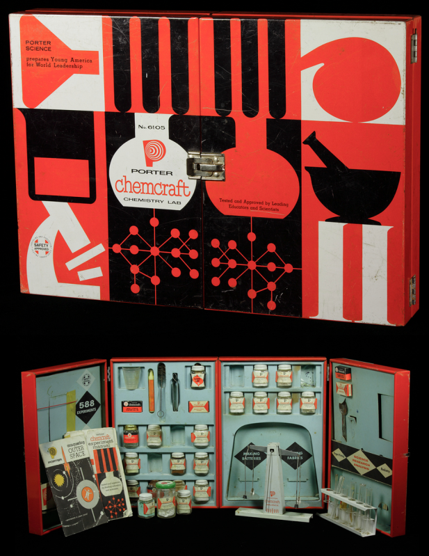 |
| Photo from The Chemical Heritage Foundation |
Let's take a look at this Porter Chemcraft chemistry set from 1958. This set is most indicative of the graphic style of mid-century modern. We see the use of black and white with the addition of bright, unadulterated red. The images are crisp and simplistic. On the inside, close attention is paid to continuity, with each item carefully designed to fit within the overall look. This set wasn't intimidating, it was friendly. A child could be at once in awe of science and eager to learn. How fantastic are these colors!
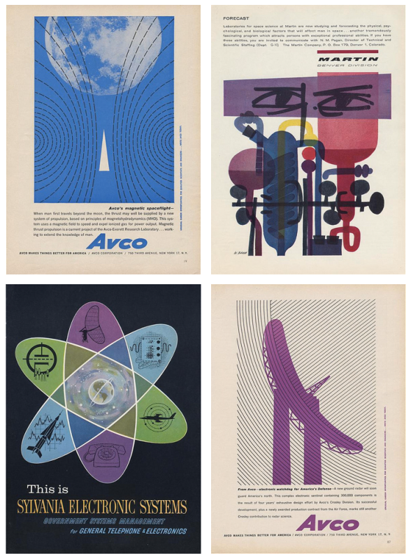
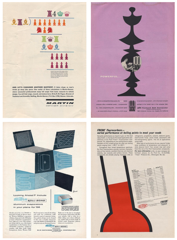
If we look at the eight samples of advertising below, we see the same use of bright color, oftentimes just one color with black and white much like the Chemcraft set. The illustrations are almost abstract in their simplicity and placement. The ads (all found here on the photostream of bustbright) are attention-grabbing, the text clean and 'futuristic'.
I adore the design of this era and when you add science, well, I love it even more. It's no surprise designers remain inspired by the work of those who, at the time, were on the cutting edge of what was to come. The next time you need some a little boost in the creative engine, try seeing things scientifically. Inspiration is everywhere, much like that thing we call oxygen. Breathe deep!
I took this opportunity to marry design, science, and one of my favorite things on earth, coffee. Invented in 1941 by a scientist, Dr. Peter Schlumbohm PhD, the Chemex coffeemaker uses the proven methods of chemistry to brew a simple, but absolutely perfect cup of coffee. This poster features the squat copy text that's prevalent on pieces from the mid-century. The word 'Chemex' was hand done in a playful style, something also common to 50's and 60's design.
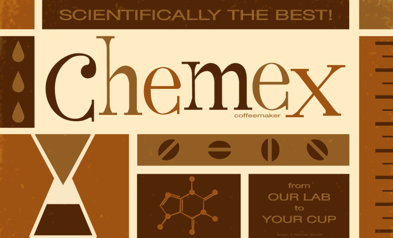 |
| Scientifically the Best! Original vector art Rachael Sinclair |
No comments:
Post a Comment