
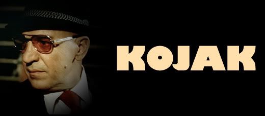
Who loves ya baby? Kojak loves ya. Telly Savalas turned a name into an icon in the 70's series Kojak. Theo Kojak was a tough New York detective with a soft spot for nearly lost causes, cigarillos, pretty ladies, and lollipops. In true 70's form, the series was full of smoky rooms, gritty streets, drab earthtones, and ugly cars. But there is something to learn from the look an attitude of a television series no matter when it was made or the era in which it was set.
A series about a police detective, especially one set in the rough city of New York needs a font that conveys authority. The Kojak title font (word in all caps) is something akin to Boris Black Bloxx or Musa. This is a san-serif with thick strokes and a more circular 'o'. It's got authority, but doesn't take itself too seriously as noted by the squat letters. Credit fonts were san-serif as well, keeping with the theme nicely.
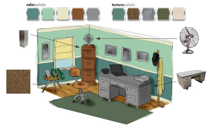
The colors of Kojak were the quintessential colors of the 1970's. Browns, golds, and reds are abound. The scenes seemed to all be tinted slightly yellow. Though action took place outside of the squad room quite often, a look at the scenes within the precinct headquarters gives us a more Kojak-specific color and texture range. As one may have expected for the time and area, the Manhattan South squad room was housed in an old building. The furnishings were haphazard and everything was awash in a thin film of aged grime. The walls, painted various shades of institutional green, were peppered with posters and tattooed with cracks and stains. The equipment, phones, and dingy holding cell were all very rough. The only spot of freshness in the musty squad room was Savros' houseplant.
When it came to wardrobe, each character had a particular style. Kojak went for gray and pinstriped three-piece suits, long overcoats with popped collars, and black fedora hats. Bobby Crocker was a tweed and corduroy kind of guy, mostly in tones of khaki, camel, and brown. Captain McNeil was the grandfatherly type, wearing drab, loose-fitting suits and blazers. He seemed like he would be perfectly at home in an old cardigan. In black or brown pants, white shirt, and skinny tie, Saperstein was the classic overworked officer. Stavros was the token sloppy guy who always seemed to have his tie undone just a bit.


Tiled patterns are great for web sites. Use monochromatic patterns with gradations or low contrast as backgrounds. Don't get too busy though as this may tire the viewer's eyes. Natural fabric textures, coffee ring-stained paper and clean or distressed metals are good for backgrounds too. These can play well as canvases for compartmentalized page elements. 70's colors are also good on the web, but beware of overly bright warm tones. Use these in accents only.
Using Kojak as an inspiration in décor can sound like a acid-trip disaster. A little bit of the 70's can go a long way and you certainly don't want to overdo it. Consider for an office an earthy moss green such as Aloe Essence (460D-4) on the upper wall and Billiard Room (480D-6) on the beadboard wainscoting with a trim color of Informal Ivory (330E-1), all from Behr. Build on that with a vintage metal desk and an understated office chair perhaps upholstered in tweed. Don't be shy of tall metal filing cabinets. In the right color, one of these in the corner can be a great place for storage of all kinds. Adorn windows with roman shades in natural muslin textures. A vintage-looking fan adds perfect punctuation, as does a few framed prints, perhaps black and white photos of Manhattan. Further accent with small potted plants on a low mod-styled table and a 60's or 70's-styled desk phone.
See, we've solved the mystery and like that. When you put aside the blatant time-period styles of something like an old TV show and focus on the pieces alone, you can create something new and fun. No matter what flavor Tootsie Pop you like, you're sure to find something useful in the life of Detective Theo Kojak.
No comments:
Post a Comment