Wednesday, November 24, 2010

Happy Thanksgiving

Thanksgiving has always been my favorite holiday. Even as a child, I looked forward to the Thursday in November almost more than I did the gift giving of Christmas. There's something pure about Thanksgiving, something selfless. On this holiday, let us celebrate the blessed things in our lives. Let us put away our worries and fears. As we join with our families and loved ones over a hearty meal, let us truly give thanks. Have a wonderful holiday everyone!


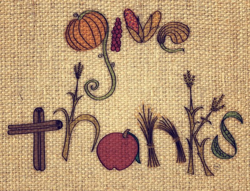
Give Thanks
Illustration and Typography
© Rachael Sinclair 2010

Color Flavor: Pumpkin

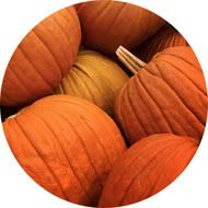
November brings the promise of food, family, and fellowship. Many may celebrate the month and the Thanksgiving holiday by partaking in a slice of pumpkin pie. Creamy and hearty with a dollop of whipped cream, there's almost nothing that says autumn like this dessert. We may also decorate our homes with gourds of all types, a festive reminder of harvest. The earthy umber of pumpkin is a perfect hue for design.

Pumpkin is not as bright and jarring as some orange tints. When a color, especially a warm color, is used in its pure form, it can appear cheap and unnatural. Pumpkin tints orange with browns and golds to ease the brightness, but manages to stay warm and vivid. Consider the different hues of the pumpkin flesh as opposed to the inside of the gourd. The flesh is oftentimes dusted with dirt and bleached by the sun where the inside of the pumpkin is damp and saturated with color. Each of these variants can be used in design to invoke a number of feelings.

Being a warm color and taken from a food, pumpkin is great for promotional items about food and cooking. Orange is an appetite stimulator, so use with these types of things is almost a given. Pumpkin is also a bit spicy and would work well with things that need an ethnic and worldly touch. Being a shade of orange makes pumpkin an energy stimulant. Vibrant and alive, it's a perfect accent color for things you want people to see quickly. Being close in relation to the color of a basketball, pumpkin would work as a color for sports promotion as well.

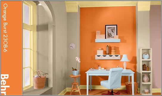
Using pumpkin in interior design is a tasty treat. As it is an energetic color and on the warm side, I recommend using it in office and kitchen areas. In this office, a brighter, fresher pumpkin is featured on an accent wall. The rest of the space is done in a buttery cream and warm putty color. A light sky blue placed strategically adds a hint of wide-open relaxation to the highly stimulating work area.


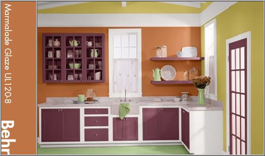
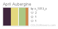
In this kitchen, the pumpkin hue is more matched to a gourd's flesh. It's a dusty, yet spicy color and plays well with the eggplant aubergine. It's used again on an accent wall as not to overwhelm. White trim pops with freshness, aided by a corn husk-like gold and springy green.


When you indulge in a slice of pumpkin pie, take in the color. This treat is more than just a slice of harvest heaven, it's ripe with inspiration. The next time you need an energetic spark of happy, try pumpkin in your design recipe.

Patterns sampled from here.

Monday, November 8, 2010

Jennie Augusta Brownscombe

Among the artistic depictions of the first Thanksgiving shines one by 'Colonial Revival' artist Jennie Augusta Brownscombe. This particular oil on canvas (titled aptly, 'The First Thanksgiving') was painted in 1914 and published in Life magazine where it reached a wide audience. The sweeping composition and attention to detail make her view of Thanksgiving's advent particularly engaging.

Given the distinction by some as being 'the Norman Rockwell of her time', Brownscombe was born in Pennsylvania in 1850. Her mother, Elvira Kennedy, was a descendant of an original Mayflower passenger. She was an artist from an early age and by 1868 was supporting herself with her craft by selling illustrations to magazines and licensing her paintings for reproduction. She studied in New York and France, lived in Rome and had exhibits of her work there and in London.

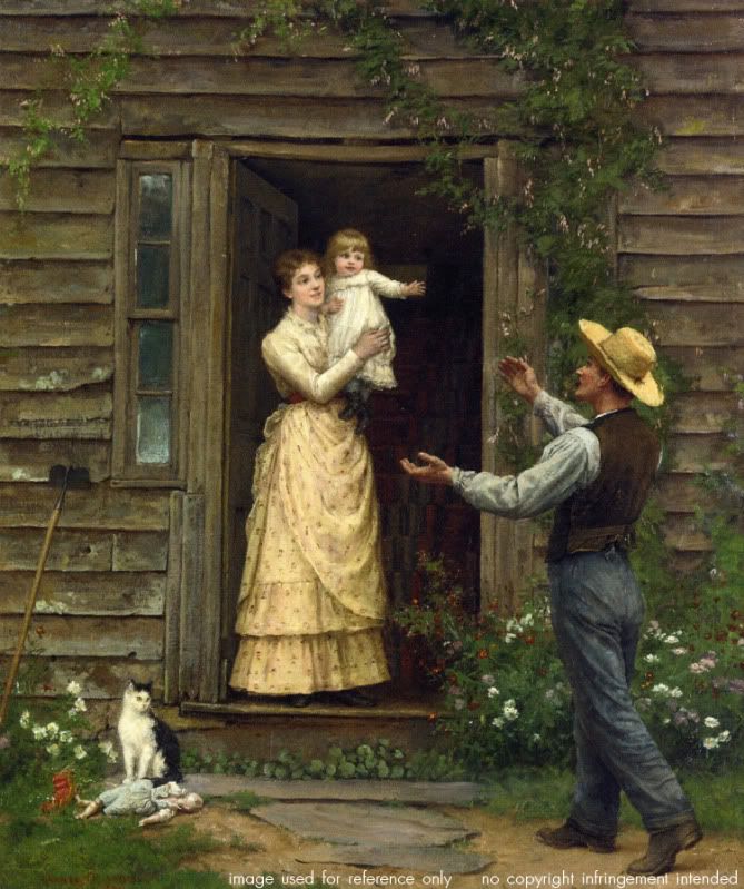
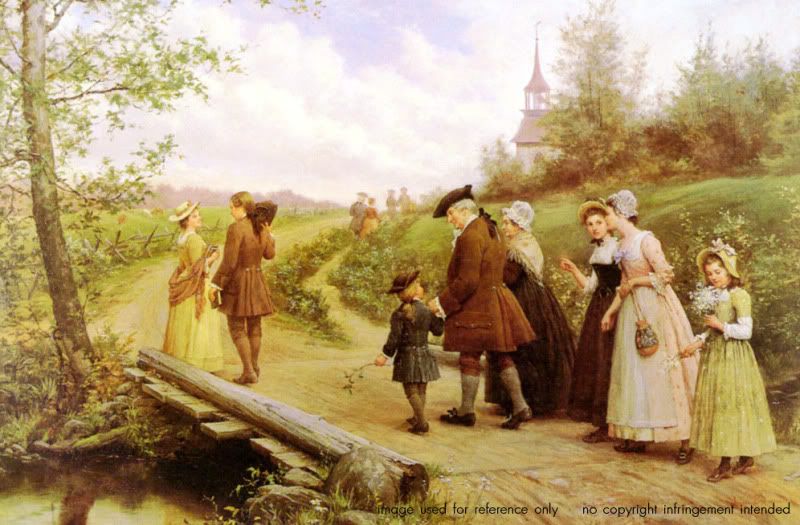
Studies of every day life have long been a passion for artists. There's a sense of oneness with the art when you can relate to its subject. In one piece, we see the happy faces of a family reunited while a cat looks on, the rustic shingles on the house testifying to Brownscombe's skill. In another, we join a procession of colonials on their way to church on Sunday morning. It is peppered with such minute details as a branch in the young boy's hand and cattle grazing in the background. Brownscombe painted what she knew, emotions she could connect with. Her use of color was joyful and engaging, her subjects like family.

Jennie Brownscombe was a pilgrim in her own way, making a name and life for herself in a time when most women were still housewives and mothers. She tapped into a talent and nostalgia that warmed the hearts of her viewers. Artists like Brownscombe place a mirror to our lives, forcing us to see the beauty in every day. Creative types can sometimes become bogged down with visions of the fantastic. A reminder of the subtle grace of life is always welcome.