Wednesday, December 15, 2010

Palette Cleanser: Holiday Cookie Recipes

I thought I'd deviate from the art and design world for a moment and post some of my favorite cookies recipes. Baked goods make great gifts for almost everyone. All of these would be great with a hot cup of coffee or tea. Celebrate the season by getting creative in the kitchen and have a wonderful holiday!

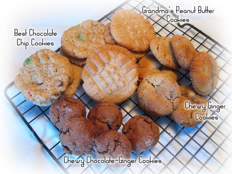
Best Chocolate Chip Cookies
I like this cookie for a number of reasons. The chopped oats add extra nutrition and a soft, nutty flavor. I like to add whole wheat flour when I can and reduce sugar. I call these my healthy pleasure.
1 c butter
1 c sugar (3/4 c for lighter taste)
1 c brown sugar
2 eggs
1/2 tsp vanilla
2 c flour (optional: 1 c all-purpose, 1 c whole wheat)
2 1/2 c quick oats *
1 tsp baking soda
1 tsp baking powder
1/2 tsp salt
8 oz chocolate chips or candy-coated chocolate pieces (For the cookies in the photo, I used both candy-coated chocolate pieces and mini chocolate chips.)

Cream the butter and both sugars. Add eggs and vanilla. In a separate bowl, combine flour, oatmeal, baking soda, baking powder, and salt. Mix dry into wet ingredients then add chocolate chips. Roll into teaspoon-sized balls, flatten in your palms, and place two inches apart on a cookie sheet. Bake for 10 minutes at 375 °. Cool on wire rack.

*Place measured oats in blender or food processor and chop into a flour-like powder.

Chewy Ginger Cookies
This cookie is a hit and they never last long. For a lover of ginger, they're a soft wonder enrobed in caramelized sugar. Another not, when made at a reasonable size, each cookie works out to 1 point in the Weight Watcher's point system.
6 tbls butter, softened
2/3 c sugar
1/4 c molasses
1 egg
2 c all-purpose flour
2 tsp baking soda
1 tsp ground ginger
1 tsp ground cinnamon
1/2 tsp ground nutmeg
3 tbls sugar

Cream butter; gradually add 2/3 cup sugar, beating until light and fluffy. Add molasses and egg; beat well. Combine flour and next 4 ingredients; gradually add to creamed mixture, stirring until well blended. Wrap dough in plastic wrap, and freeze for 30 minutes. Shape dough into 1-inch balls, and roll in remaining 3 tablespoons sugar. Place 2 inches apart on cookie sheets coated with cooking spray. Bake at 350º for 12 minutes or until lightly browned. Remove from sheets; cool on wire racks.

Grandma's Peanut Butter Cookies
The is the recipe my grandmother and I used to bake when I was a child. They hold a special place in my heart. They're not overly nutty, but just enough. Baked just right, they melt in your mouth!
1 c sugar
1 c brown sugar
1 c butter (or 1/2 c butter and 1/2 c shortening)
1 c peanut butter, crunchy or creamy
2 eggs
1 tsp vanilla
3 c (approximately) all-purpose flour
2 tsp baking soda
1/8 tsp salt

Combine sugars and butter, beat until creamy. Add peanut butter, eggs, and vanilla. Combine dry ingredients in a separate bowl and add to peanut butter mixture gradually. Roll teaspoon amounts of dough into balls and place on a cookie sheet. Dip a fork in sugar and make a crisscross pattern on top of the cookie, flattening slightly. If dough is too sticky to roll immediately, refrigerate for about 30 minutes before rolling. Bake in a preheated 350º oven for 8 to 12 minutes or until lightly browned around the edges. Cool on wire rack.

Chewy Chocolate-Ginger Cookies
I decided to try this recipe (I usually don't like Martha's recipes) and I'm glad I did. I love the heat brought by the fresh grated ginger. They're especially nice with a nice steaming cup of artisan dark roast coffee!
You can find this recipe at here through Martha Stewart's Web site.


Wednesday, December 8, 2010

Idea Seeds: Santa Claus

Santa Claus is one of the most recognizable symbols of the holiday season. His rosy cheeks, hearty laughter, and flowing white beard seem synonymous with jollity. He's had songs written about him, poems, been featured in plays and movies. He's the star of the most famous parade in America, the Macy's Thanksgiving Parade. Santa has also been used in a consecutively successful advertising campaign by none other than Coca-Cola.

Though Santa Claus has a rich and sometimes polarizing history, the version we think of most today was spearheaded by cartoonist and illustrator Thomas Nast in the mid-1800's. Nast was also the 'father' of the Republican and Democrat animal mascots. His Santa, featured on the cover of Harper's Weekly, was portly, wore a hat and fur-trimmed coat, and had a long beard.

A figure like Santa was bound to be popular, but his popularity and image reached new heights when he was tapped to be the holiday spokesperson for Coca-Cola in the 1930's. This image, designed by Haddon Sundbloom, brought the jovial elf into thousands of homes and even caused some to speculate red and white had been chosen for his clothes because they were Coca-Cola's colors. It is believed, however, Santa wore red and white long before then.

Santa Claus is not so much a person as he is a feeling. Most of us can recall the days and nights leading up to Christmas and how excited we all were at the thought of being visited by the man from the North Pole. Being so popular, Santa has been depicted in a myriad of ways. I charge you to use this Idea Seed to come up with your own image of Santa. Be creative, be different, be you. Merry Christmas to all and to all a good night!


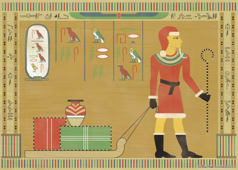
"Ho, Ho, Ho Like An Egyptian"
original digital art

Hieroglyphs translate roughly as:
Across the top: Christ the King is born today.
Left side border: Joy to the world
Right side border: the Lord is come
Within the frame: Santa Claus says Merry Christmas

Wednesday, November 24, 2010

Happy Thanksgiving

Thanksgiving has always been my favorite holiday. Even as a child, I looked forward to the Thursday in November almost more than I did the gift giving of Christmas. There's something pure about Thanksgiving, something selfless. On this holiday, let us celebrate the blessed things in our lives. Let us put away our worries and fears. As we join with our families and loved ones over a hearty meal, let us truly give thanks. Have a wonderful holiday everyone!


Give Thanks
Illustration and Typography
© Rachael Sinclair 2010

Color Flavor: Pumpkin

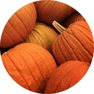
November brings the promise of food, family, and fellowship. Many may celebrate the month and the Thanksgiving holiday by partaking in a slice of pumpkin pie. Creamy and hearty with a dollop of whipped cream, there's almost nothing that says autumn like this dessert. We may also decorate our homes with gourds of all types, a festive reminder of harvest. The earthy umber of pumpkin is a perfect hue for design.

Pumpkin is not as bright and jarring as some orange tints. When a color, especially a warm color, is used in its pure form, it can appear cheap and unnatural. Pumpkin tints orange with browns and golds to ease the brightness, but manages to stay warm and vivid. Consider the different hues of the pumpkin flesh as opposed to the inside of the gourd. The flesh is oftentimes dusted with dirt and bleached by the sun where the inside of the pumpkin is damp and saturated with color. Each of these variants can be used in design to invoke a number of feelings.

Being a warm color and taken from a food, pumpkin is great for promotional items about food and cooking. Orange is an appetite stimulator, so use with these types of things is almost a given. Pumpkin is also a bit spicy and would work well with things that need an ethnic and worldly touch. Being a shade of orange makes pumpkin an energy stimulant. Vibrant and alive, it's a perfect accent color for things you want people to see quickly. Being close in relation to the color of a basketball, pumpkin would work as a color for sports promotion as well.

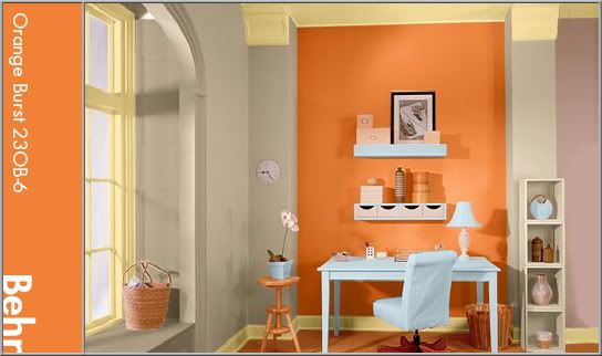
Using pumpkin in interior design is a tasty treat. As it is an energetic color and on the warm side, I recommend using it in office and kitchen areas. In this office, a brighter, fresher pumpkin is featured on an accent wall. The rest of the space is done in a buttery cream and warm putty color. A light sky blue placed strategically adds a hint of wide-open relaxation to the highly stimulating work area.


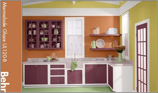
In this kitchen, the pumpkin hue is more matched to a gourd's flesh. It's a dusty, yet spicy color and plays well with the eggplant aubergine. It's used again on an accent wall as not to overwhelm. White trim pops with freshness, aided by a corn husk-like gold and springy green.


When you indulge in a slice of pumpkin pie, take in the color. This treat is more than just a slice of harvest heaven, it's ripe with inspiration. The next time you need an energetic spark of happy, try pumpkin in your design recipe.

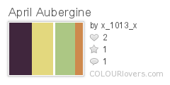
Patterns sampled from here.

Monday, November 8, 2010

Jennie Augusta Brownscombe

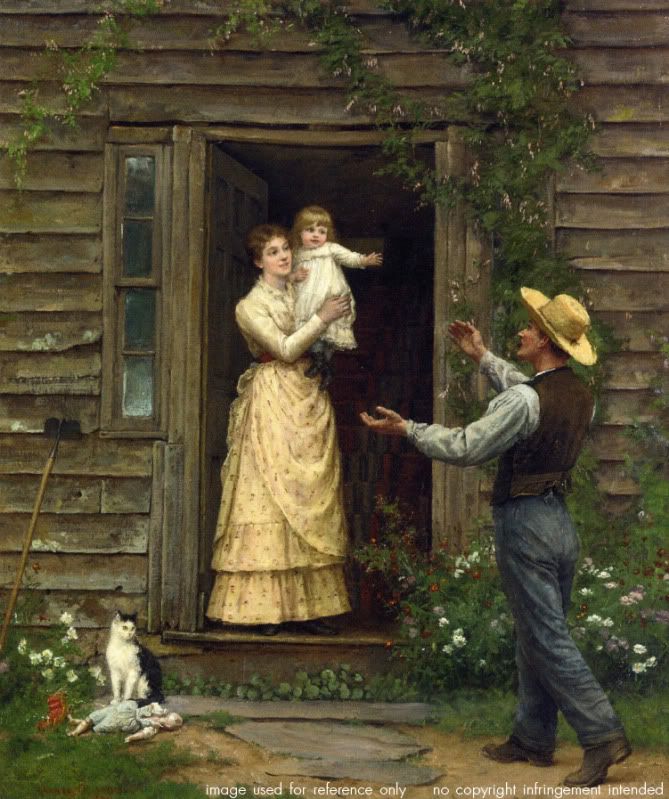
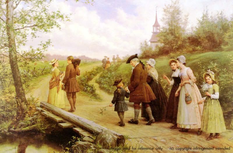
Among the artistic depictions of the first Thanksgiving shines one by 'Colonial Revival' artist Jennie Augusta Brownscombe. This particular oil on canvas (titled aptly, 'The First Thanksgiving') was painted in 1914 and published in Life magazine where it reached a wide audience. The sweeping composition and attention to detail make her view of Thanksgiving's advent particularly engaging.

Given the distinction by some as being 'the Norman Rockwell of her time', Brownscombe was born in Pennsylvania in 1850. Her mother, Elvira Kennedy, was a descendant of an original Mayflower passenger. She was an artist from an early age and by 1868 was supporting herself with her craft by selling illustrations to magazines and licensing her paintings for reproduction. She studied in New York and France, lived in Rome and had exhibits of her work there and in London.

Studies of every day life have long been a passion for artists. There's a sense of oneness with the art when you can relate to its subject. In one piece, we see the happy faces of a family reunited while a cat looks on, the rustic shingles on the house testifying to Brownscombe's skill. In another, we join a procession of colonials on their way to church on Sunday morning. It is peppered with such minute details as a branch in the young boy's hand and cattle grazing in the background. Brownscombe painted what she knew, emotions she could connect with. Her use of color was joyful and engaging, her subjects like family.

Jennie Brownscombe was a pilgrim in her own way, making a name and life for herself in a time when most women were still housewives and mothers. She tapped into a talent and nostalgia that warmed the hearts of her viewers. Artists like Brownscombe place a mirror to our lives, forcing us to see the beauty in every day. Creative types can sometimes become bogged down with visions of the fantastic. A reminder of the subtle grace of life is always welcome.


Sunday, October 31, 2010

Happy Halloween

Ghost House
by Robert Frost

I dwell in a lonely house I know
That vanished many a summer ago,
   And left no trace but the cellar walls,
   And a cellar in which the daylight falls,
And the purple-stemmed wild raspberries grow.

O’er ruined fences the grape-vines shield
The woods come back to the mowing field;
   The orchard tree has grown one copse
   Of new wood and old where the woodpecker chops;
The footpath down to the well is healed.

I dwell with a strangely aching heart
In that vanished abode there far apart
   On that disused and forgotten road
   That has no dust-bath now for the toad.
Night comes; the black bats tumble and dart;

The whippoorwill is coming to shout
And hush and cluck and flutter about:
   I hear him begin far enough away
   Full many a time to say his say
Before he arrives to say it out.

It is under the small, dim, summer star.
I know not who these mute folk are
   Who share the unlit place with me—
   Those stones out under the low-limbed tree
Doubtless bear names that the mosses mar.

They are tireless folk, but slow and sad,
Though two, close-keeping, are lass and lad,—
   With none among them that ever sings,
   And yet, in view of how many things,
As sweet companions as might be had.

Friday, October 29, 2010

Design Dissection: Sleepy Hollow

“What was to be done? To turn and fly was now too late; and besides, what chance was there of escaping ghost or goblin, if such it was, which could ride upon the wings of the wind?” -Washington Irving, The Legend of Sleepy Hollow


There are few things as frightening as a ghost that can haunt and kill without necessity of a head. The original text of "The Legend of Sleepy Hollow" was included in The Sketch Book of Geoffrey Crayon, published in 1820. Set in the 1790's, Legend follows the story of Ichabod Crane, a nervous schoolmaster. Ichabod relocates to a glen of Tarry Town called Sleepy Hollow, where he encounters the horrific tale of the Headless Horseman. In 1999, Tim Burton released his own adaptation of the story starring Johnny Depp as Crane, a forensic investigator from New York. Burton's story, though it deviates from the original, was an amazing romp. The visuals and atmosphere were particularly notable. "The Legend of Sleepy Hollow" is one of my favorite scary stores of all time so I've chosen Burton's film for this installment of Design Dissection.

From the first, Sleepy Hollow swaths the viewer in a dusty, faded shroud of terror. We're party to the first killings of the horseman against a tumultuous evening sky. Gelatinous blood splatters on the foreboding face of a scarecrow and the stage is set. The promotional title is wrought in a jagged, heavy-inked script, a typeface that looks like the writing of calligrapher who is under great emotional distress. The tails on the font are drawn down like the slice of a blade, most apropos. The film titles are aged but elegant in serif small caps. Text appears against shots of the New England countryside and the hurried trek of a carriage. The letters react to their visual field, fading like fog, wavering like sun through the trees, and falling like autumn leaves.

Costuming is period appropriate. The men wear breeches, buckled shoes or riding boots, longcoats, cravats, and powdered wigs. The women are laced in corsets, their dresses flaring in large bells. To match the atmosphere, everyone seems washed out, something that gives the red of spilled blood even more impact. An interesting color note; most of the blacks in costuming and even the sets are a dusty tone, more like charcoal. True blacks are used sparingly. The overall feel of the film is reminiscent of an early 19th century portrait or perhaps a folk-art painting. The sets, even those 'out of doors' are intimate, like a stage production (as is natural considering nearly everything was filmed inside a studio building). The cinematography places actors and structures like elements of a folksy illustration. Symmetry is used as a character itself, creating stiffness and tension against the wispy mist and twisted trees.

The Headless Horseman merits mention all to himself. The costume designer, Colleen Atwood, did a magnificent job with the wardrobe. The 'Hessian' looks all the part of a long-dead phantom with a worm-eaten cape and body armor in a perpetual coating of Hudson Valley mud. Though otherworldly, the horseman is all too real, from his thorny spurs and snake-hilted sword to his frothing black charge. The hellfire is in the actions of this ghost, not spewing from the nostrils of his horse.

As I mentioned before, Burton's film is faded and weather-worn. Grays, browns, sun-bleached blues and yellows are abound. The reds are artificial, like the stain of old rouge on a powder-white cheek. The startlingly clean and soft hair treatments and luxurious wardrobe fabrics add a softer touch to the textures of the film. Without them, we would have only element-tortured wood and leaf-littered forest floor.
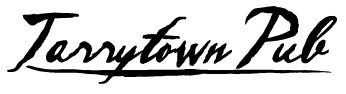
It's easy to get bogged down in the theme of a film like this and find it difficult to appreciate the elements and feel on their own. As usual, we will start with typefaces. Inked scripts like the one used for the promotional title can conjure a few things. Scripts in general are more organic, as one might expect from something patterned after handwriting. Calligraphic scripts are elegant; simple ones appearing masculine while those with long sweeping tails can seem more feminine. Meter of stroke is important as well. The typeface used for the promotional title is thick as if the stylus was held with the wide part of the nib perpendicular to the baseline. The ink flows freely and heavily. For this reason, the words aren't always easy to make out at a distance. Usage should be contained to one or two words. This breed of script would be good for masculine branding and perhaps a fine clothier or a pub-like eatery.

The film titles are done in a serif font that appears to have oxidized over time. The strokes waver, but remain strong. This type of lettering is useful for blocks of text as well as names and titles. As a basic serif, the uses are endless, but this one, with its added age character, is especially good for things relating to 'old world', antique, or well-worn and treasured items. This face would be appropriate on materials for a high-end furniture store, attractions relating to history, financial institutions, or blogs.


Atmosphere is key in designing with Sleepy Hollow elements. As stated above, the feel of the film is heavy, foreboding, and misty, yet artificial and nonthreatening; much like the Hammer films that lent Burton inspiration. Lighting remains soft and mostly even. This lighting can be used to decrease the dark sharpness of any design and is good for things that need to appear aged or vintage. Use colors, textures, and effects that play up and with diffused light. Use black perhaps only in logos, accent items, or text.

Speaking of colors, Sleepy Hollow presents a rather muted rainbow. Presumably set in late autumn/early winter, the colors are washed out and heavily tinted brown. Colors like these, again, are good for vintage schemes, but also for earthy palettes and seasonal items. Textures are those of era-appropriate fabrics and furnishings. Damask print, faint stripes, satin, lace, and rough wood can be used to infuse any design with a late 19th century Hudson Valley feel. Low contrast patterns are excellent as backgrounds for web sites or print media. Don't be afraid to use wood grains in these schemes as well.


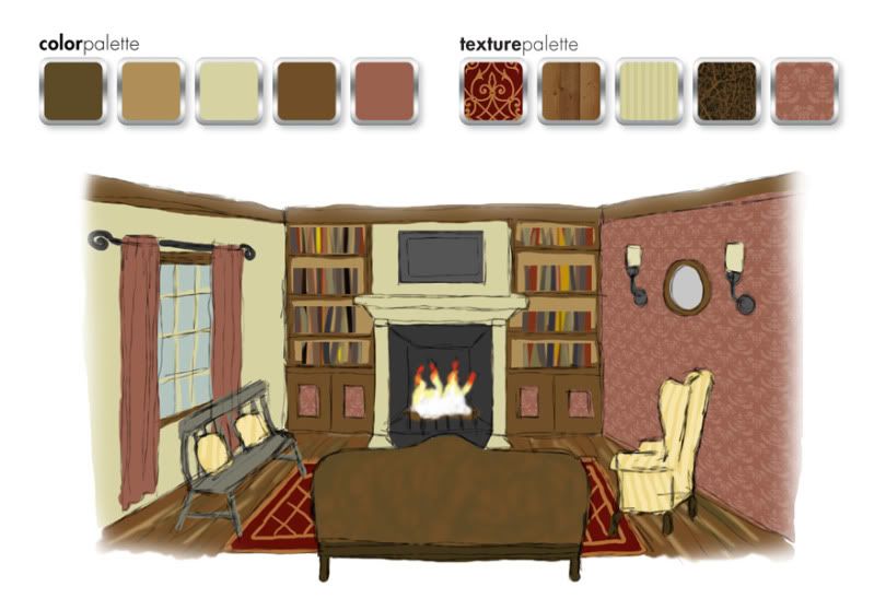
When decorating a space in Sleepy Hollow style, remember it only takes a few steps too far to lose your head. I suggest this look for a dining area, living room, or bedroom. For this example, I've chosen a living room with a fireplace. Start with neutral walls in your preferred film hue. Pale mustard, muted moss, or misty gray blue would be nice. Choose an accent wall and adorn with a damask print (or a black and white stripe, something featured quite a bit in Burton design) that coordinates with the other wall colors. For furniture, choose classic pieces but nothing overly ornate. Wood constructed lounge chairs work well, as do spindle-back chairs and benches. This time period was reserved in a lot of respects; the simplicity in furnishings due partially to availability of supplies and labor in the small farm towns.

For window treatments, I suggest plain drapes that extend to the floor in a coordinating color. Hang these from a wrought-iron-looking rod with swirled finials. (Tim Burton's style often includes swirls.) Rustic paneled shutters would work too. Wall adornments should be sparse. If you wish to hang art or mirrors, choose modest frames. Electric wall sconces or 'wireless' ones with large candles or oil lamps would be appropriate. Choose a sconce that is antique in design. Table and floor lamps would be nice, perhaps ones with a rustic iron finish. Built-in bookcases in stained wood are optimal, ones with decorative molding at the top and bottom. Hide the bottom shelves (if you have some) behind modest doors, perhaps inlaid with the damask pattern from the walls. This shelving should frame the fireplace, the mantel being understated but still maintain a presence

Texture is always important. As I've stated before, bare rustic wood is fitting. You can upholster modestly in stripes and less modestly in leather. Instead of heavy upholstery, consider cushions in muslin or pillows in quilt prints. Wood floors are best, but area rugs in understated 'oriental' patterns can add the right touch regardless of flooring.


A gore-filled film about decapitation is a treat on Halloween, but the design is just the trick for all kinds of looks. So when the air gusts cold and the Jack-o-lanterns burn, cast an eye to the western woods and capture some chilling design inspiration.