

Red is a color that demands attention. Depending on its hue and tint, it can bring to mind war, adventure, spice, speed, heritage, luxury, or warmth. In some cultures, red means blood, in others, joy. Used a lot in advertising, red is the ultimate color for drawing the eye.
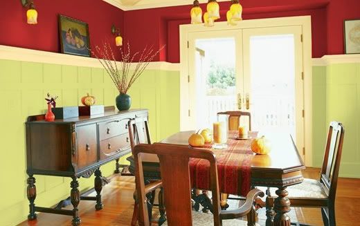
 In decorating, maple red is an exciting accent color. As you can see by these two examples, red brings spice to the room. Because of this, it's best to use in kitchens and dining areas. In the first example, a craftsman-type dining room, a maple with blue undertones is used at eye level complimented by a light earthy green and frothy cream (Valspar Sangria Red [CI113], Celery [6007-10A], and Hazy Dawn [3004-2B] respectively). This red will enhance the tones in darker wood and tends to go well with oriental rugs and tapestries.
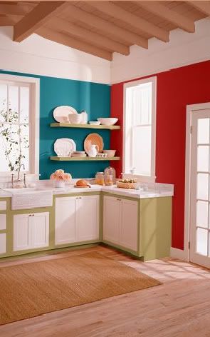
In the kitchen sample, a warmer maple (Behr Grenadine S-G-180) is paired with a maritime blue (Behr Tropical Skies S-H-530). To complete the colonial feel, a khaki color is used as an accent against the white cabinetry (Behr Beachwalk 340F-S). This red is good for bringing life to lighter woods as seen with the floor and ceiling.
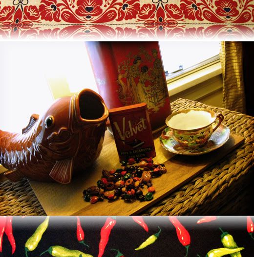
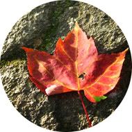
Maple is an ageless color of beauty and fire. Bringing a hint of this color into your life can be just the right kind of indulgence. As stated above, maple works well with branding and advertising that requires more richness. It looks great with black and gold. It's also good for Asian-themed designs, as shown by the lamp, fish, and tea cup in the photo. Be careful, however, for maple red isn't quite a fresh color. The undertones of blue and brown do age the hue and dull the brightness, so it may not be best to use in advertisements of fresh produce or something similar. It's a nice color as an accent on web sites, but I hesitate to recommend it for large portions as it may become tiresome to the eyes. As with many good things, it is possible to have too much.

No comments:
Post a Comment