
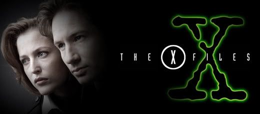
 The inaugural Design Dissection is given over to my favorite fandom of all time; The X-Files. Running for nine seasons, spawning two feature films and countless other items, X-Files is a sci-fi cultural phenomenon. As with any series, X-Files has a look and feel that is unmistakable. Let's start from the ground up and examine fonts. With the exception of a distressed typewriter font used for the iconic 'X' and in various other places, the series used mostly san-serif fonts on promotional items and on screen titles. The X-Files 'logo' font, whose exact name I cannot find, is tall and narrow with equal apertures, mid-line crossbars, parallel strokes, and scattered semi-serif tails. It's a perfect 'modern' font for a science fiction program and brings to mind a digital age. Viking Gothic and Evening Edition are two fonts that come close to matching this one, though they don't have all the requirements. The logo itself, much like the series feel as a whole, is airy, with the letters spaced out quite a bit. This treatment helps things breathe and gives the viewer a sense of openness. I've used Steelfish on the examples later on in the post.
The colors of X-Files were mostly cool and dark with the occasional touches of fire. The predominate mood color was an eerie, otherworldly green with a sinister glow. Darkness with glowing accents was a running feature in the cinematography and production design as well. Lighting was key because lighting had to create the right shadows. The sets, wardrobe, and make-up were muted; as if treated with a slight dark umber filter. The series had a feeling similar to paintings by Rembrandt, de La Tour, and Caravaggio who all employed a keen sense of chiaroscuro, strong contrasts between light and dark.

Though UFOs are generally thought to be 'flying saucers', the UFOs in X-Files were very different. The curvilinear form was replaced by a hard-edged shape, usually triagular. Hard lines were prevalent. There's a post-modern feel to the series, a combination of line and form that comes off as very technical. With the exception of neckties, there's not much pattern. Clothing is solid color and tailored. Jewelry is limited as well, with featured pieces, such as Scully's gold cross, being quite understated.
A look at the players and their respective living spaces shows us how important personal appearance and surroundings are to establishing character. Mulder's apartment is dark with mis-matched furniture and is very haphazard. Scully's apartment is more furnished, lit with table lamps to create warmth, and appears clean and neat. Walter Skinner always had a strong, masculine presence with immaculate clothing and metal-rimmed glasses. His home, which we see only briefly, is modern and arranged almost militarily, much like his personal appearance. C.G.B. Spender, or more commonly known as the Smoking Man, was always rumpled and disconcerting. His wrinkled suits matched his wrinkled skin and his living spaces were those of a vagrant, very utilitarian and sparse.
 All the elements came together to make beautiful, but often unnerving music. These elements can be transferred to other design projects with ease to create similar moods. First, we must keep in mind what we want to convey with our project. If this is for a client, it's important to remember what these elements mean and what kind of images they bring to mind. As I said above, non-playful san-serif fonts are usually considered modern, sleek, and calculating. They're perfect for technological endeavors and architectural
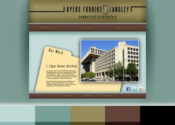
  firms. See website example above for Byers, Frohike & Langley (named after The Lone Gunmen) with five-color palette blocked out at the bottom. The fonts are of course great for scientific clients as well, especially theoretical sciences, chemical, pharmaceutical, and research facilities. For an examples of this, see Fenig Chemical (named after one of my favorite minor characters in the X-Files universe, Max Fenig) and the S. Mulder Observatory (named for Mulder's lost sister, Samantha).
 The colors of the X-Files, for the most part, appear damp. The series was filmed in Vancouver for the first five seasons, so the colors would be appropriate for something nautical like the featured Queequeg's Fish & Chips. The mid- and light-tones of these colors are great for offices or bedrooms as they are calming. Furnish spaces with metal-framed furniture, solid-color
 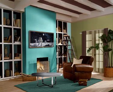 textiles and leather to complete the clean look. You could even pepper the area with some space-themed art. Remember, X-Files used high contrast between light and dark, so to truly emulate the style, consider small lamps as opposed to large overhead lighting. Also consider heavier window treatments, perhaps accent drapes over tinted sheer curtains.
When you find something that inspires you, whether it be a painting, a photograph, or a television series, it's fun to deconstruct the magic and use components in your work and life. The X-Files created a distinctive and detailed look that has remained the same over two decades. Actors age, styles change, but the atmosphere of the latest venture, I Want to Believe, was the same as the pilot episode in 1993. I hope you've enjoyed this Design Dissection. The truth is out there!
This is an excellent "under the hood" look at the overall design elements for this show. Once you're aware of the design, I think it creates an even greater appreciation for the show. Kind of like how being in band makes you appreciate how all the parts make a whole piece of music, and you start listening for that in every song you hear.
ReplyDeleteWhat's next? "Chuck?" "Supernatural?" I'd like to see you do the same for those shows.
Those are certainly on the list! I'd like to do some movies too, maybe a western or something period.
ReplyDeleteSo cool! I sometimes envy (in a good way) your ability to see things this way. I like to 'Fringe' added to the shows that Tim mentioned!
ReplyDeleteIt makes me wish you had watched 'Veronica Mars' because that show was so subtly gorgeous with details and lighting. I'd love to see you dissect it.